Notebook Box Design
Topics
Details
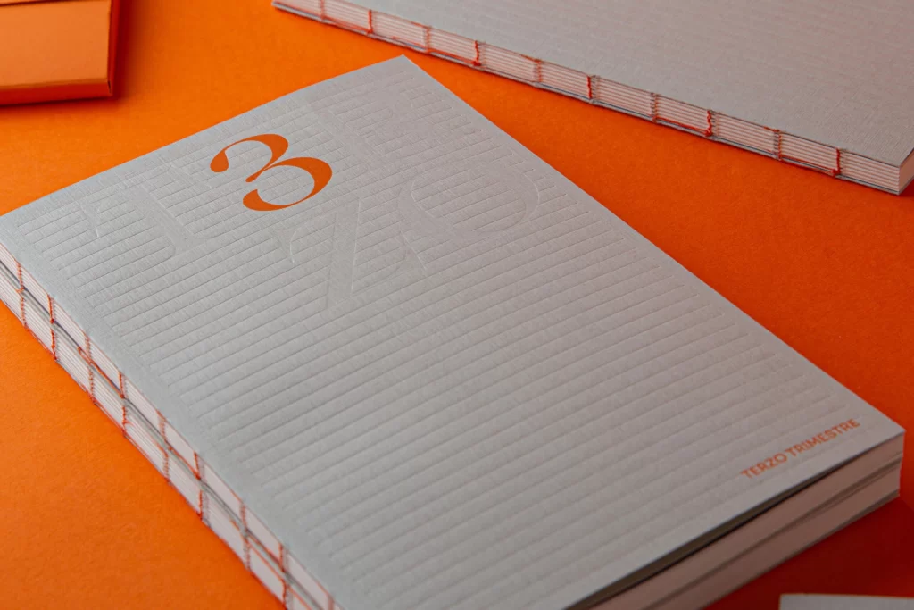
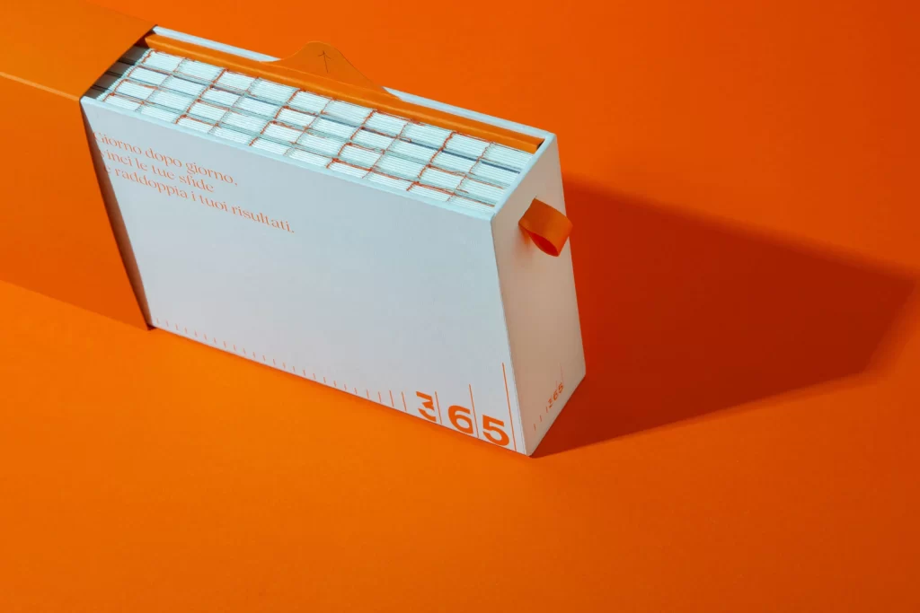
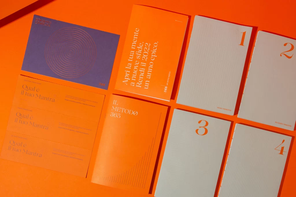
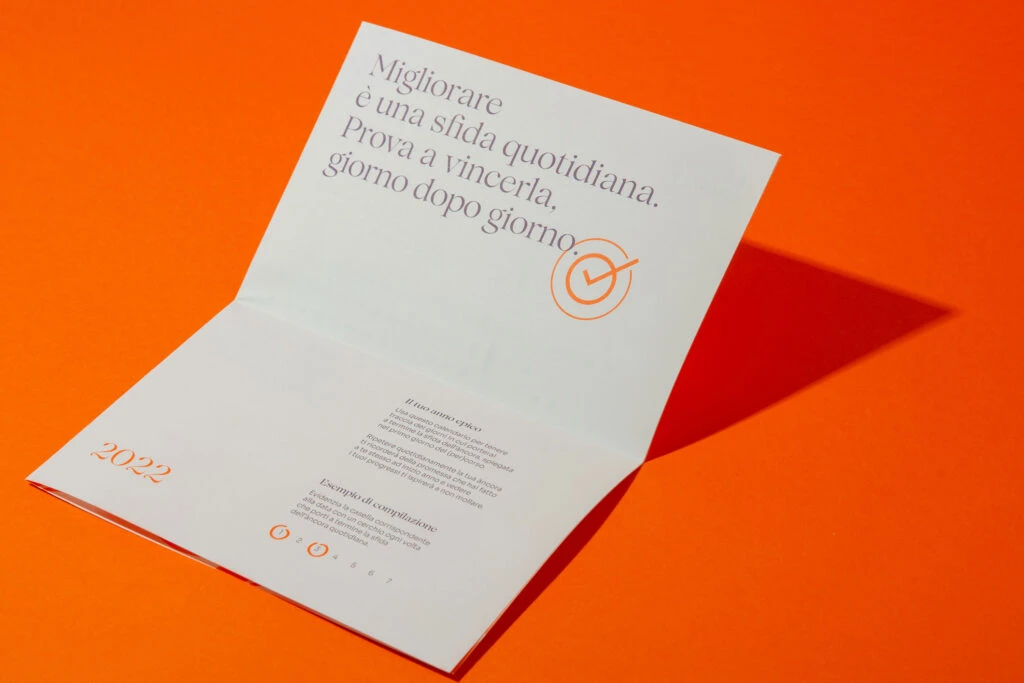
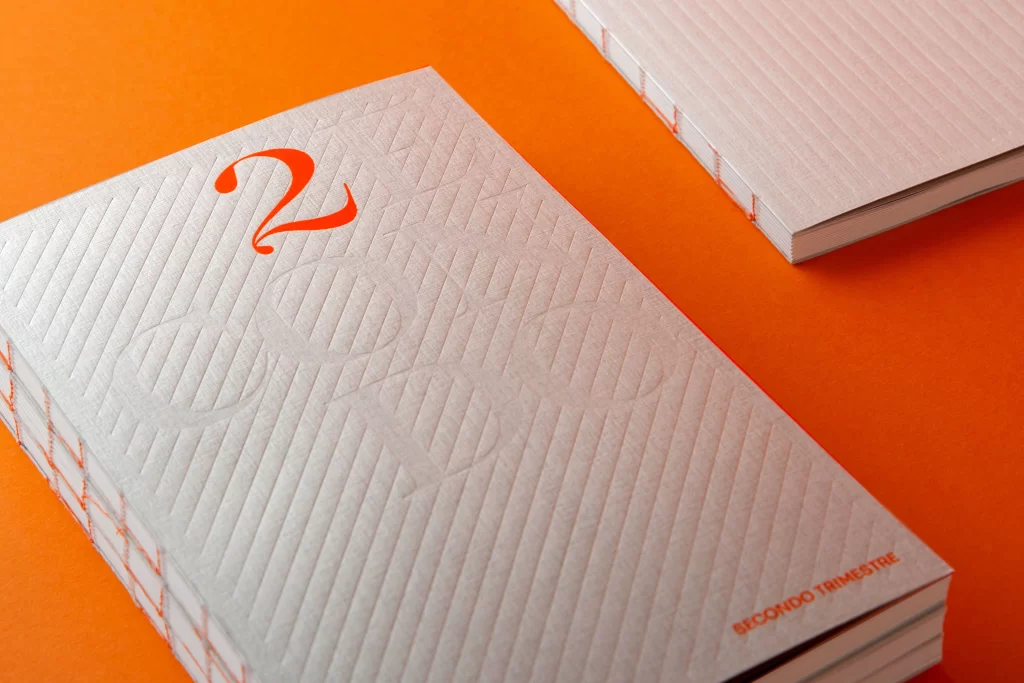
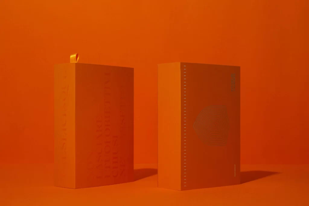
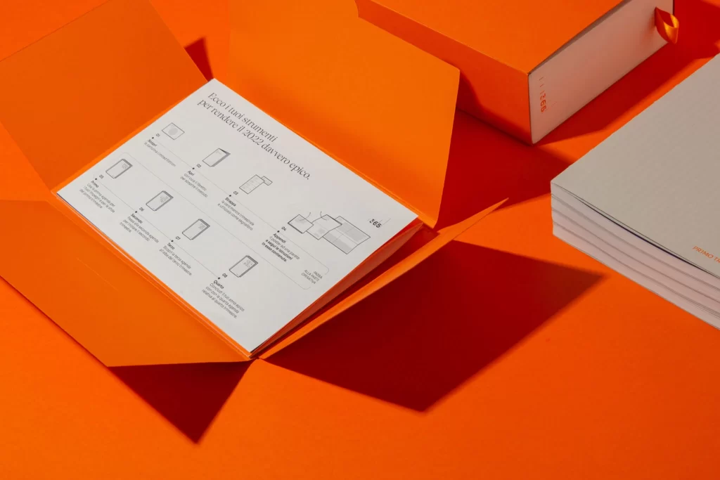
Vibrant orange paper dominates the frame, forming a rigid sleeve that has been partially unfolded to reveal a white insert printed with Italian text and minimalist line icons. The composition places this open package in the foreground, angled slightly to display the interior layout, while a closed version of the same box and a stack of light grey notebooks rest in the upper right background. Strong directional lighting casts sharp, geometric shadows across the saturated surface, emphasizing the crisp edges of the cardstock and the clean typography visible on the inner panel.
What distinguishes this packaging is the bold monochromatic approach that extends from the exterior shell to the background surface, creating a seamless visual field that makes the white informational sheet pop. The structural choice of a fold-out wrapper rather than a traditional lid allows for an expansive canvas to present product details or usage instructions directly to the viewer. Subtle details like the ribbon pull-tab on the closed box and the precise alignment of the notebook stack suggest a high level of finish and attention to tactile user experience.
Packaging engineers studying sleeve-and-insert constructions would examine the seam placements and fold lines evident in the open state. Brand managers developing premium stationery lines could analyze how the intense color choice communicates energy while the internal documentation maintains clarity. Print production specialists might reference the contrast between the matte orange substrate and the sharp black linework to calibrate their own color separation processes.