Notebook Box
Topics
Details
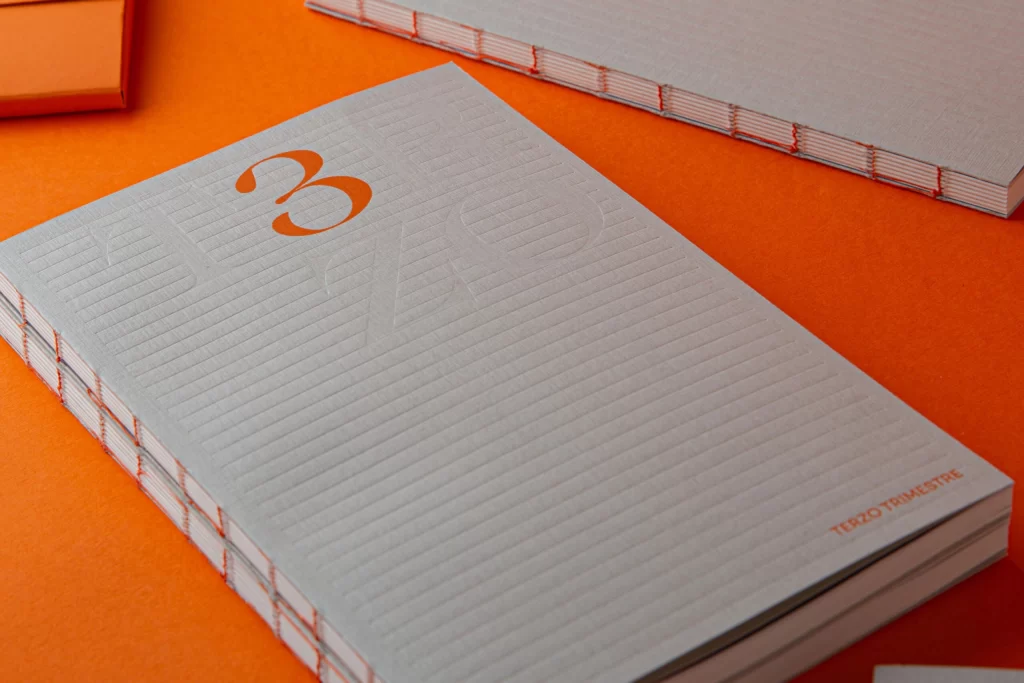
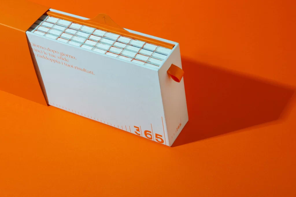
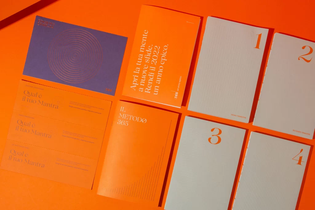
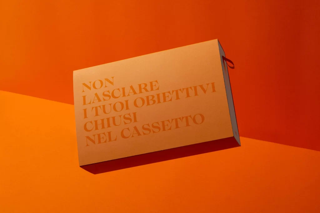
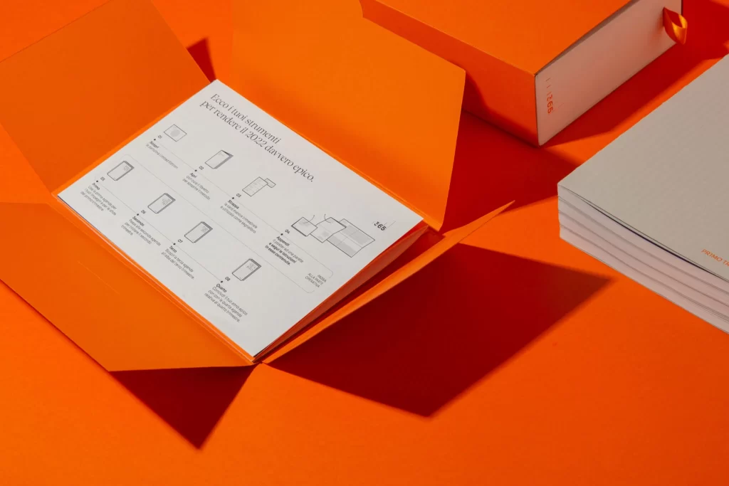
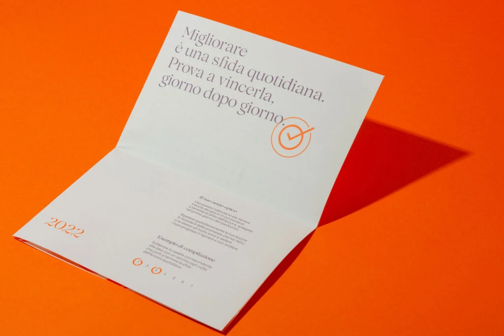
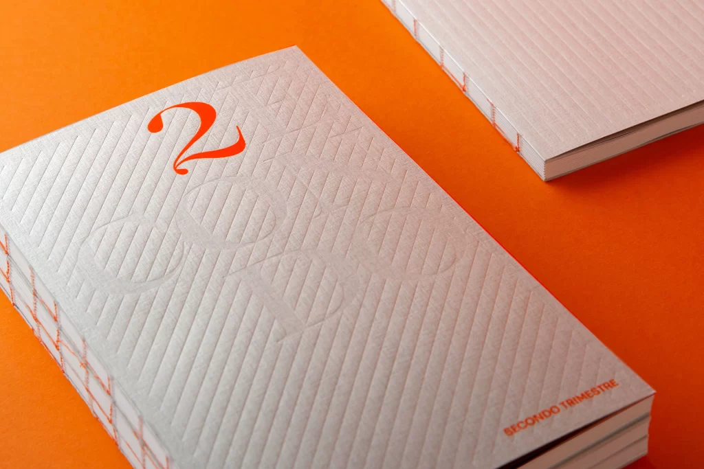
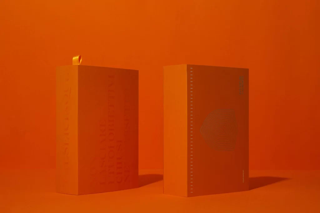
Saturated orange light floods the frame, illuminating two rigid rectangular boxes that stand in stark monochromatic harmony with the backdrop. The left container features a vertical ribbon pull at its crown and displays large, translucent typography running down its spine, while the right counterpart presents a subtle concentric arc pattern and a perforated edge detail. Soft shadows ground the objects, suggesting a slightly elevated camera perspective that emphasizes the matte texture of the cardstock and the precision of the structural folds.
Visual cohesion drives the impact of this composition, relying on a single hue to unify product and environment into a singular graphic statement. The interplay between the bold, ghosted lettering on one face and the delicate geometric linework on the other creates a sophisticated typographic rhythm. Such a restrained palette forces the viewer to notice the tactile qualities of the material and the architectural integrity of the packaging construction rather than being distracted by contrasting colors.
Art directors examining premium packaging solutions would find this arrangement useful for analyzing how minimal color palettes can elevate perceived value. Brand strategists might study the balance between functional elements like the ribbon tab and decorative graphics to understand luxury positioning. Furthermore, photographers could utilize this setup as a technical exercise in lighting uniform objects to reveal form without losing detail to overexposure.