Notebook Label
Topics
Details
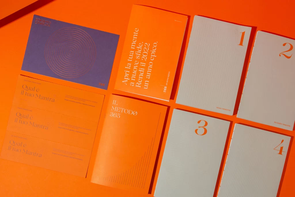
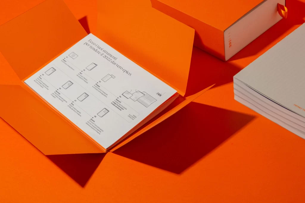
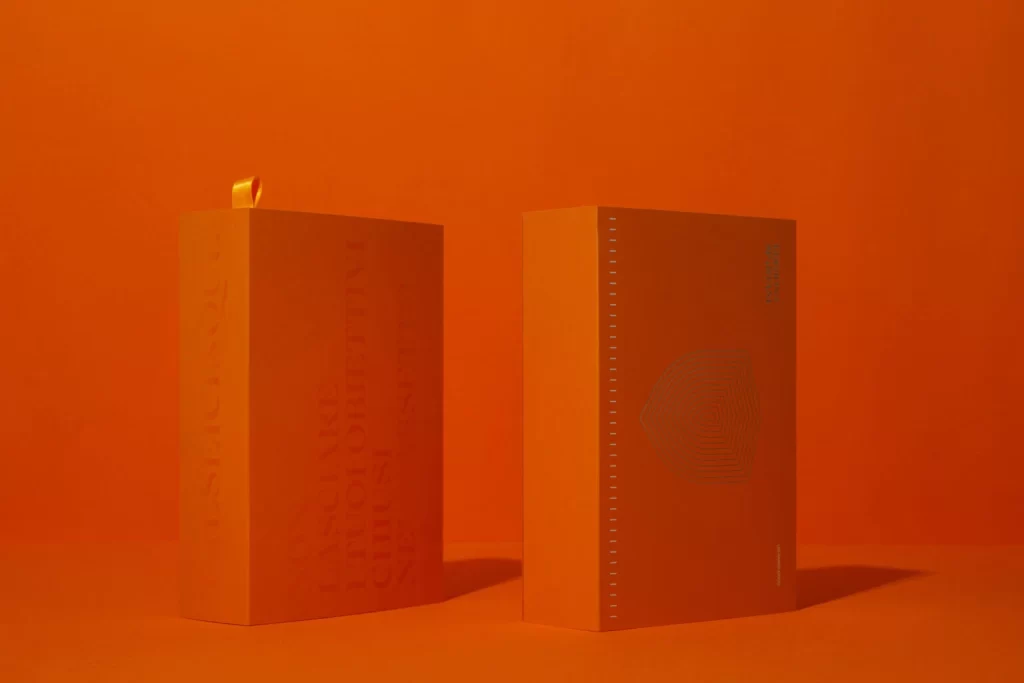
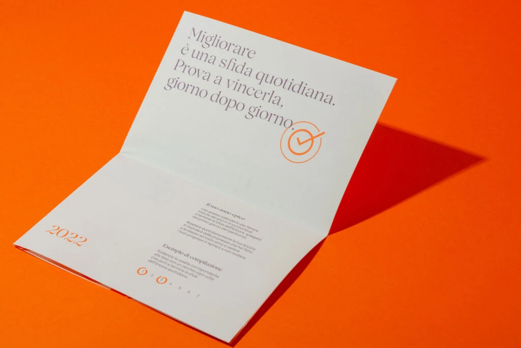
Against a saturated orange backdrop, a white bi-fold notebook lies open at an oblique angle, casting a sharp, elongated shadow toward the right. The upper panel features elegant Italian typography in a slate-gray serif font that reads 'Migliorare è una sfida quotidiana. Prova a vincerla, giorno dopo giorno,' accompanied by a minimalist orange checkmark enclosed in concentric circles. Below the fold, smaller text blocks detail usage instructions alongside the year '2022' rendered in a matching orange hue, while three small circular icons anchor the bottom left corner of the layout.
Visual distinction emerges from the striking interplay between the warm, energetic background and the cool, refined typography of the printed page. The composition leverages negative space effectively, allowing the singular graphic element—the encircled checkmark—to serve as a focal point that reinforces the motivational message. Such a restrained color palette, limited to white, gray, and a single vibrant accent, demonstrates how minimalism can convey sophistication without overwhelming the viewer.
Art directors and brand strategists might examine this spread when developing identity systems for wellness apps or productivity tools that require an aspirational yet grounded tone. Print designers could study the typographic hierarchy and margin spacing to understand how to balance inspirational copy with functional instructions on a single leaf. Additionally, photographers specializing in flat-lay compositions would find value in analyzing how the directional lighting creates depth while maintaining the legibility of the text across both panels.