Caswell Massey Soap Box
Topics
Details
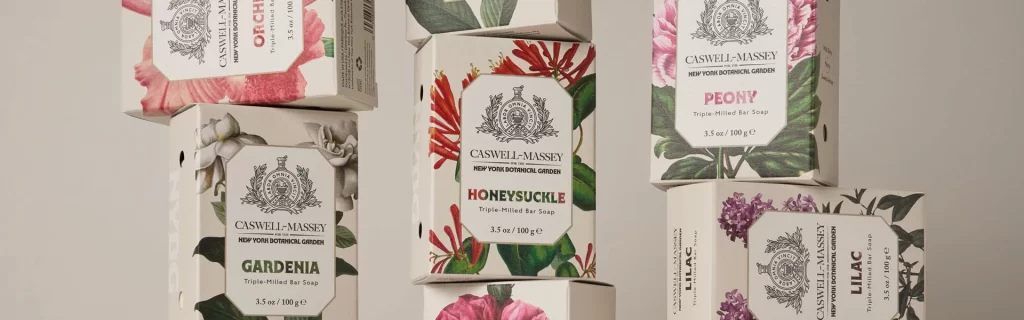
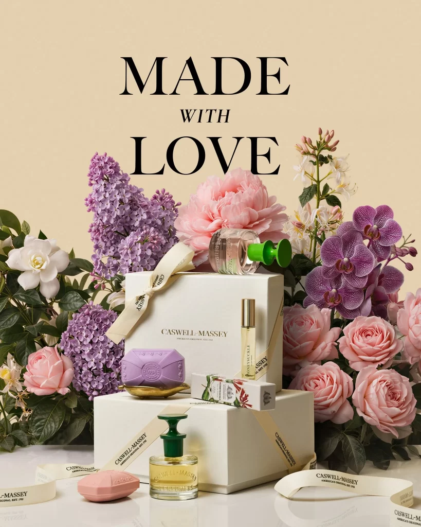
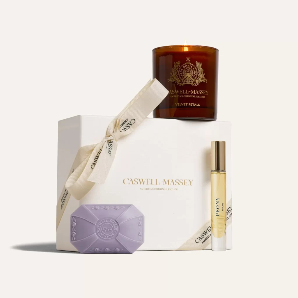
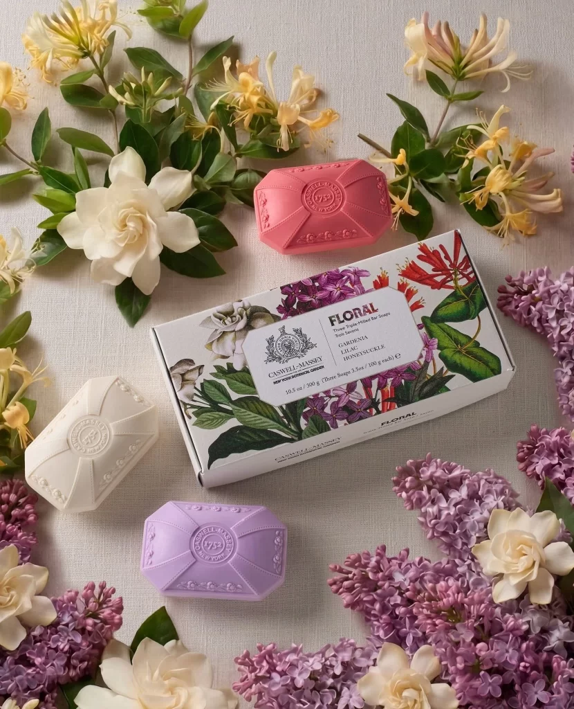
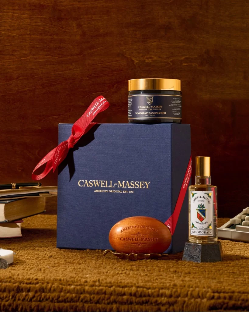
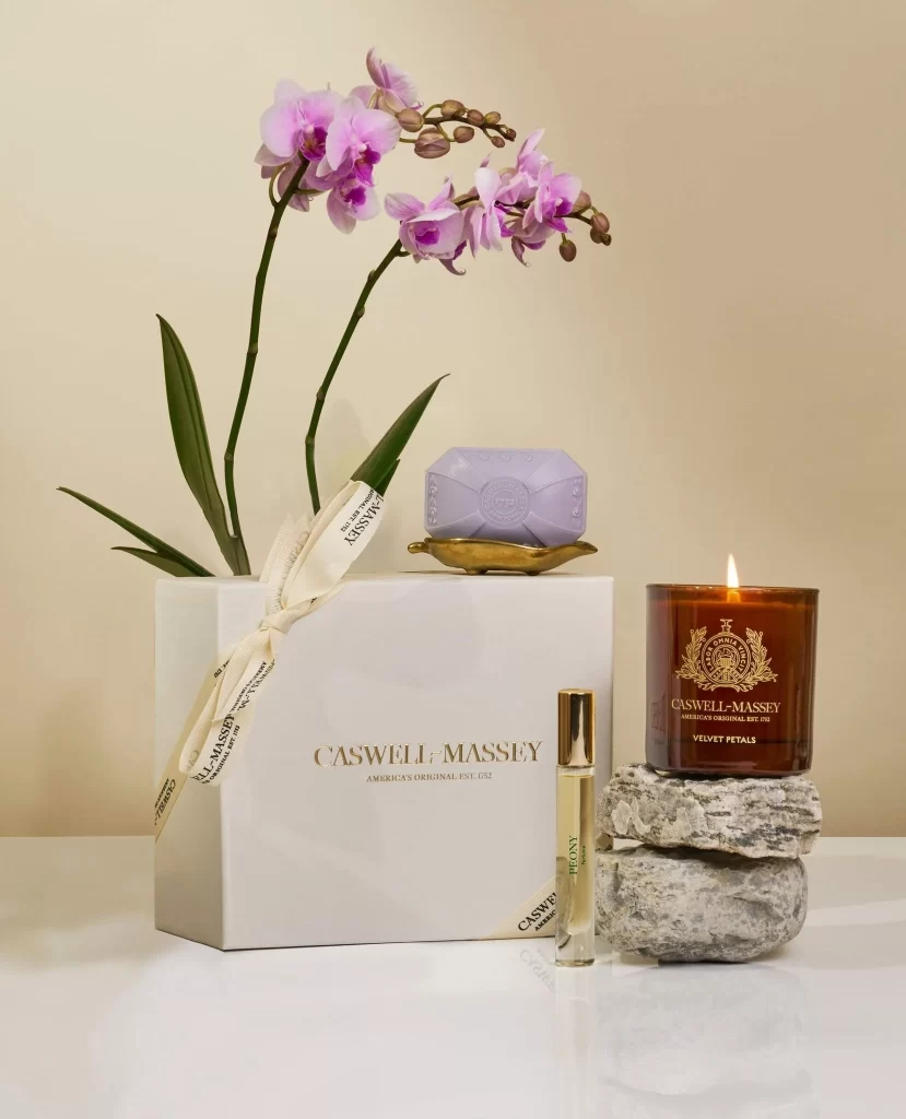
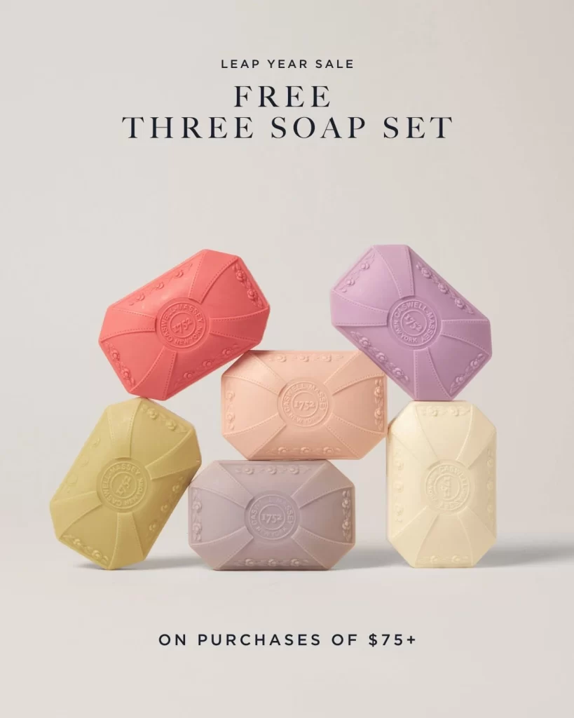
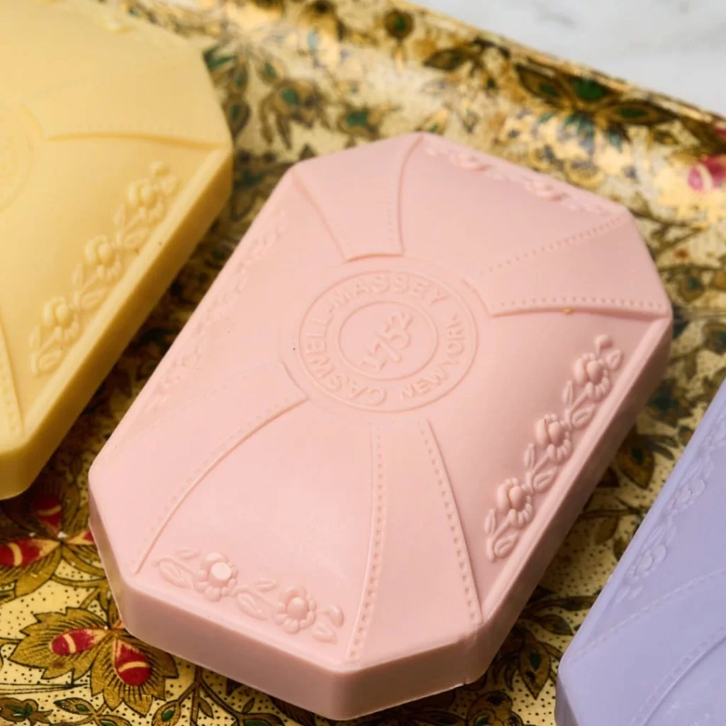
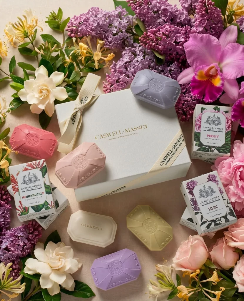
Soft pastel hues dominate the composition, featuring a pale blue gift box tied with a cream ribbon that displays the gold-embossed 'CASWELL-MASSEY' logo. Surrounding the central package are six distinct bar soaps in coral, lavender, pale pink, ivory, chartreuse, and periwinkle, each embossed with a circular crest and arranged alongside their individual floral packaging. Fresh botanicals—including white gardenias, purple lilacs, yellow honeysuckle, and pink peonies—frame the products against a neutral beige surface, illuminated by diffused overhead lighting that creates gentle shadows beneath each object.
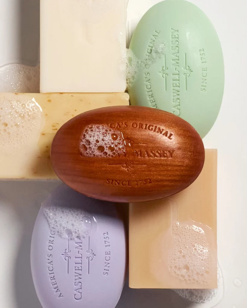
The visual appeal lies in the sophisticated color coordination between the soap hues and their corresponding flower species, creating an intuitive sensory map for consumers before they even open the packaging. Octagonal and rectangular geometric shapes provide structural variety while maintaining cohesive branding through consistent typography and crest motifs across all materials. This particular arrangement demonstrates how luxury positioning can be achieved through thoughtful prop styling that bridges the gap between product photography and still-life art.
Packaging designers studying premium beauty brands would find this layout useful for analyzing how to balance multiple SKUs within a single promotional frame without visual clutter. E-commerce art directors could reference the floral integration techniques when planning seasonal campaign imagery that requires organic elements to soften commercial product shots. Color theorists might also employ this as a case study in analogous and complementary palette construction for feminine-coded luxury goods.