CLARWELL-MANSFIELD Soap And Perfume
Topics
Details
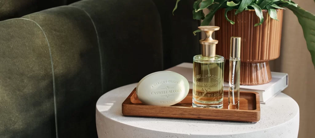
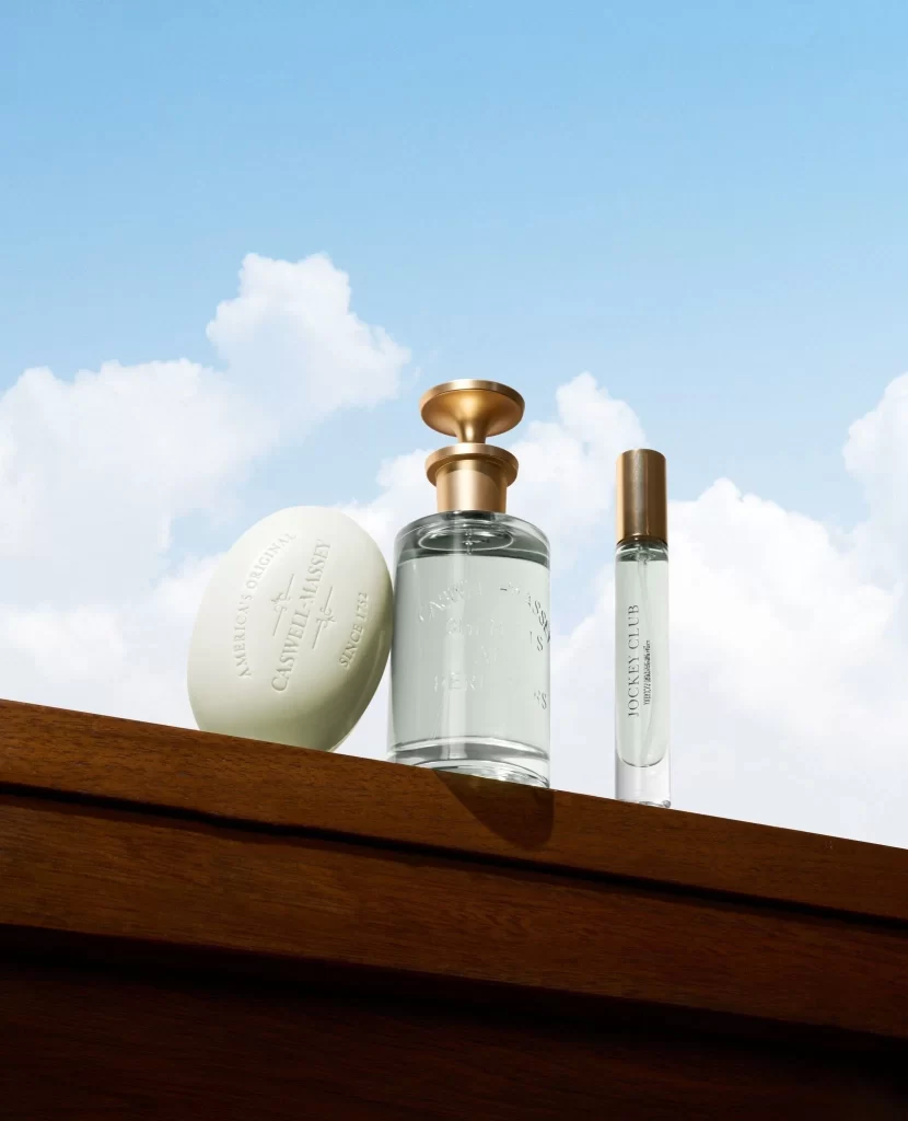
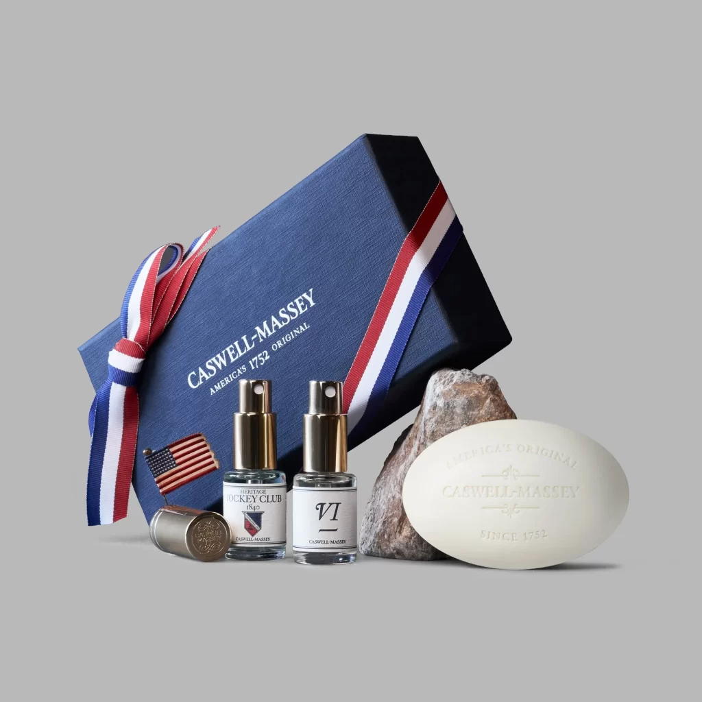
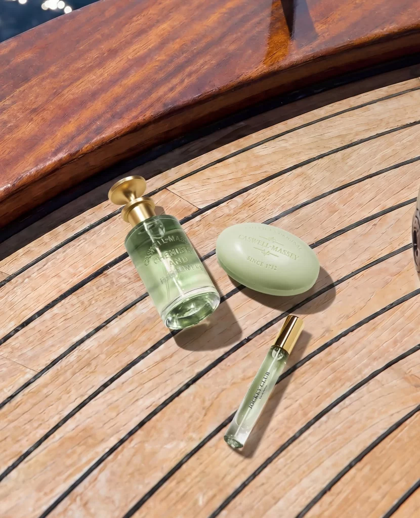
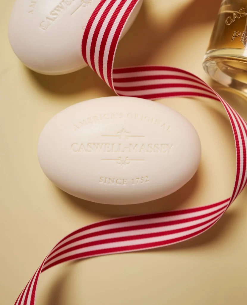
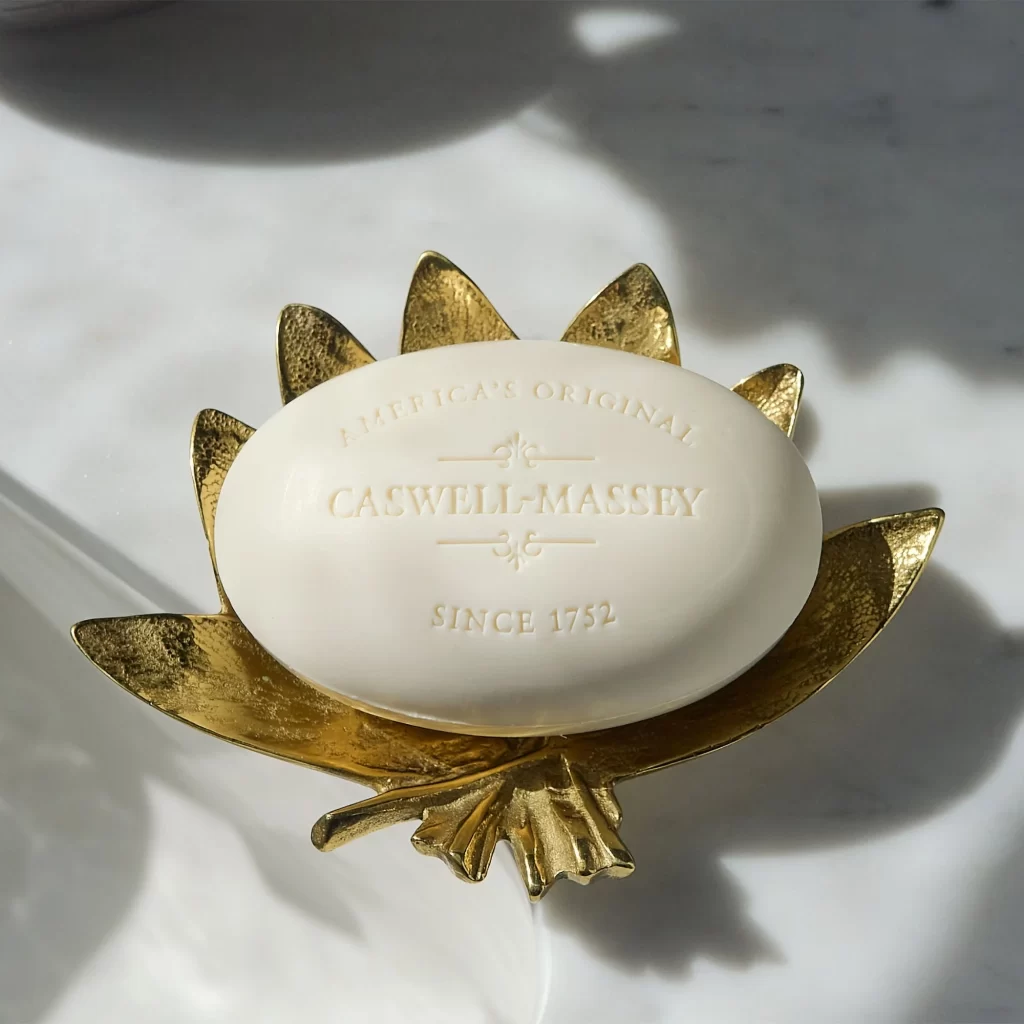
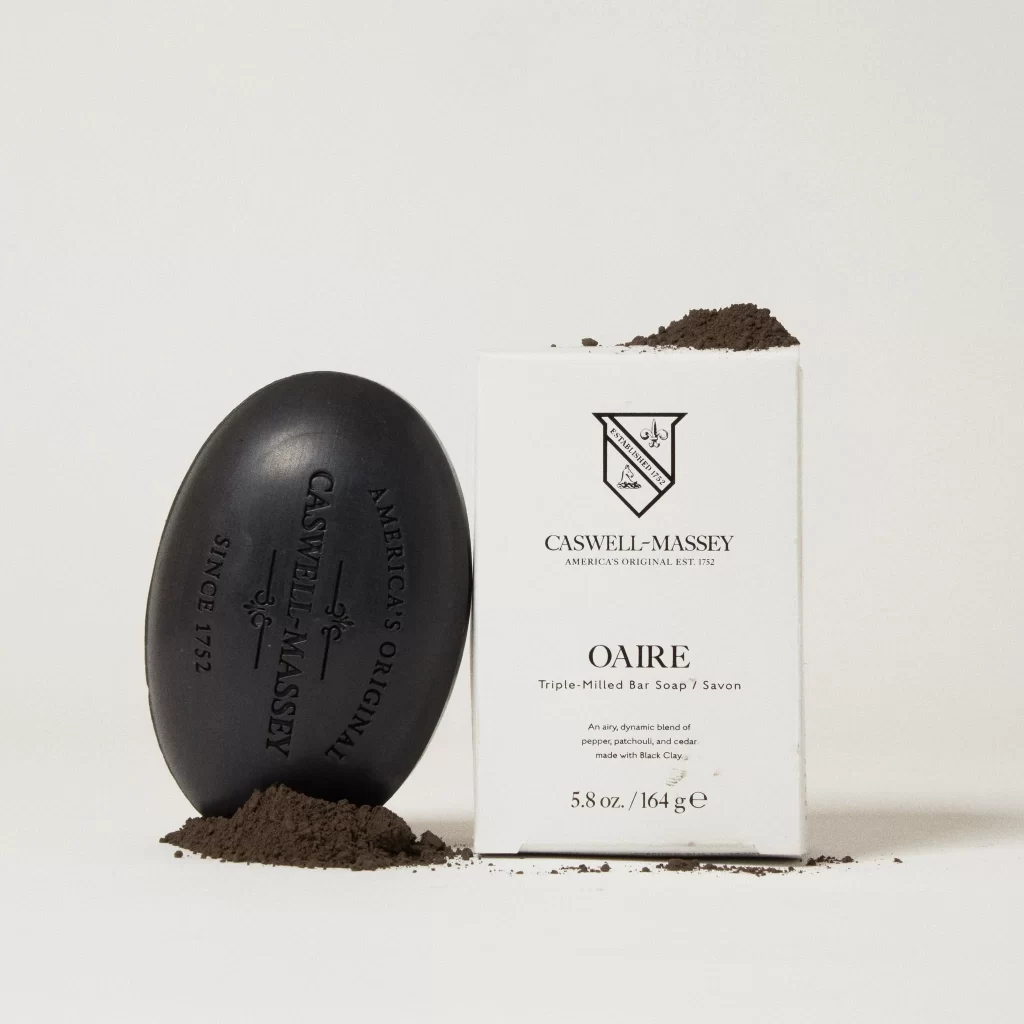
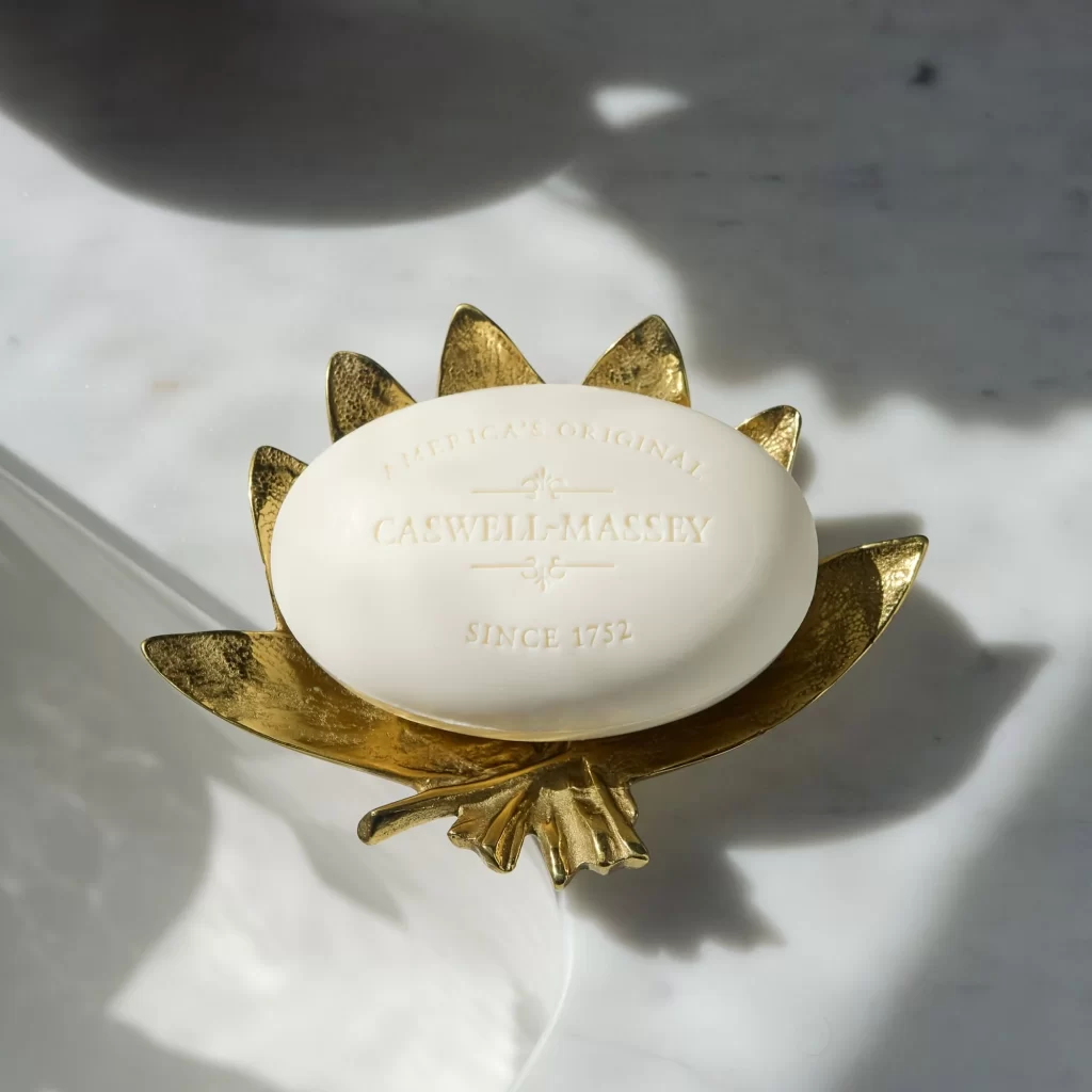
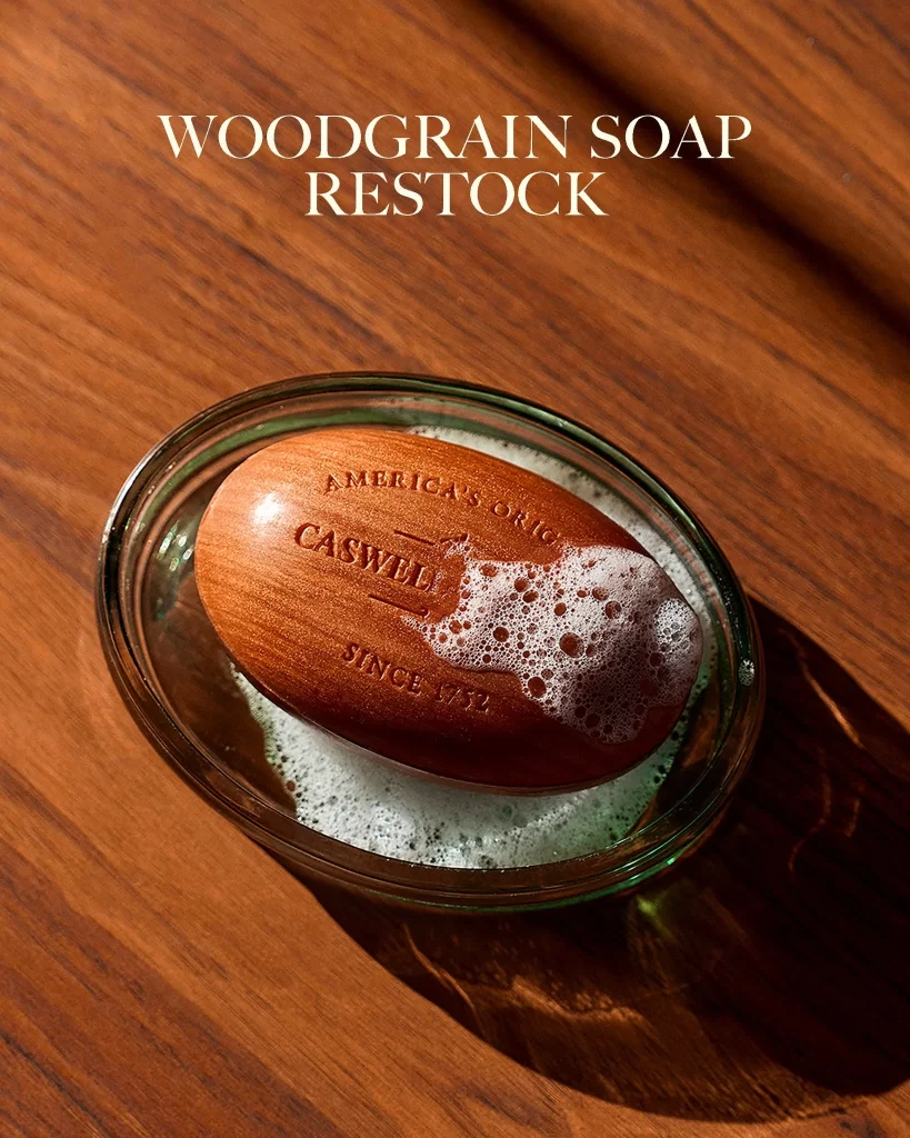
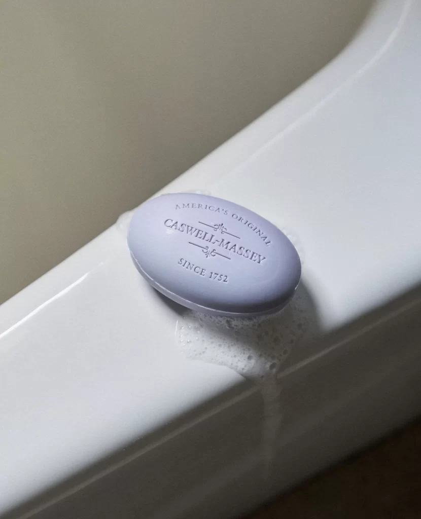
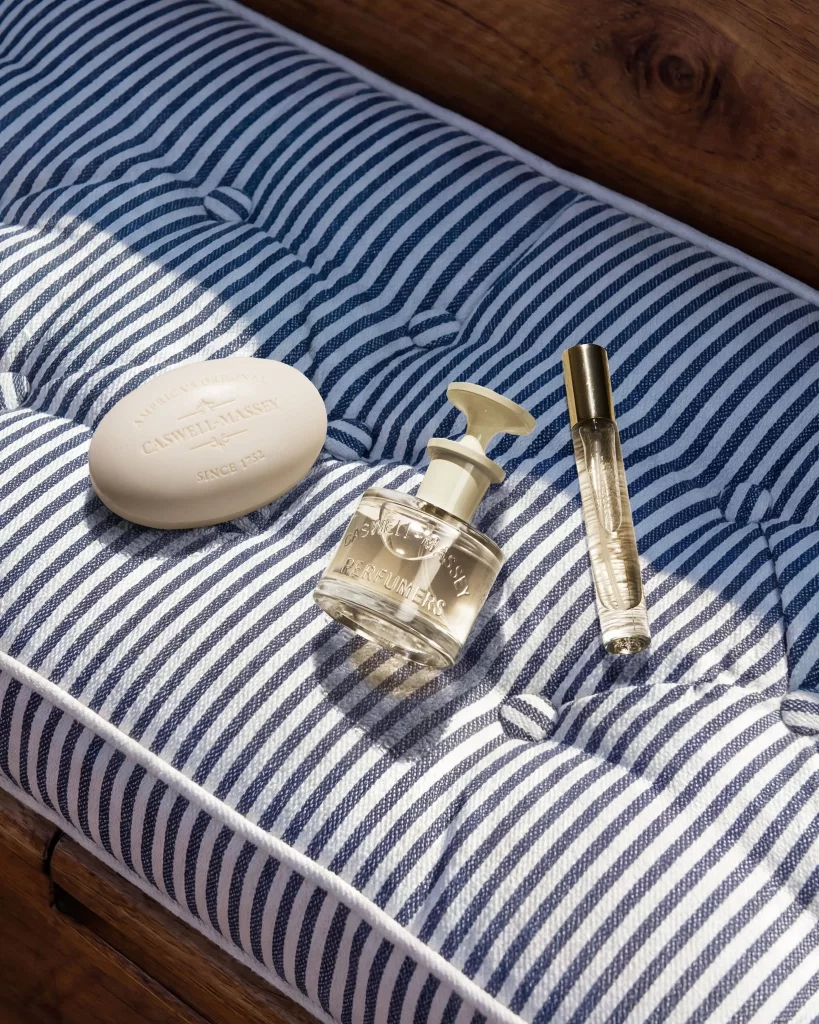
Bathed in natural sunlight, three personal care items rest upon a navy and white striped cushion with deep tufting. An oval white soap bar sits to the left, embossed with 'CLARWELL-MANSFIELD' and 'SINCE 1952', while a clear glass perfume bottle with a cream-colored stopper occupies the center, bearing the same brand name alongside 'LE NUMÉROS'. To the right stands a slender rollerball vial capped in brushed gold, all arranged against a warm wooden backdrop that frames the composition from a slightly elevated angle.
The visual appeal lies in the deliberate contrast between the matte ceramic soap, the transparent glass revealing liquid within, and the metallic sheen of the rollerball cap. Typography plays a subtle yet crucial role here, with the serif lettering on both the soap and bottle lending an air of heritage elegance that complements the nautical stripe pattern beneath. This particular arrangement balances soft organic curves against rigid linear textiles, creating a study in textural variety that feels both curated and casually placed.
Product photographers might study this setup to understand how directional light enhances glass transparency without causing harsh glare on reflective surfaces. Packaging designers could draw inspiration from the cohesive color palette of cream, clear, and gold when developing luxury skincare lines that aim for a timeless aesthetic. Art directors planning lifestyle shoots for wellness brands will find the interplay between fabric textures and smooth cosmetic containers particularly useful for mood board development.