Cotton Tissue Box White Blue Minimalist Design
Topics
Details
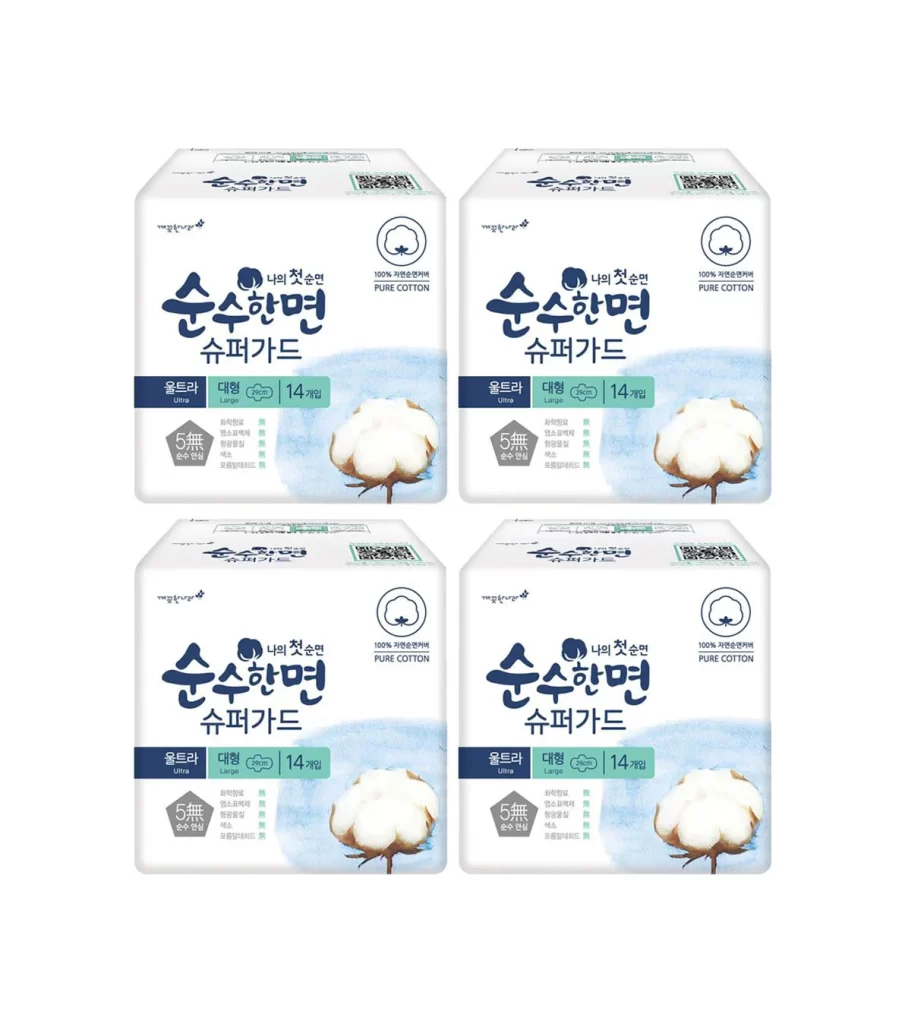
Four identical rectangular cartons of cotton sanitary pads occupy the frame in a precise two-by-two grid, each box rendered in a crisp white with soft cerulean blue accents. The packaging features bold Korean typography for the brand name '순수한면' (Pure Cotton) alongside the English translation, a circular cotton-boll icon, and a photographic image of raw cotton fiber against a watercolor-style blue wash. A dark navy band across the lower third indicates the 'Ultra Large' size and 14-count quantity, while a pentagonal badge highlights '5無' (5-free) chemical-free certification.
Visual hierarchy relies on the interplay between deep indigo lettering and airy sky-blue gradients, creating a clinical yet organic aesthetic that signals purity without sterility. The photographic cotton element introduces tactile realism that contrasts sharply with the flat vector graphics and clean sans-serif typefaces surrounding it. Symmetrical repetition of the four units emphasizes mass-market consistency while the minimalist color palette ensures immediate shelf recognition in retail environments.
Packaging designers studying pharmaceutical or personal-care branding would examine this composition to understand how limited palettes convey trust and natural ingredients. E-commerce photographers could reference the even frontal lighting and shadowless presentation for catalog standardization. Marketing teams developing eco-friendly product lines might analyze the placement of certification badges and material claims to optimize consumer communication on similar rectangular formats.