Frinsa Salmon Can
Topics
Details
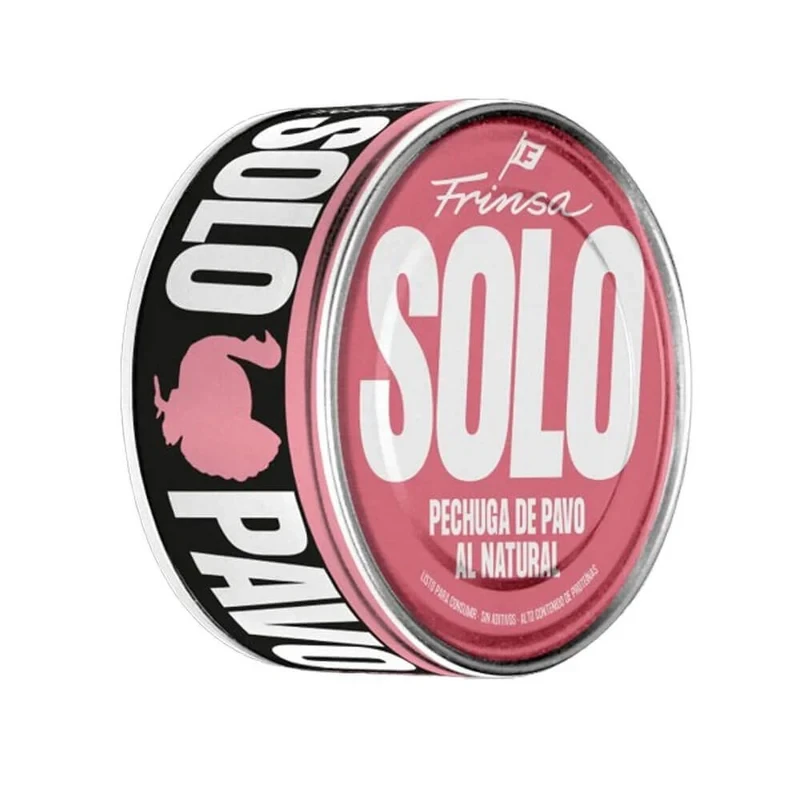
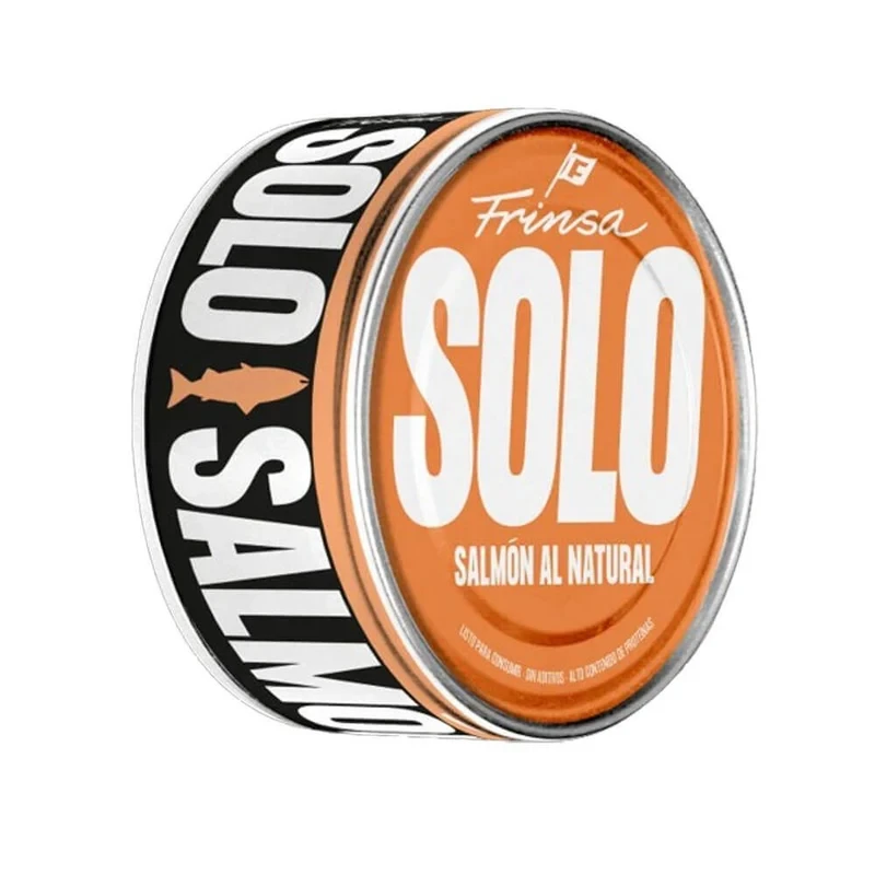
A cylindrical salmon can dominates the frame, displaying a vibrant orange front label with bold white typography spelling 'SOLO' above 'SALMÓN AL NATURAL' in smaller capital letters. The brand name 'Frinsa' appears in elegant cursive script near the top of the orange surface, while the black side panel features vertically oriented white text reading 'SOLO SALMON' with an orange fish silhouette between the words. Soft studio lighting highlights the metallic silver rim and creates subtle shadows that emphasize the can's three-dimensional form against a clean background.
Visual impact here derives from the aggressive contrast between the warm orange field and the stark monochrome elements of the side label. The typographic hierarchy is immediately clear, utilizing scale to prioritize the product name over the more delicate cursive branding and smaller descriptive text. Such a layout demonstrates how industrial packaging can balance bold commercial messaging with clean, modern aesthetics through limited color palettes and strong geometric forms.
Product photographers might study this composition to understand how to effectively light reflective metal surfaces without creating distracting glare. Branding specialists could analyze the interplay between the heavy block fonts and the lighter script to inform their own packaging identity systems. Additionally, 3D texture artists often utilize such clear shots of manufactured goods to accurately recreate material properties like metallic sheens and printed label finishes in digital environments.