Frinsa Natural Protein Can Design
Topics
Details
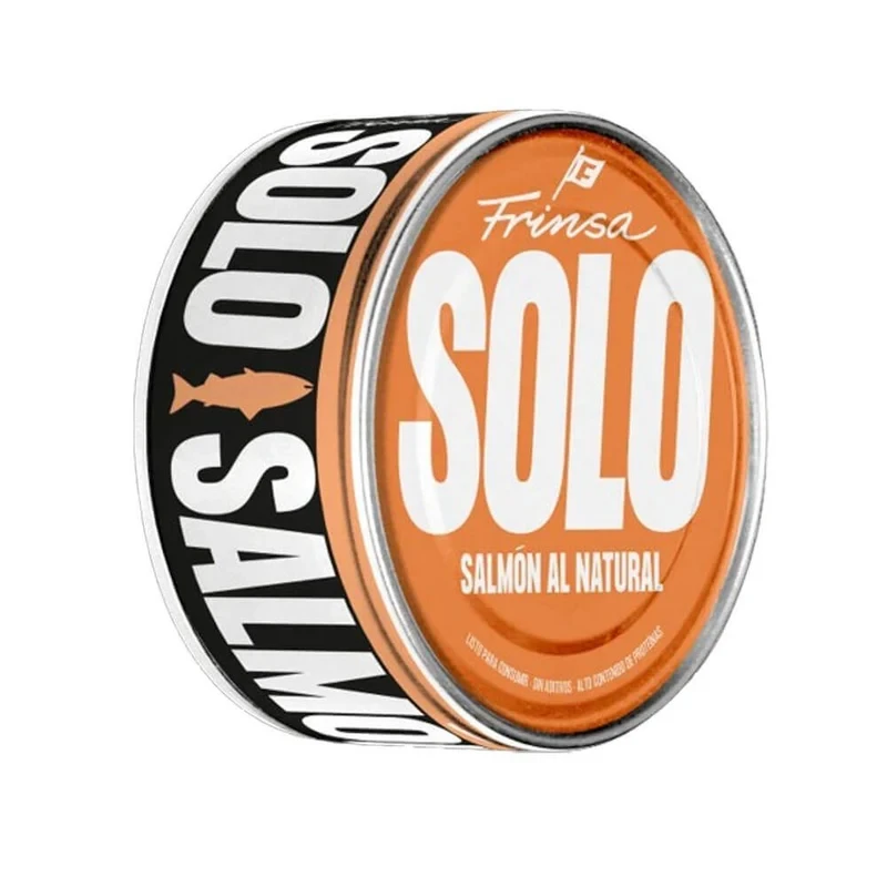
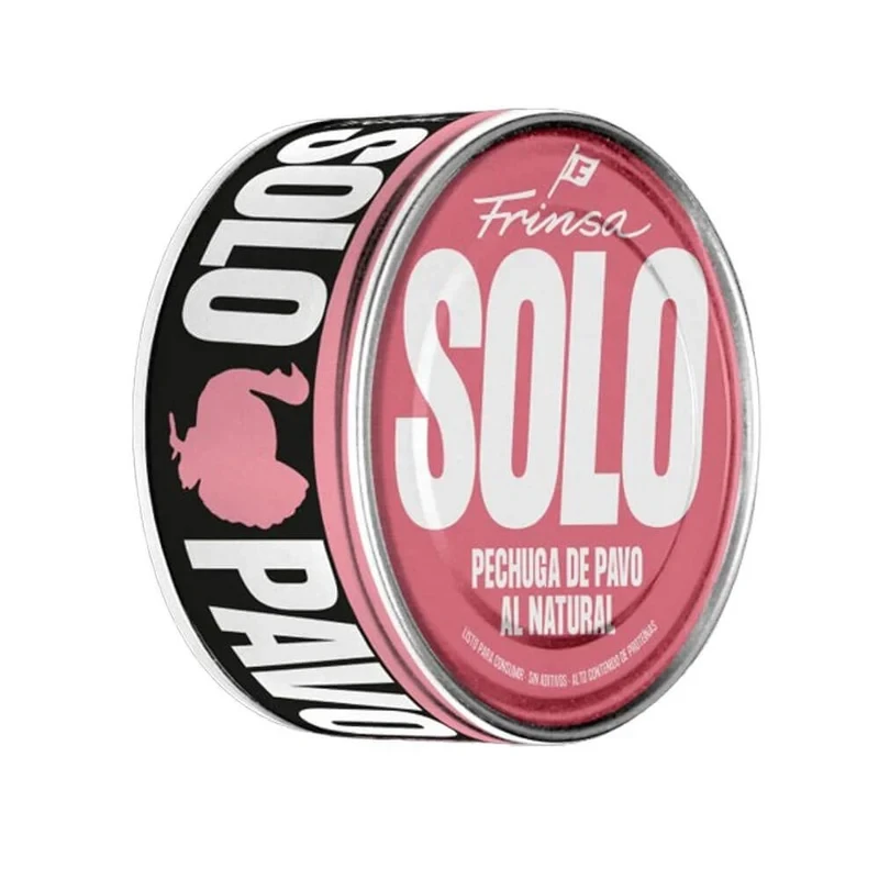
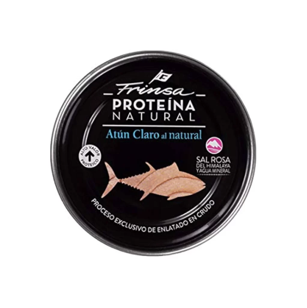
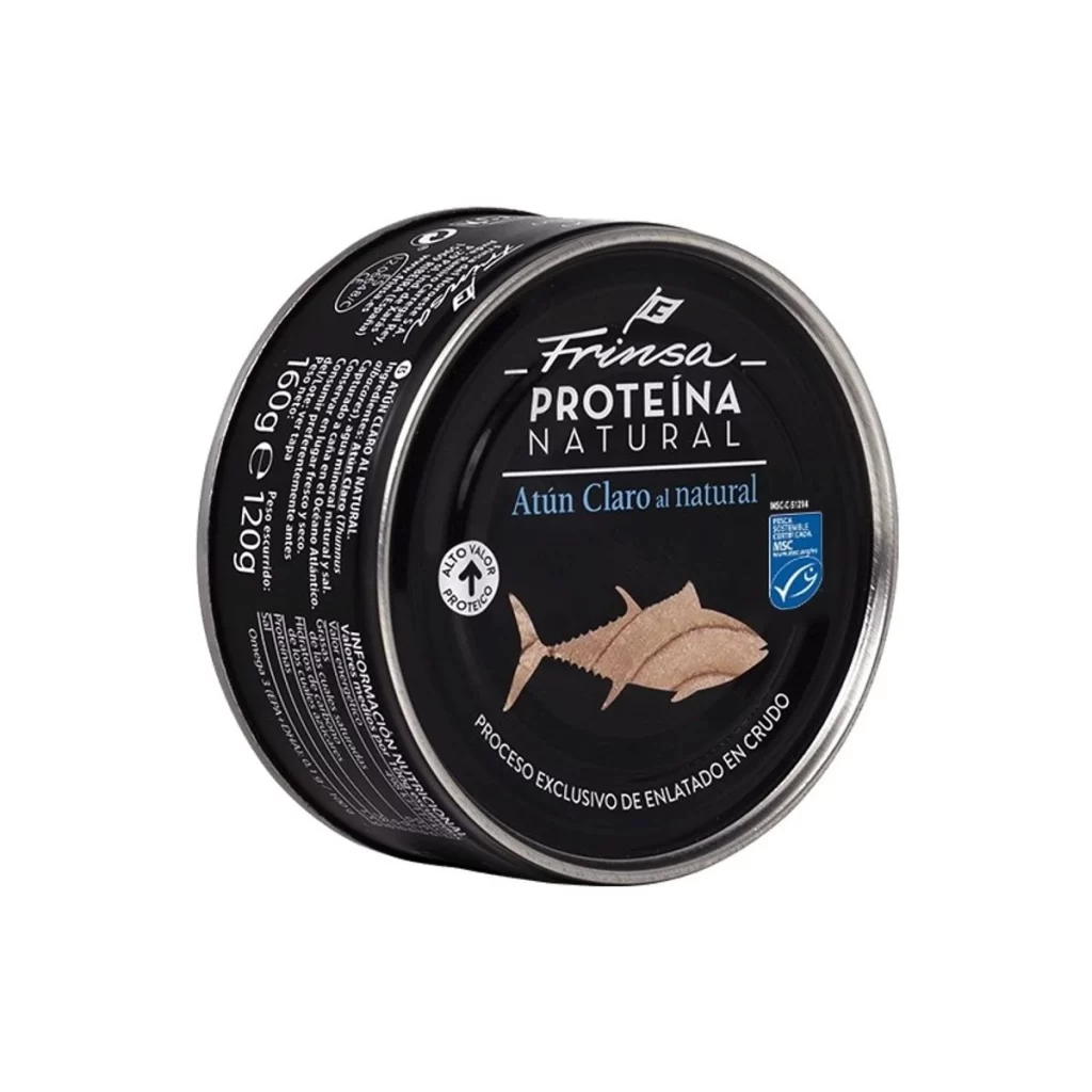
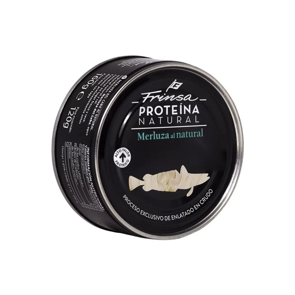
A cylindrical black tin can displays the Frinsa Proteína Natural branding across its lid, featuring white and teal typography above a pale fish silhouette. The container's metallic silver rim catches light along its curved edge, while nutritional information and weight markings wrap around the dark body in smaller white text. Positioned at a slight three-quarter angle, the can reveals both its top surface and side panel against a clean, neutral background.
Visual hierarchy is established through the strategic use of font weights and color accents, drawing immediate attention to the protein-focused marketing message. The inclusion of a circular badge stating ‘ALTO VALOR PROTEICO’ reinforces the health-conscious positioning without cluttering the clean layout. Subtle details like the curved text along the bottom edge describing the exclusive raw canning process add technical credibility while maintaining an upscale, modern aesthetic.
Packaging designers studying premium seafood branding will find the typographic pairing and negative space management particularly instructive for luxury market positioning. Marketing teams developing high-protein food lines could analyze how nutritional claims are integrated into the overall visual identity rather than treated as afterthoughts. Illustrators looking to simplify organic forms into recognizable icons should note how the fish silhouette balances anatomical accuracy with graphic simplicity.