Hero Cosmetics Bright Eyes 15ml Skincare Image 02 Packaging
Topics
Details
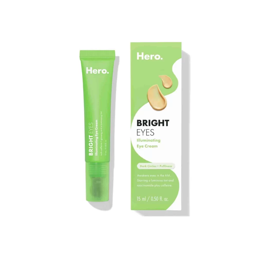
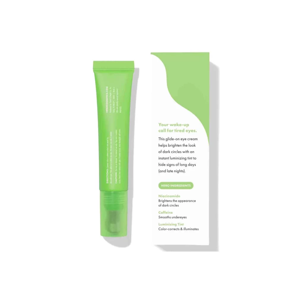
A translucent lime-green squeeze tube stands beside its matching carton, both casting soft drop shadows onto a white surface. Vertical typography detailing directions and cautionary notes runs down the tube's length, while the box features a bold, organic green wave sweeping across its upper right quadrant. Prominent text on the packaging introduces the product as a wake-up call for tired eyes, highlighting hero ingredients like Niacinamide, Caffeine, and Luminizing Tint.
Visual interest stems from the deliberate interplay between the product’s clinical transparency and the box’s graphic confidence, creating a cohesive yet texturally varied pairing. The curvilinear green element on the carton breaks the rectangular rigidity with an almost liquid motion, echoing the glide-on nature of the cream itself. Such thoughtful color blocking ensures immediate shelf recognition while the minimalist type hierarchy keeps the focus squarely on the functional benefits promised by the brand.
Brand strategists might analyze this layout to understand how color psychology reinforces efficacy claims in the skincare sector, particularly regarding fatigue-fighting products. Packaging designers could study the balance of negative space against informational density to optimize their own retail presentations. Art directors planning e-commerce photography sessions would benefit from noting how the frontal perspective and even lighting eliminate distractions while maintaining material authenticity.