Hero Cosmetics Glow Balm 112g Glow Balm Image 01 Packaging
Topics
Details
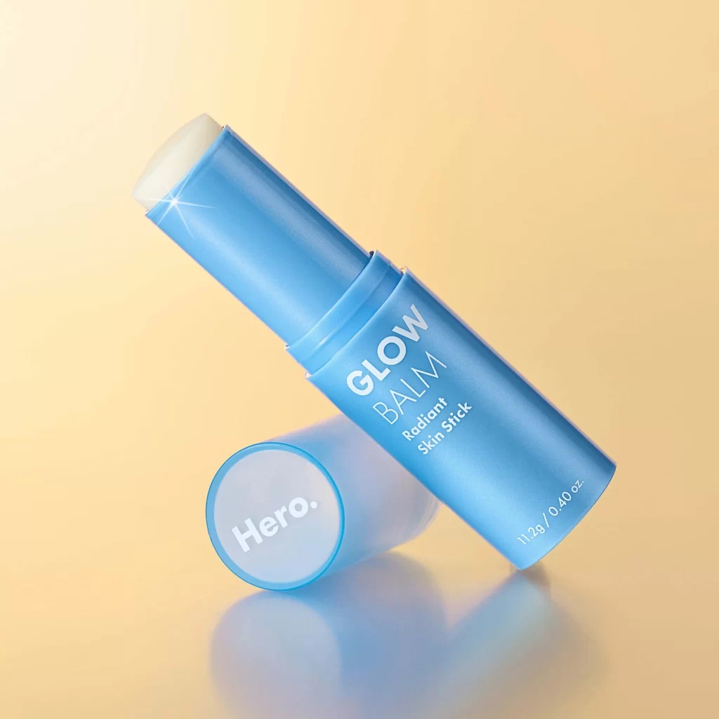
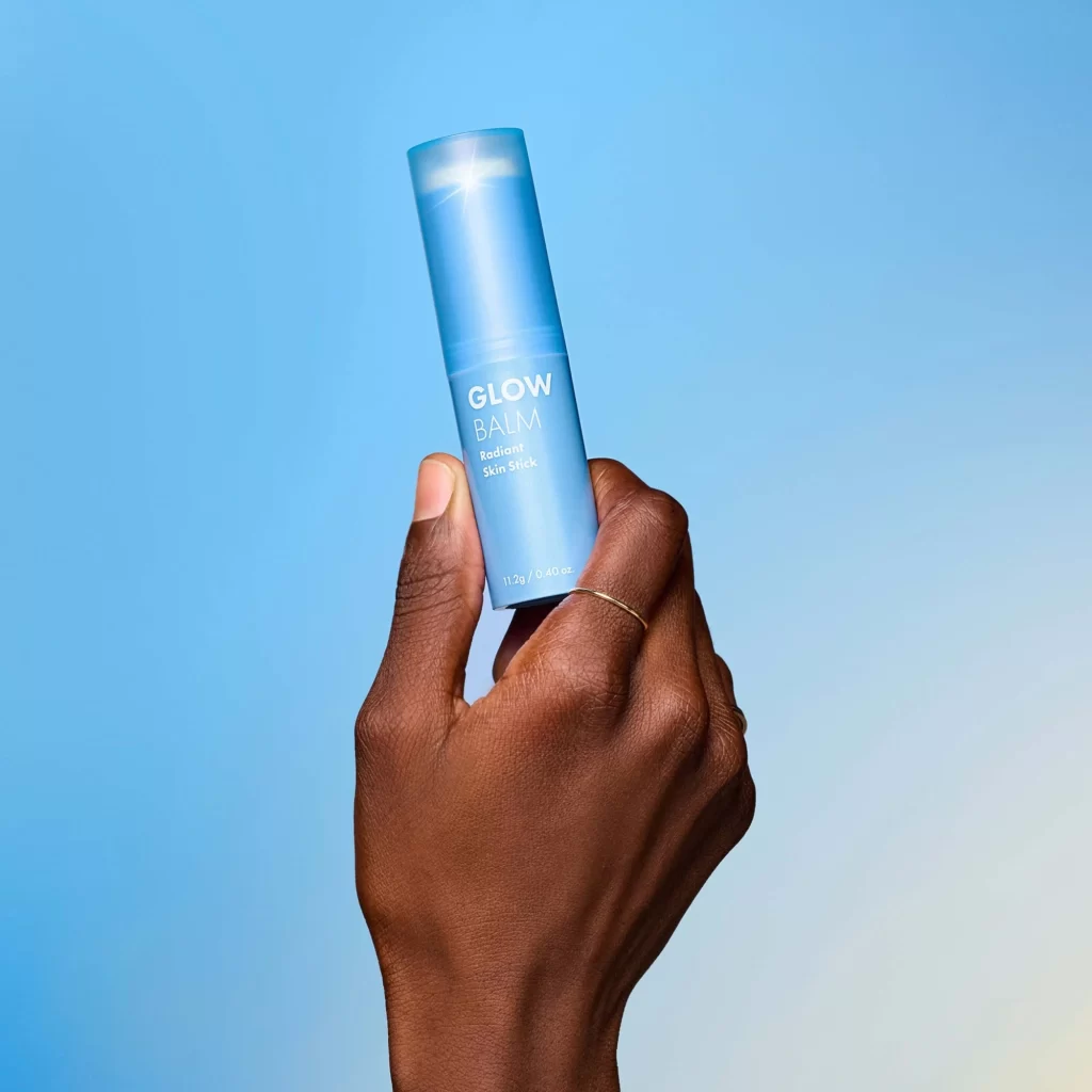
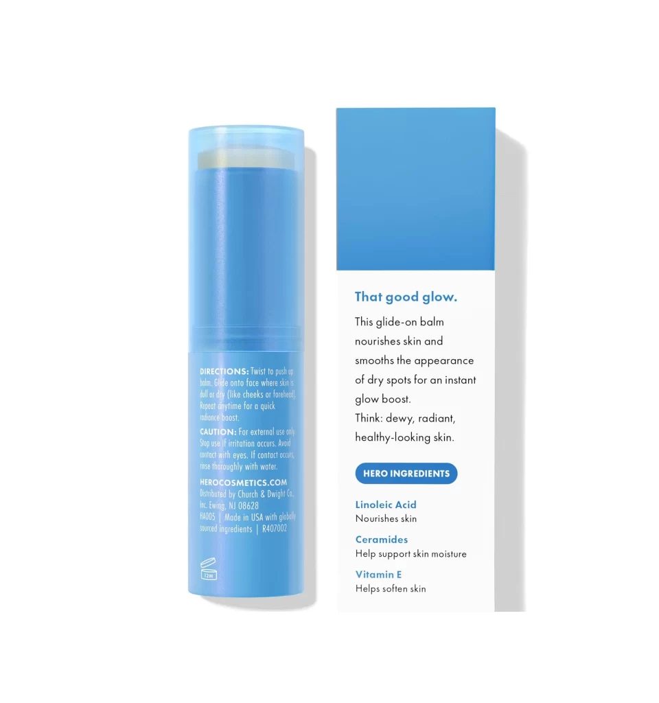
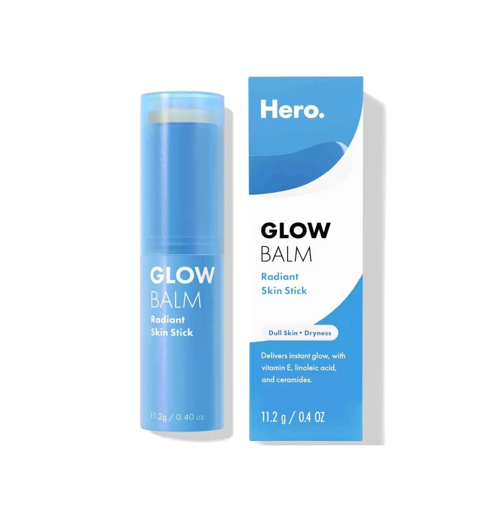
The Hero Cosmetics Glow Balm appears in both its cylindrical container and accompanying box, rendered in a translucent blue tube that reveals the pale balm stick within. Matching azure packaging features crisp white typography displaying the brand name, product title, and key ingredient details, while soft diffused lighting casts gentle shadows to the right of each object from a straight-on camera perspective.
Visual distinction emerges from the confident interplay between saturated cyan tones and generous negative space. Bold sans-serif lettering for ‘GLOW BALM’ commands attention without competing with the brand’s more understated logotype above. The sweeping curved graphic element on the carton introduces dynamic movement that contrasts beautifully with the rigid cylindrical form of the applicator itself.
Packaging designers studying contemporary skincare branding will find valuable insight in this composition’s color blocking strategies. Marketing teams developing e-commerce assets could analyze how the dual-product presentation communicates texture and finish simultaneously. Beauty industry copywriters might examine how descriptive phrases like ‘Radiant Skin Stick’ integrate with ingredient callouts to create a cohesive value proposition.