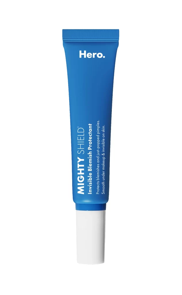
Hero Cosmetics Mighty Shield 10ml Skincare Packaging
Topics
Details
A vibrant cobalt-blue tube stands vertically, its cylindrical body tapering gently toward a ribbed screw-cap while the lower portion transitions into a clean, opaque white base that creates a sharp two-tone contrast. Bold white typography dominates the upper third with the brand name 'Hero.' in a modern sans-serif, while the product name 'MIGHTY SHIELD' and its description as an 'Invisible Blemish Protectant' run vertically along the lower half in crisp white lettering against the blue surface.
Visual hierarchy emerges through strategic typographic scaling and orientation, where vertical lettering breaks the horizontal monotony of standard cosmetic packaging. The saturated blue hue functions as both brand identifier and psychological signal of clinical efficacy, while the matte finish suggests premium formulation quality. Minimalist composition eliminates visual noise, allowing the product’s architectural form—particularly the interplay between the flexible tube material and rigid cap—to communicate functionality through pure geometry.
Packaging designers analyzing pharmaceutical-grade aesthetic trends would examine this specimen for its balance of medical authority and consumer accessibility. Brand strategists developing color-coded skincare lines could reference this specific cyan-to-white ratio for category differentiation within retail environments. Industrial design students studying squeeze-tube ergonomics might deconstruct the cap’s textural grip patterns and the tube’s structural integrity under pressure.