Hero Cosmetics Bright Eyes 15ml Skincare Image 03 Packaging
Topics
Details
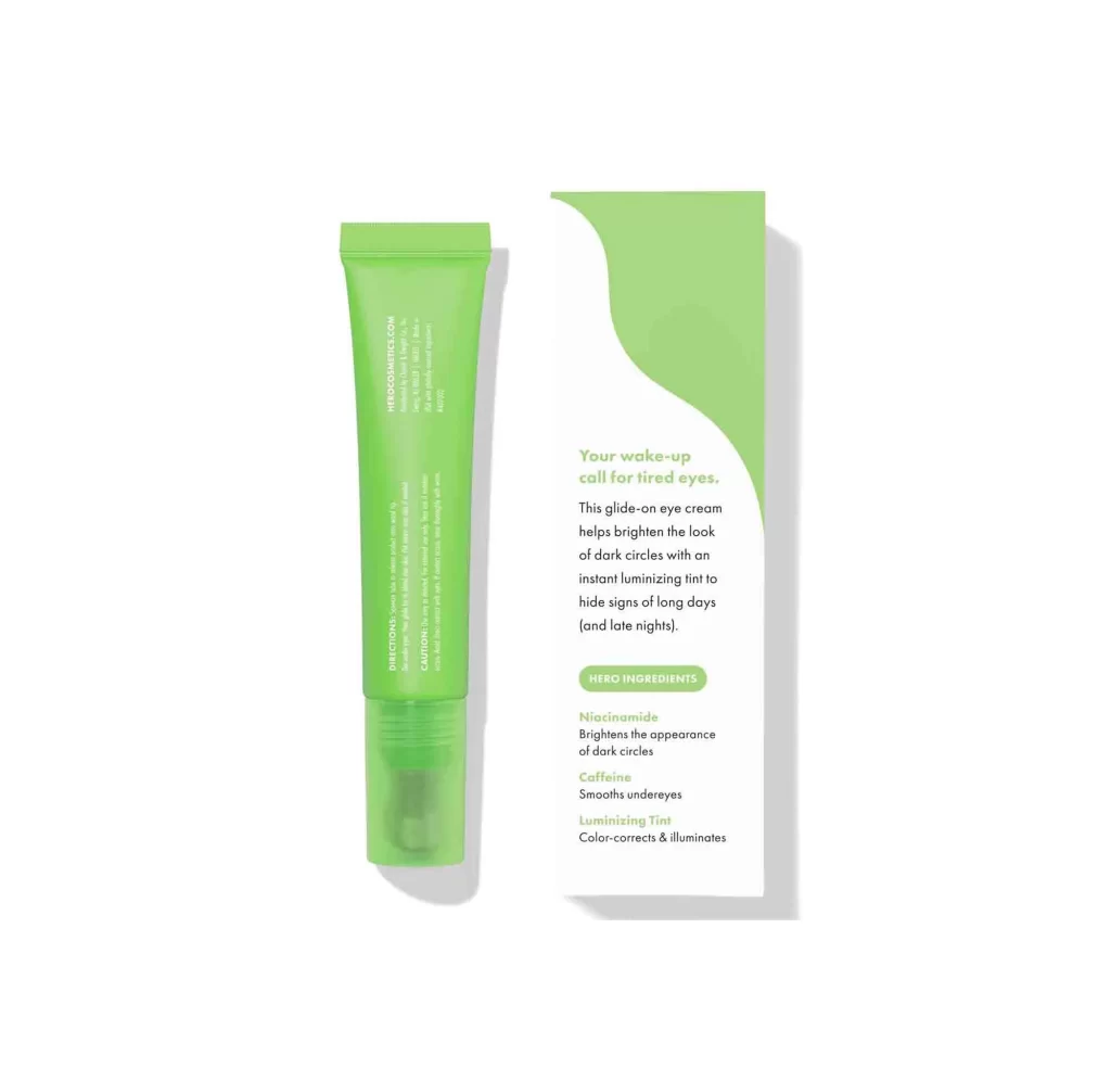
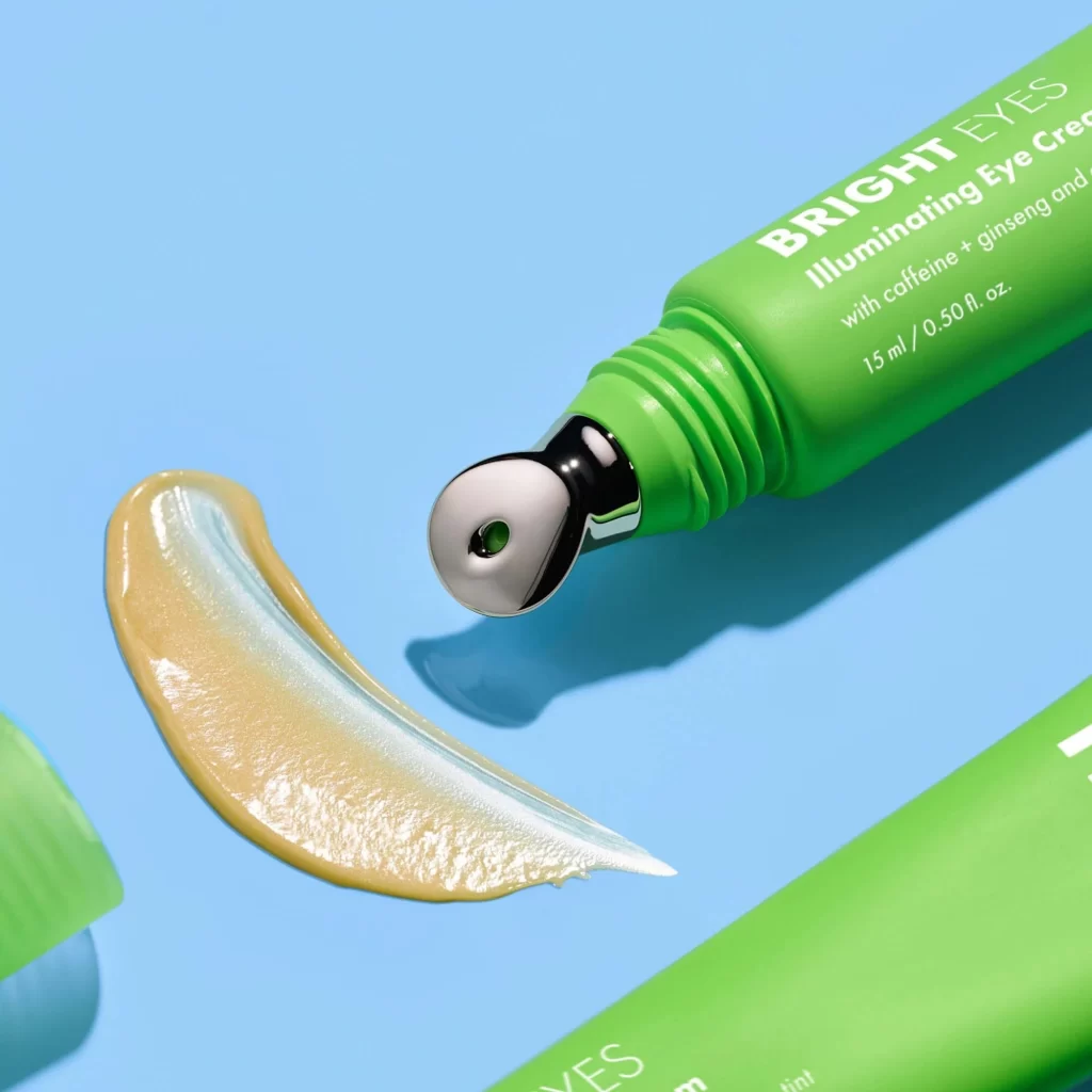
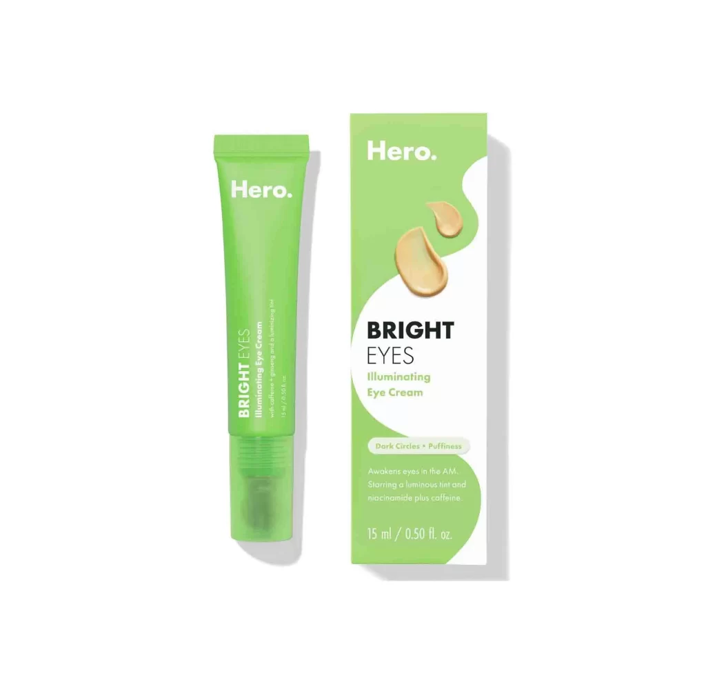
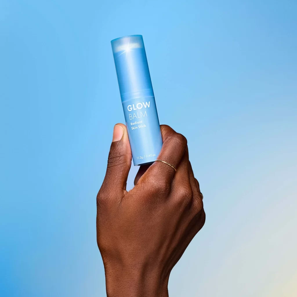
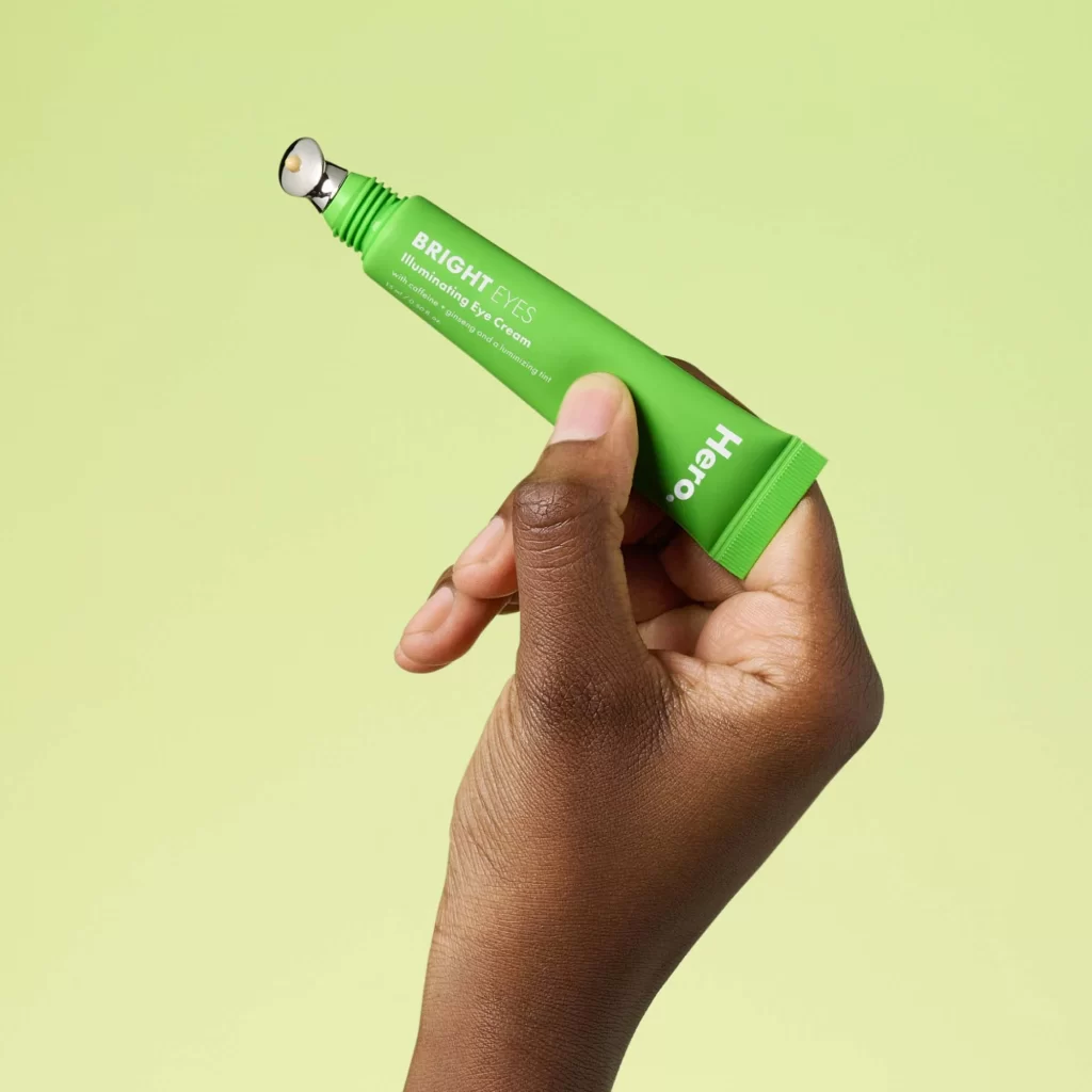
A hand with deep brown skin grips a vibrant green tube of Hero Cosmetics Bright Eyes Illuminating Eye Cream, its cylindrical body displaying white sans-serif typography for the brand and product name. A metallic applicator tip with a small bead of cream protrudes from the ribbed nozzle, while soft, even lighting illuminates the scene from the front-left against a pale lime-green backdrop.
Visual distinction emerges from the striking contrast between the saturated emerald packaging and the neutral background, creating immediate shelf appeal. The inclusion of a built-in metal massage tip serves as both a functional tool and a premium design element that elevates the product beyond standard squeeze tubes. Hand-model diversity in product photography ensures broader consumer relatability while showcasing how the item fits ergonomically in use.
E-commerce teams might leverage this composition to demonstrate proper grip and application technique for digital storefronts. Packaging designers could study the color hierarchy and typographic placement when developing similar skincare ranges. Marketing professionals may reference the lighting setup and background choice for creating cohesive brand asset libraries across multiple product SKUs.