Hero Cosmetics Bright Eyes 15ml Skincare Image 06 Packaging
Topics
Details
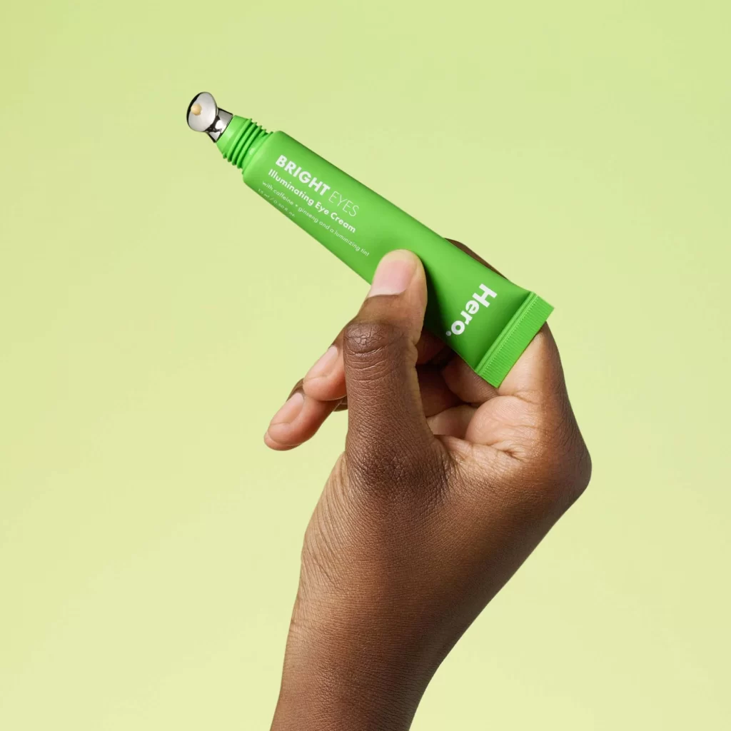
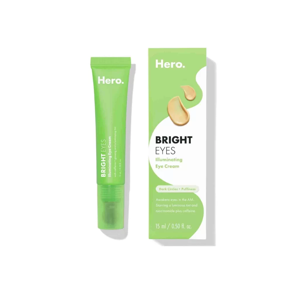
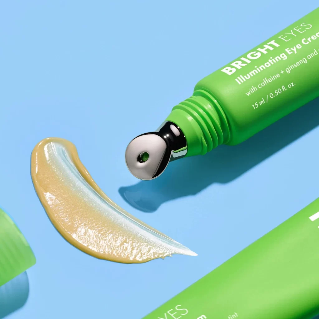
A bright green tube of Hero Cosmetics Bright Eyes Illuminating Eye Cream angles diagonally across a cyan background, its metallic silver rollerball applicator pointing toward a creamy beige swatch with pearlescent sheen. Crisp white typography on the packaging identifies the product name, key ingredients including caffeine and ginseng, and the 15ml volume measurement. The rollerball's central opening reveals green cream within, matching the tube's vivid hue.
What sets this particular shot apart is the clever integration of the product’s texture sample directly alongside its innovative delivery mechanism. The metallic rollerball tip creates an immediate visual association with cooling application and precision targeting, while the luminous quality of the cream swatch suggests light-reflecting properties without needing additional explanation. This composition successfully bridges the gap between container aesthetics and actual product performance through careful spatial arrangement.
Beauty brand art directors might study this reference when planning e-commerce photography for rollerball or massage-applicator skincare lines, particularly those emphasizing illuminating or depuffing benefits. Packaging designers could analyze how the green hue contrasts against cool blue backgrounds to make wellness-oriented products pop on digital shelves. Content creators working on unboxing sequences or texture-focused social media posts would find useful guidance here for balancing hardware details with cosmetic payoff demonstrations.