Hero Cosmetics Bright Eyes 15ml Skincare Image 01 Packaging
Topics
Details
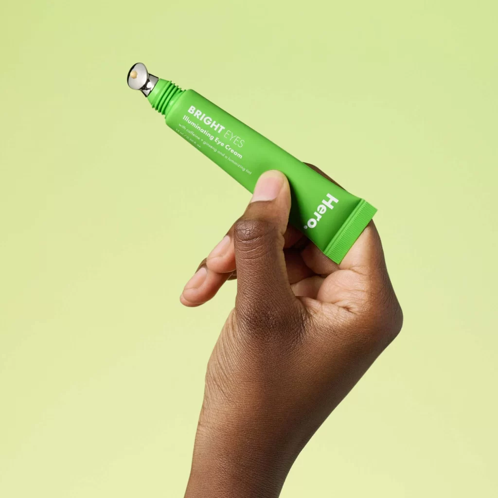
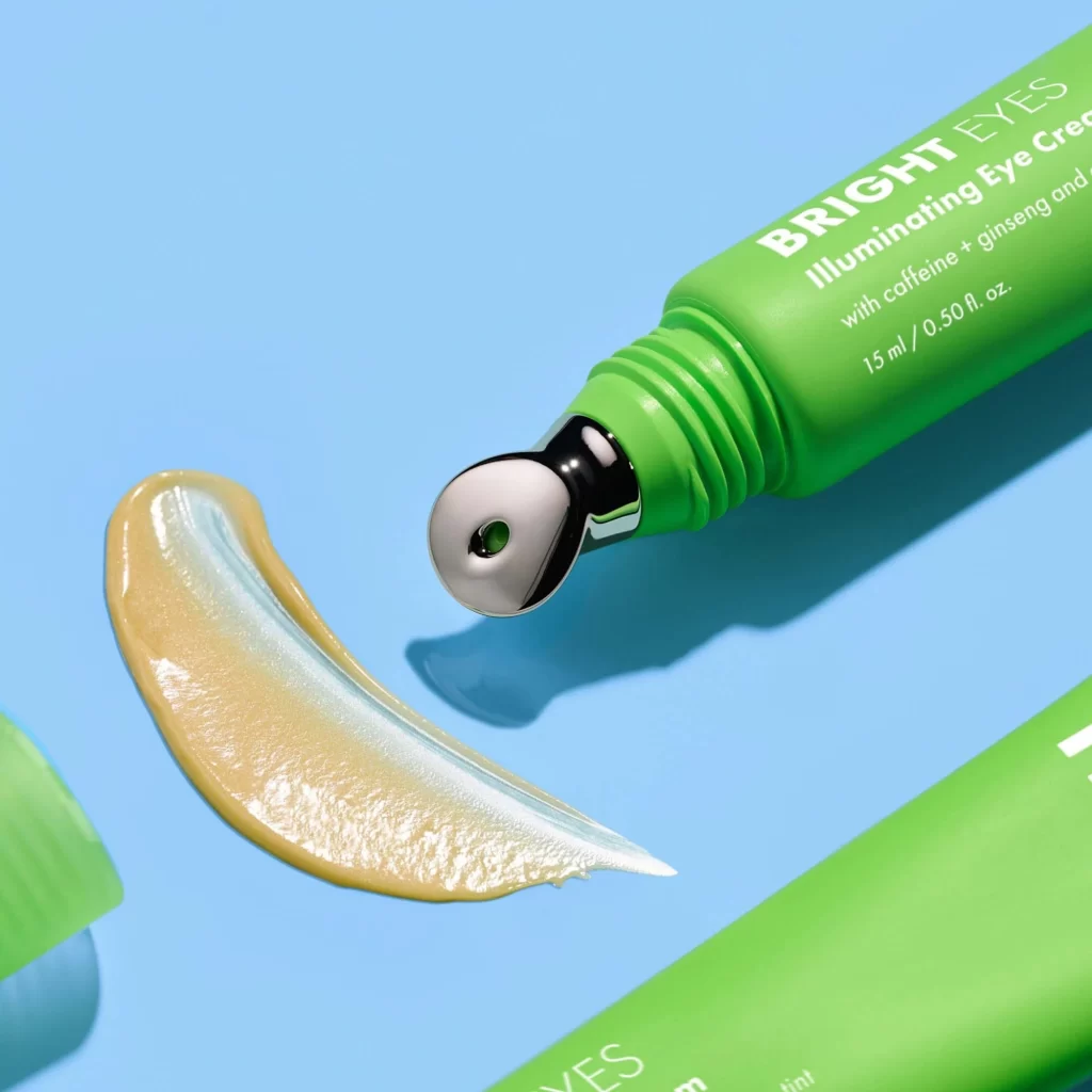
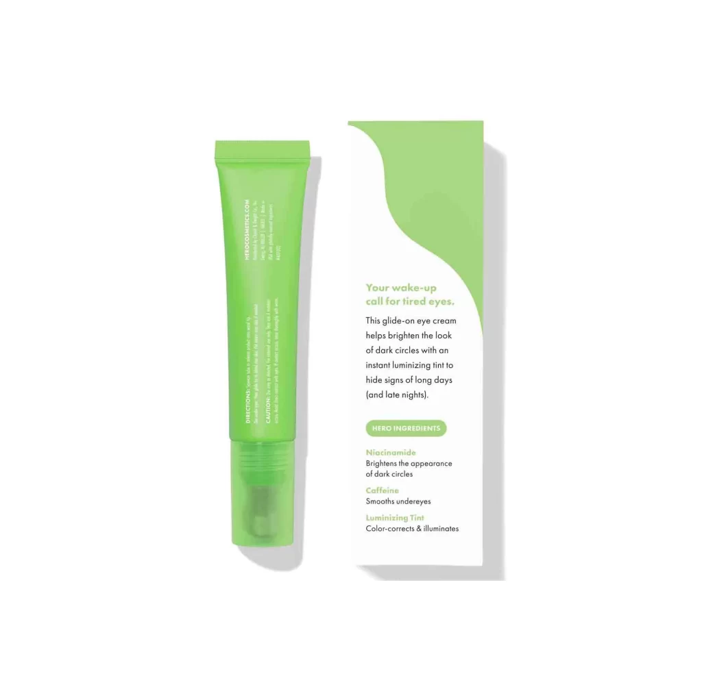
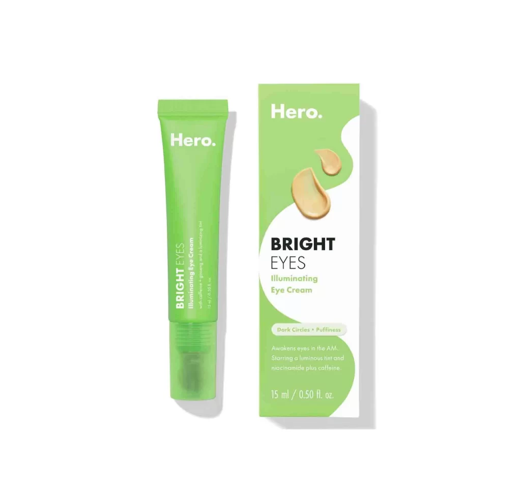
A vibrant lime-green squeezable tube stands beside its matching rectangular box, both displaying the Hero Cosmetics branding on a white surface. The tube features the brand name in bold white sans-serif at the top, with 'BRIGHT EYES' running vertically in smaller text below. Its packaging counterpart mirrors this green-and-white palette, incorporating two golden cream swatches and the product name 'BRIGHT EYES Illuminating Eye Cream' alongside claims for dark circles and puffiness.
Visual distinction emerges from the energetic green hue dominating both components, which immediately signals vitality and freshness within the skincare category. The asymmetrical white wave slicing through the box creates dynamic movement while elegantly framing the product claims about dark circles and puffiness. Those tactile cream droplets add a luxurious, sensory dimension that bridges the gap between clinical efficacy and indulgent self-care.
Brand managers developing clean-beauty product lines could analyze this color strategy for communicating ingredient transparency and energizing benefits. Packaging designers studying contemporary cosmetic trends will find valuable precedent in how the curved graphic elements guide the eye toward key marketing copy without cluttering the layout. Art directors planning e-commerce photography might reference this straightforward composition for showcasing dual-package presentations effectively.