Hero Cosmetics Mighty Patch Face 3ml Pimple Patch Packaging
Topics
Details
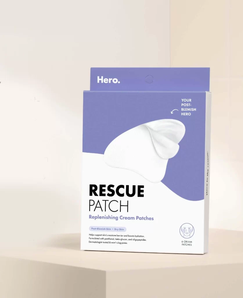
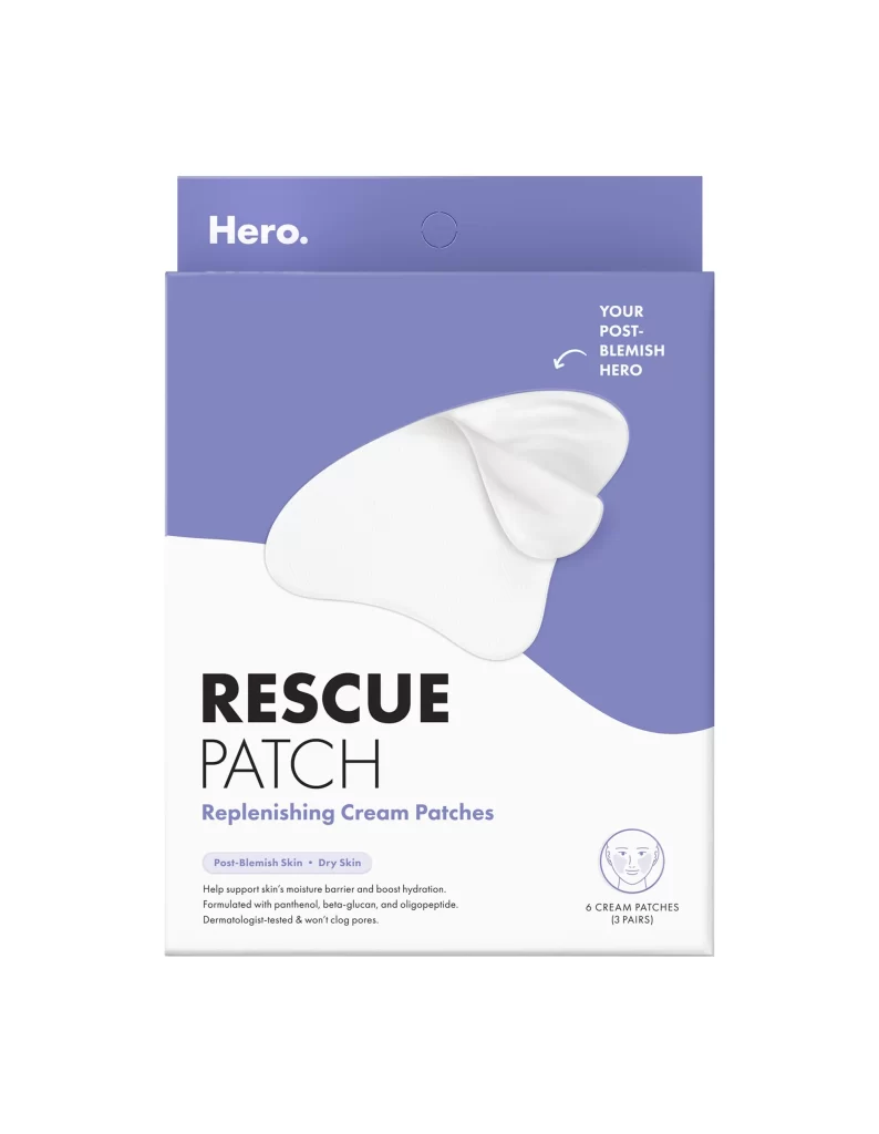
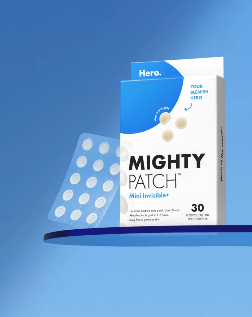
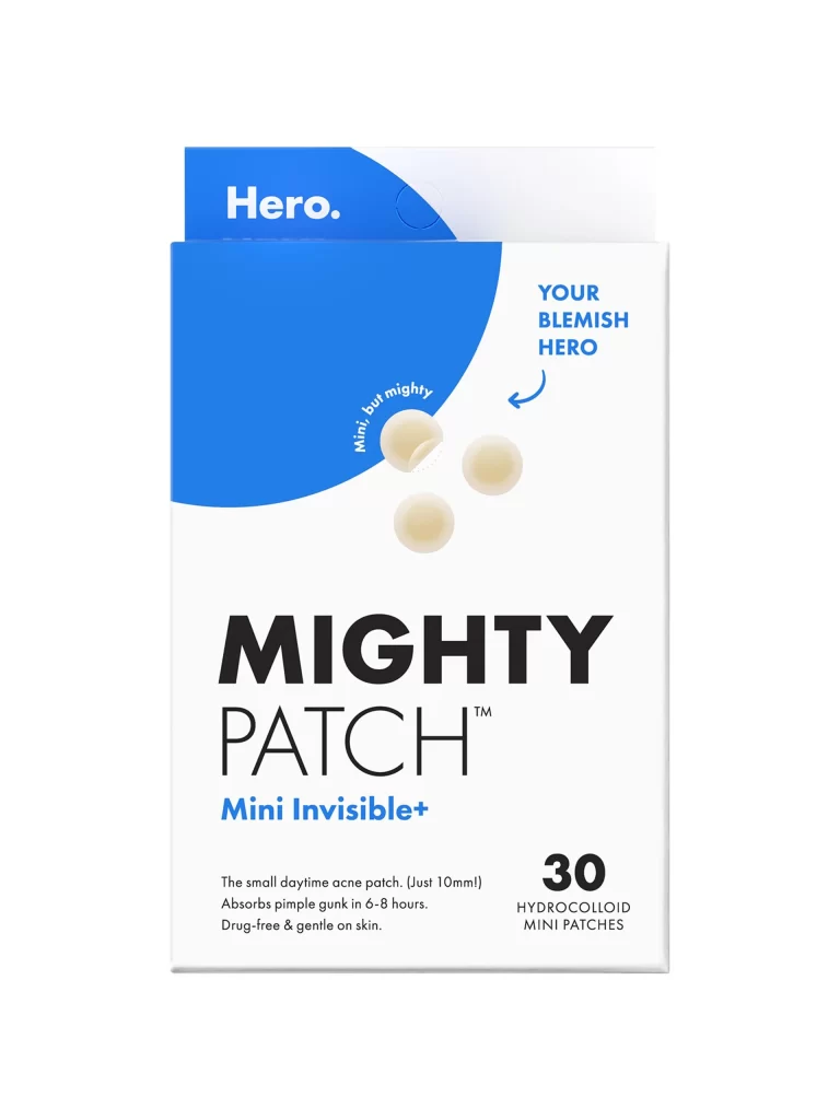
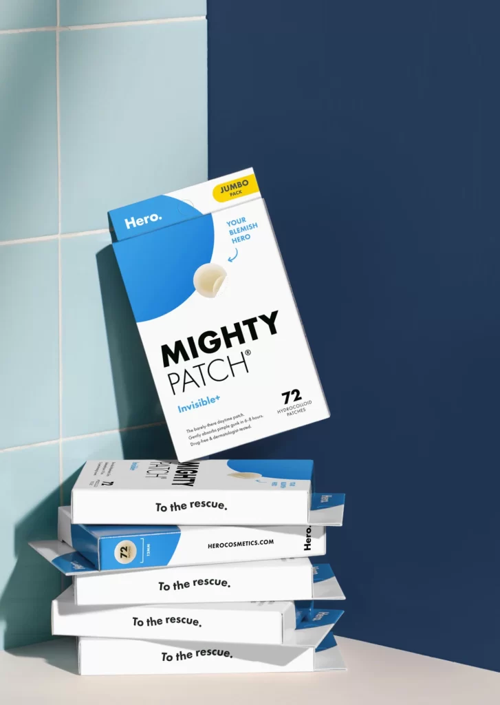
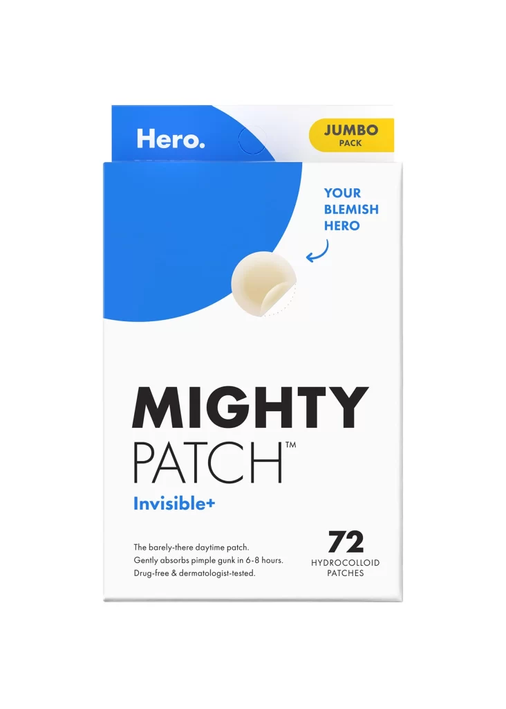
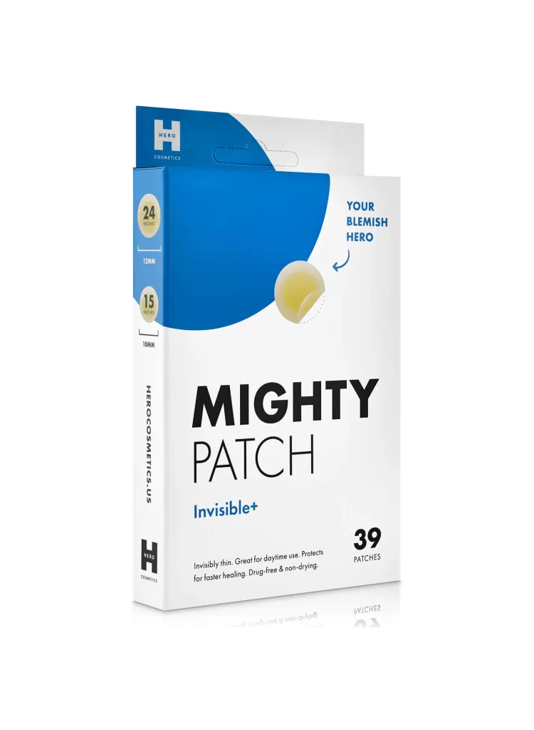
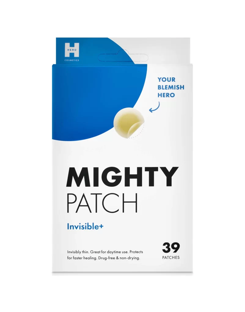
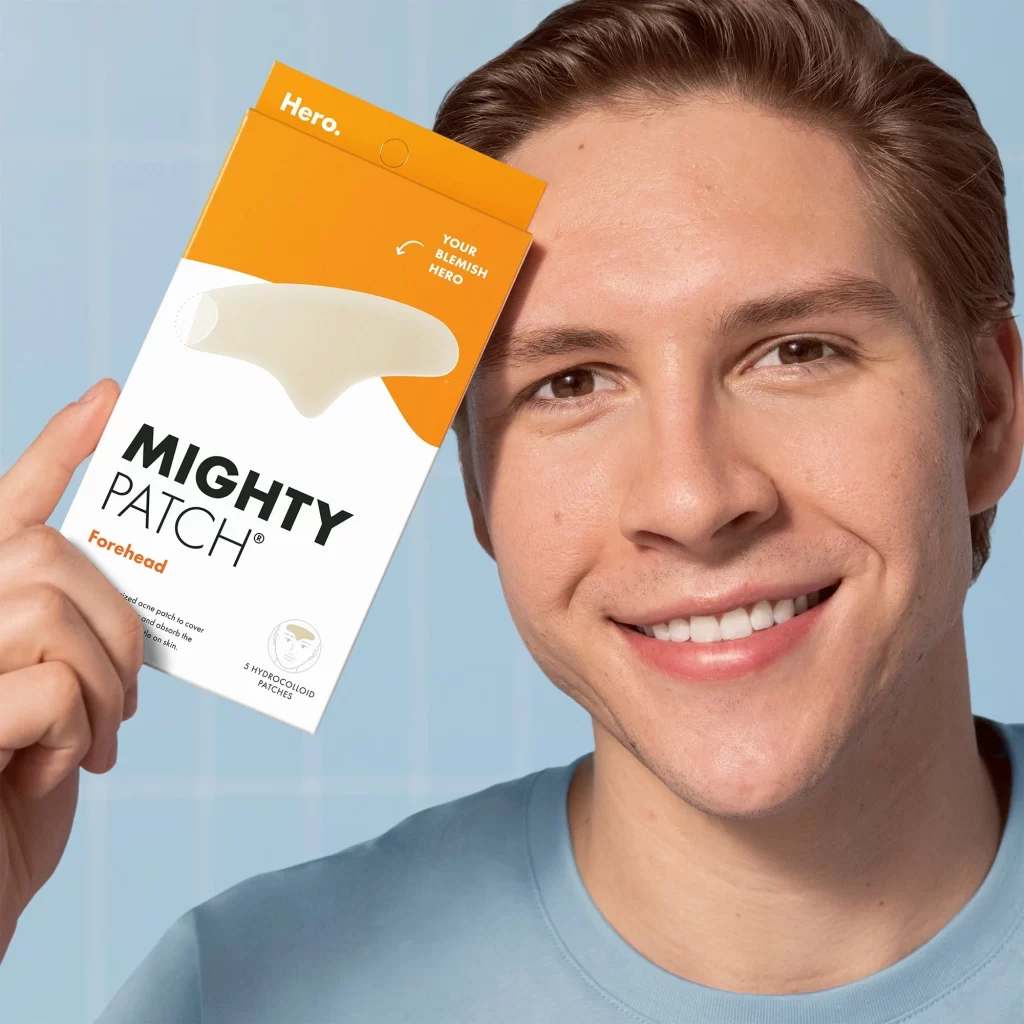
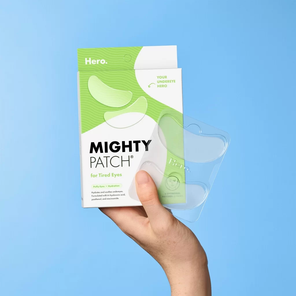
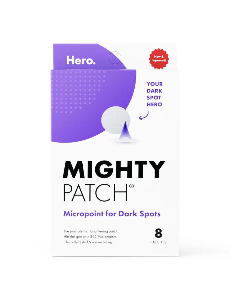
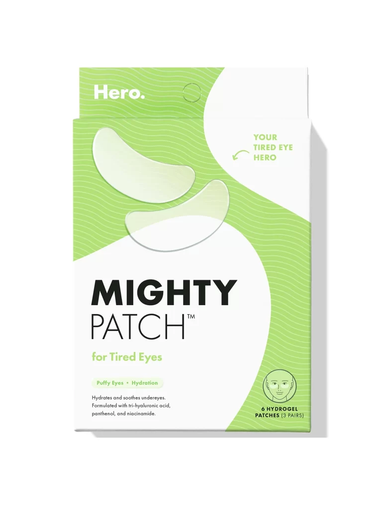
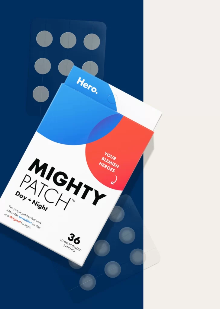
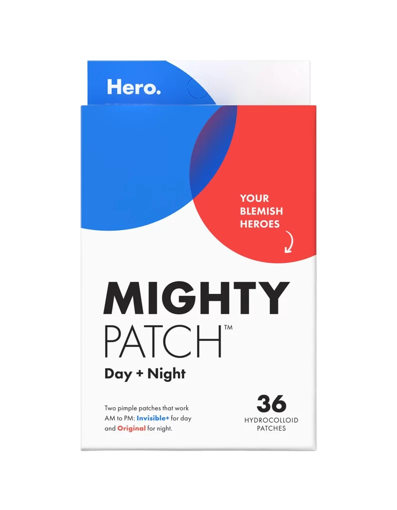
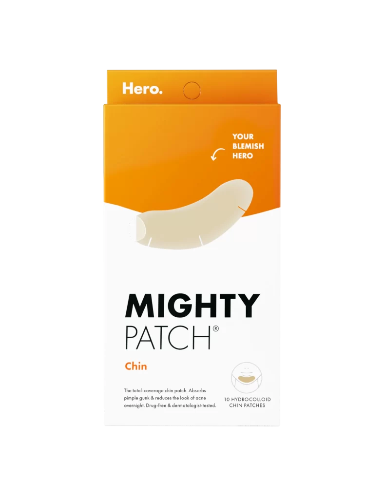
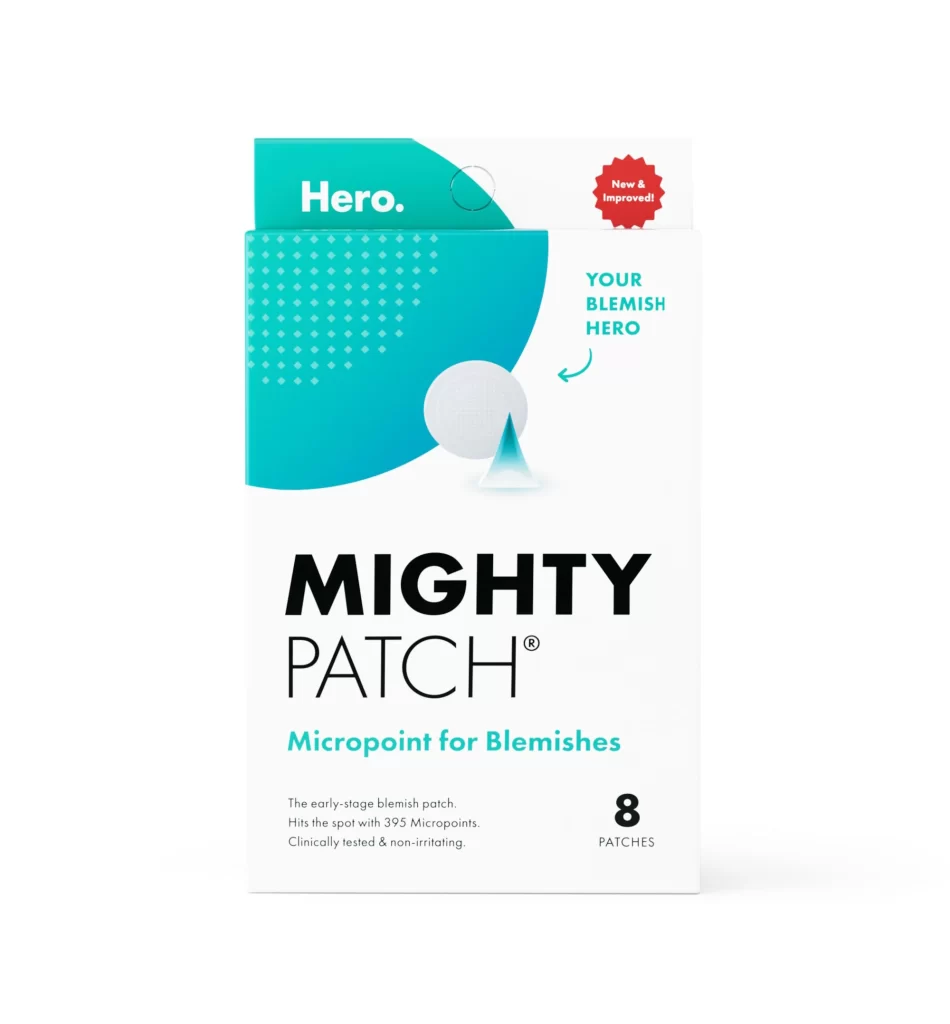
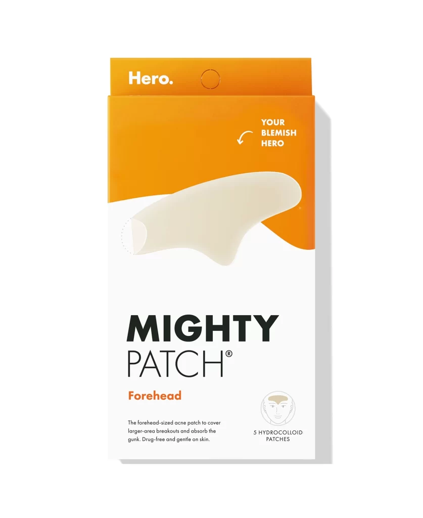
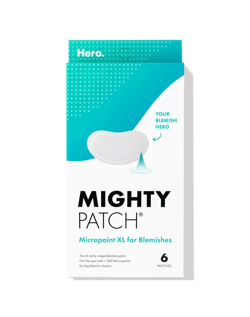
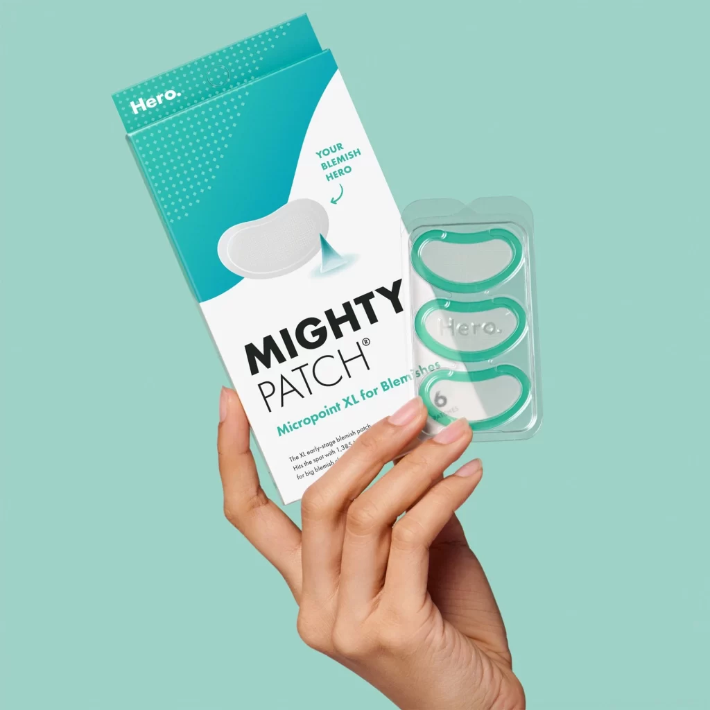
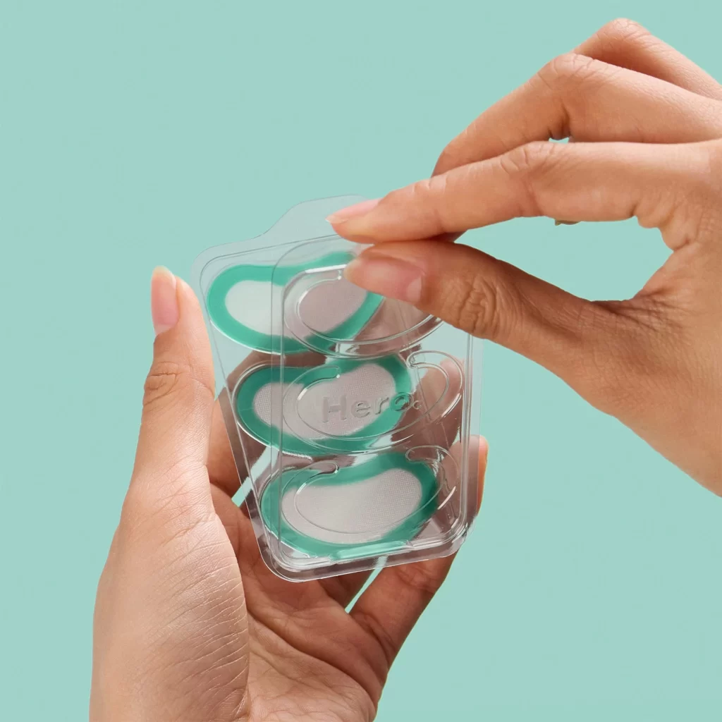
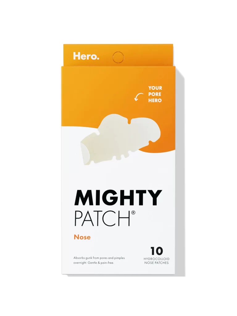
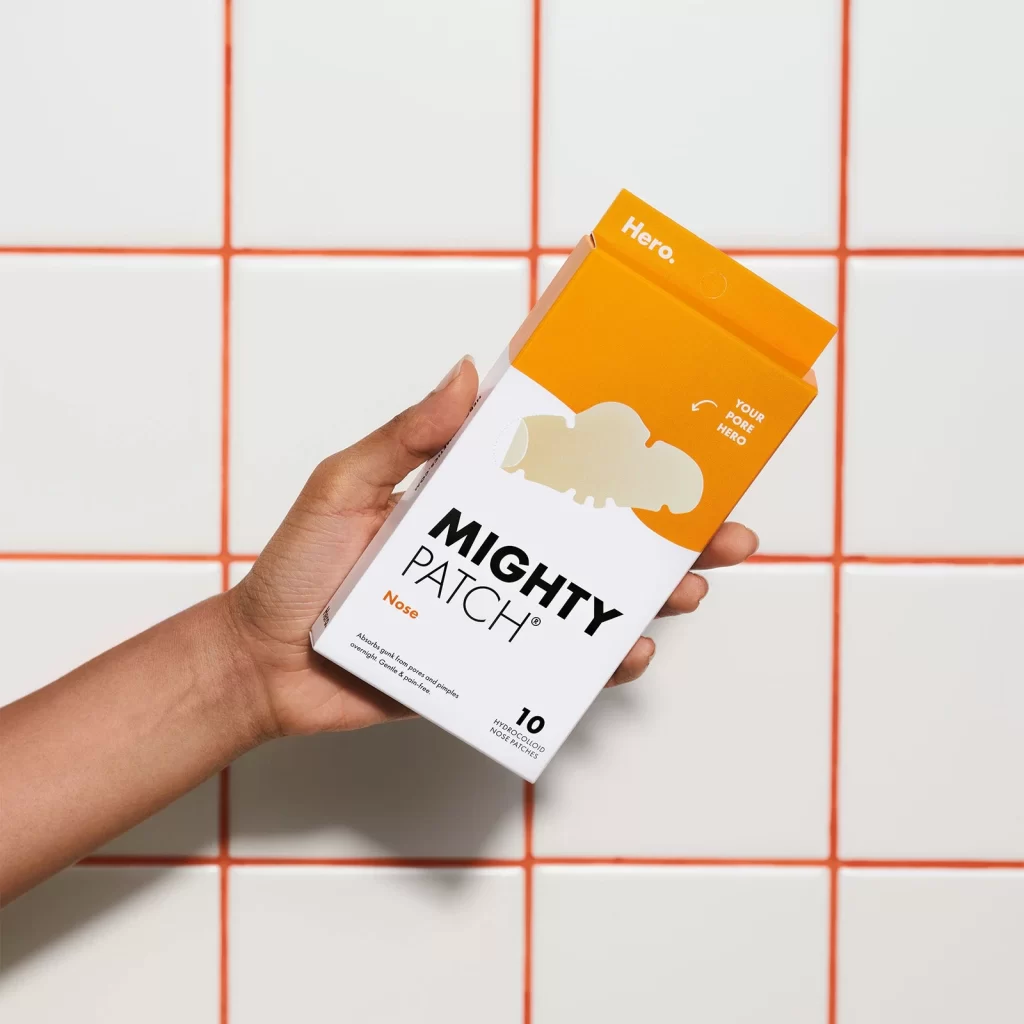
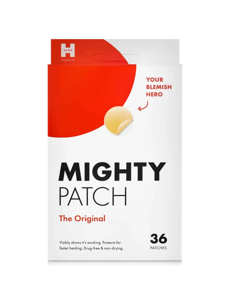
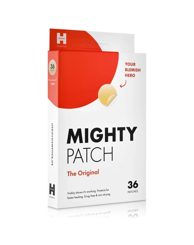
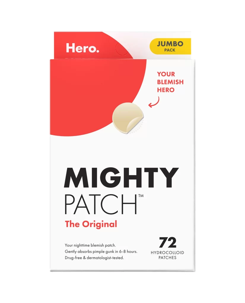
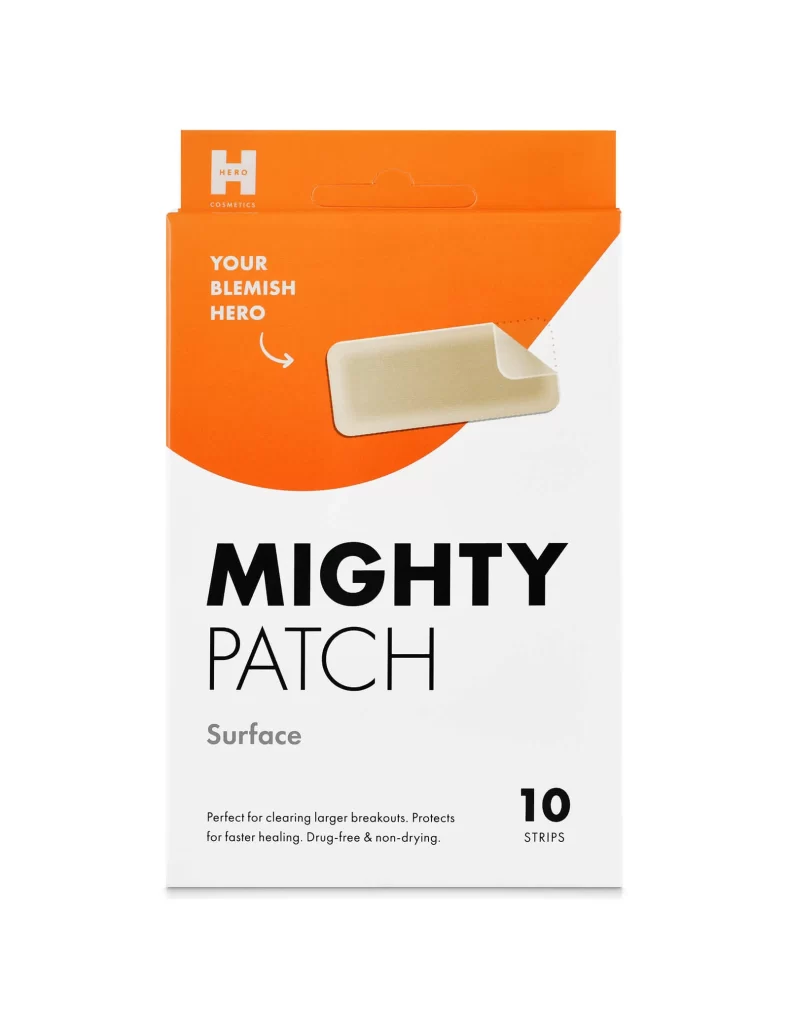
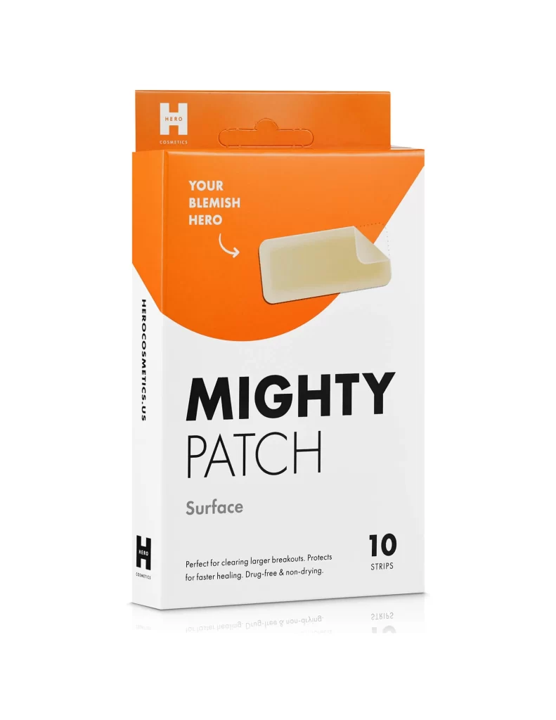
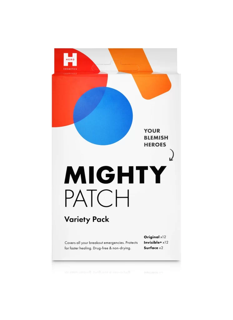
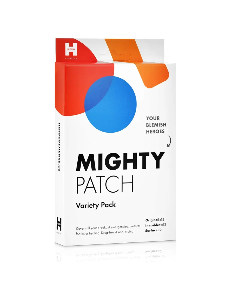
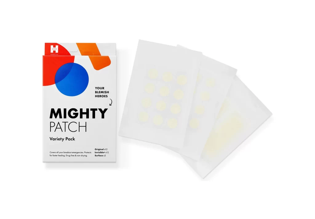
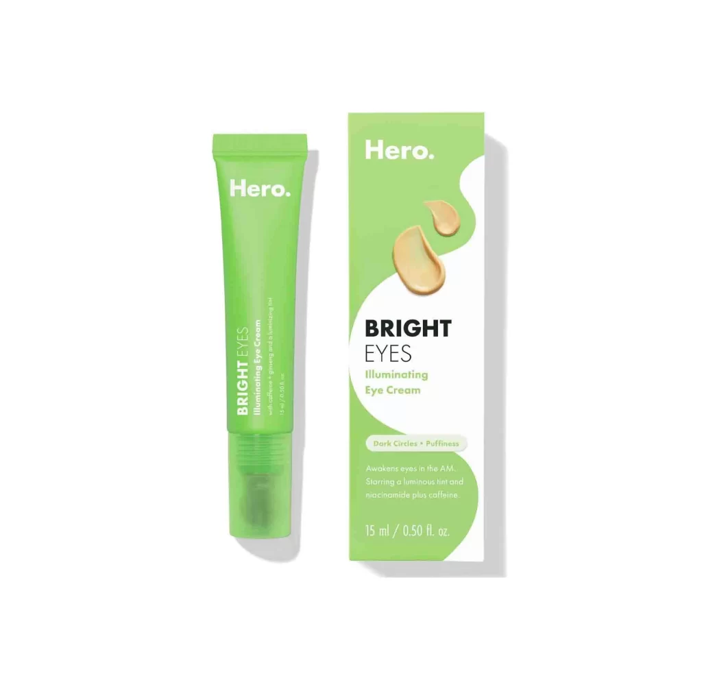
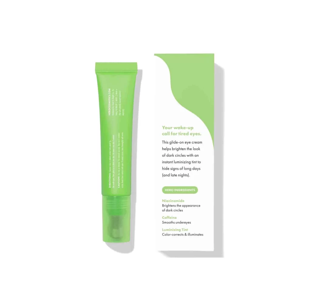
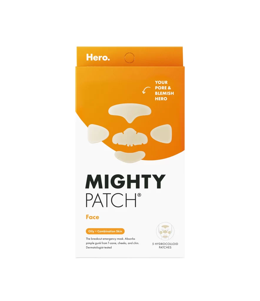
A vibrant orange upper section curves diagonally into a clean white lower half, creating a bold two-tone color scheme for the packaging. The brand name 'Hero.' appears in white sans-serif font at the top, while five translucent, hydrocolloid patch shapes occupy the center, arranged to mimic facial contours like the nose and cheeks.
Visual interest is driven by the high-contrast palette and the clever use of the product itself as a central graphic element, effectively demonstrating the various shapes included in the set. The diagonal split between the energetic orange and the minimalist white creates a dynamic yet organized layout that guides the eye from the branding down to the specific product claims. Furthermore, the inclusion of a small icon illustrating face placement adds functional clarity without cluttering the modern aesthetic.
Packaging designers studying skincare retail trends would utilize this reference to analyze how color blocking influences consumer perception of efficacy and energy. Brand identity specialists might examine the typographic hierarchy to understand how to balance bold product names with delicate instructional details. Additionally, marketing teams could reference the spatial arrangement of the patches to brainstorm ways to showcase multiple product variants within a single, cohesive frame.