Glytone Acne Clearing Cleanser 67 Fl Oz Cleanser Packaging
Topics
Details
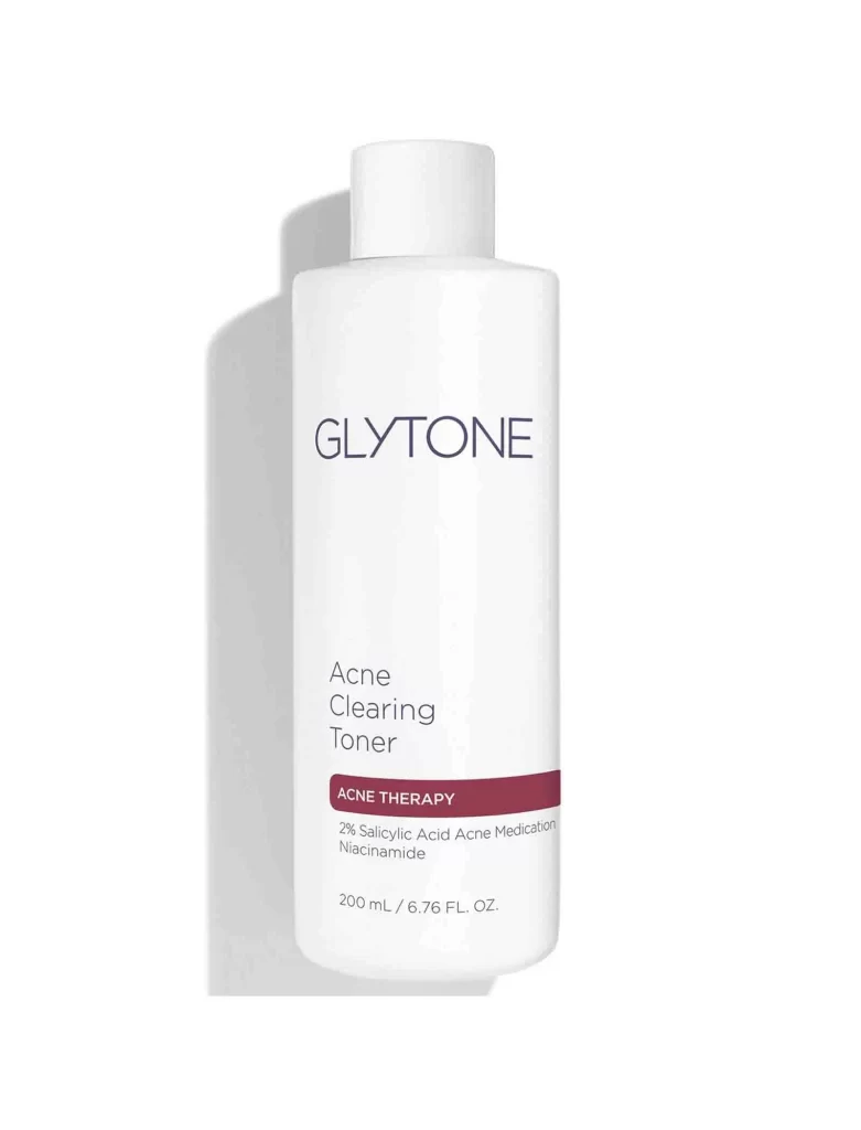
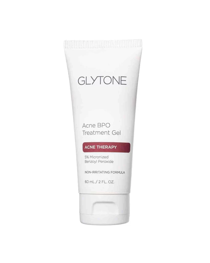
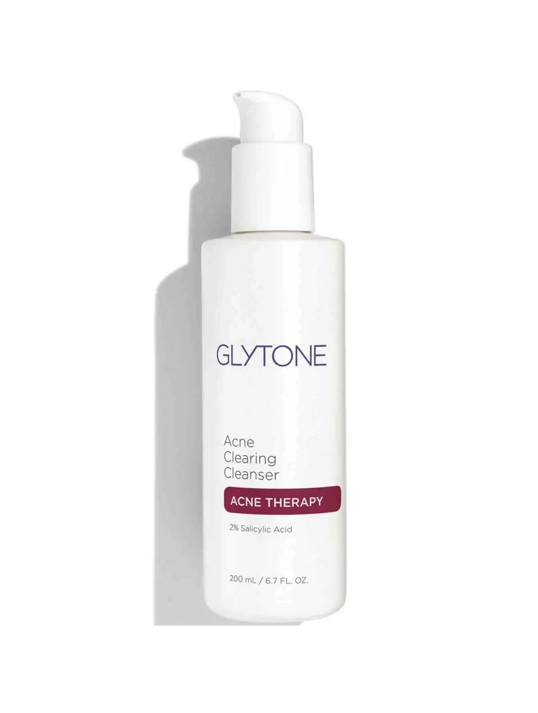
A cylindrical white bottle with a pump dispenser and curved nozzle stands upright, casting a subtle gray shadow to its left on a white surface. The front label displays the brand name GLYTONE in dark blue uppercase letters, with Acne Clearing Cleanser printed below in lighter weight font. A maroon rectangular badge containing the text ACNE THERAPY appears beneath the product name, followed by 2% Salicylic Acid and the volume measurement 200 mL / 6.7 FL. OZ. at the bottom.
Minimalist medical aesthetics define this packaging design through its restrained color palette of white, navy, and deep burgundy. The typographic hierarchy creates clear visual separation between product identity and therapeutic classification without decorative elements. Such clinical simplicity signals pharmaceutical-grade skincare while maintaining shelf presence through bold contrast between the dark text and pristine bottle surface.
Brand managers analyzing competitive positioning in dermatological skincare would examine this composition for packaging strategy insights. Packaging designers studying pump dispenser integration with cylindrical containers could reference the spatial relationships shown here. Marketing teams developing acne treatment product lines might evaluate how therapeutic labeling communicates efficacy through visual hierarchy alone.