Glytone Exfoliating Serum 55 2 Fl Oz Face Serum Packaging
Topics
Details
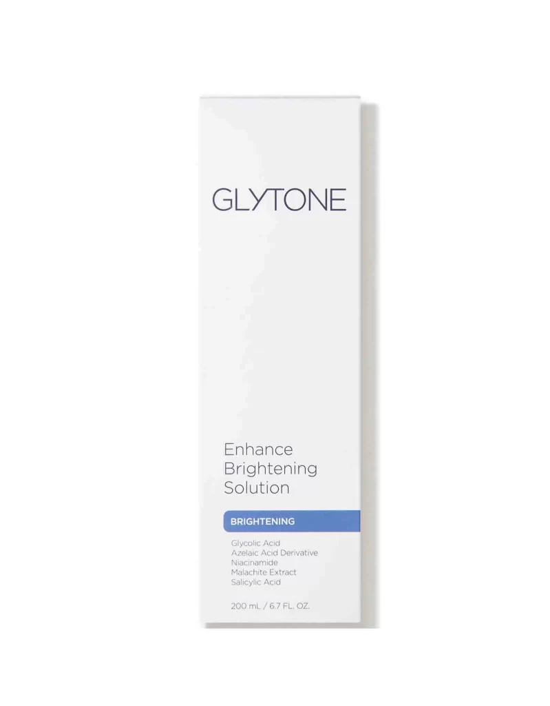
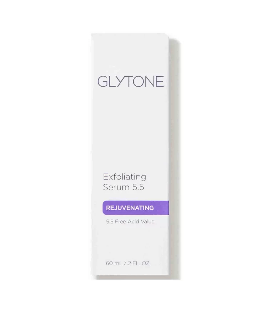
A tall, rectangular carton with a clean matte white surface stands in direct frontal view, casting a soft, diffuse shadow to the right. Dark charcoal typography renders the brand name GLYTONE in thin sans-serif capitals at the top, followed by Exfoliating Serum 5.5 in a lighter weight. A vibrant violet horizontal bar contains the word REJUVENATING in white capitals, with 5.5 Free Acid Value and the 60 mL / 2 FL. OZ. volume printed below.
Minimalist typographic hierarchy defines this pharmaceutical aesthetic, relying on generous negative space rather than decorative imagery to convey clinical efficacy. The strategic placement of the saturated purple accent creates a focal point that draws immediate attention to the product’s functional category while maintaining an overall sense of sterile sophistication. Such restrained visual language signals professional-grade skincare through precision alignment and a limited palette of neutral tones punctuated by a single bold color.
Brand managers developing medical-grade cosmetic lines might examine this layout to understand how to balance regulatory information with premium positioning. Packaging engineers could reference the dimensional proportions and text placement when designing similar tall-format boxes for liquid treatments. Marketing teams analyzing competitive skincare aesthetics would find value in studying how color blocking guides consumer perception of product benefits without explicit graphical elements.