Glytone Hydrating Cream 17 Oz Skincare Packaging
Topics
Details
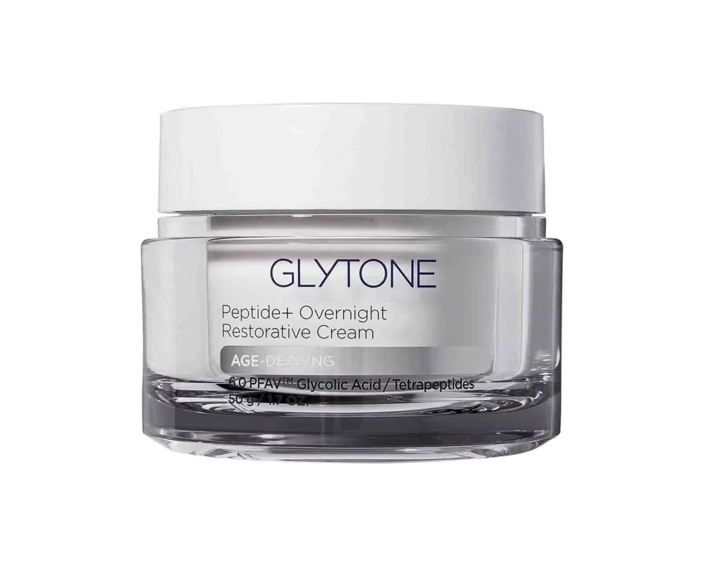
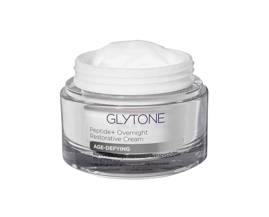
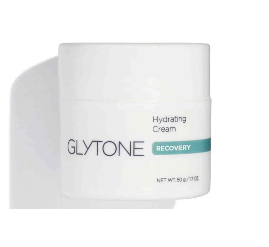
A cylindrical jar of Glytone Hydrating Cream dominates the frame with its matte white body and matching lid, casting a soft, diffused shadow to the left on a white surface. The brand name 'GLYTONE' appears in a thin, elegant sans-serif font across the center of the container, while 'Hydrating Cream' sits in smaller text above it and a teal 'RECOVERY' badge anchors the right side. Net weight information reading 'NET WT. 50 g / 1.7 OZ' occupies the lower right quadrant, completing the clinical yet approachable packaging design.
Visual interest stems from the disciplined use of negative space and the strategic placement of color accents within an otherwise achromatic palette. The teal stripe acts as a focal point, immediately drawing the eye to the product’s functional purpose without overwhelming the minimalist aesthetic. Such restraint in design suggests a medical-grade reliability, where the lack of ornamentation communicates efficacy and professional formulation rather than decorative luxury.
Brand strategists might analyze this composition to understand how minimalism conveys trust in the dermatological market. Packaging engineers could study the balance between the wide lid and the label area to optimize their own container designs for maximum readability. Furthermore, art directors working on pharmaceutical or high-end skincare campaigns often look to such examples to master the art of communicating sophistication through simplicity and precise typographic hierarchy.