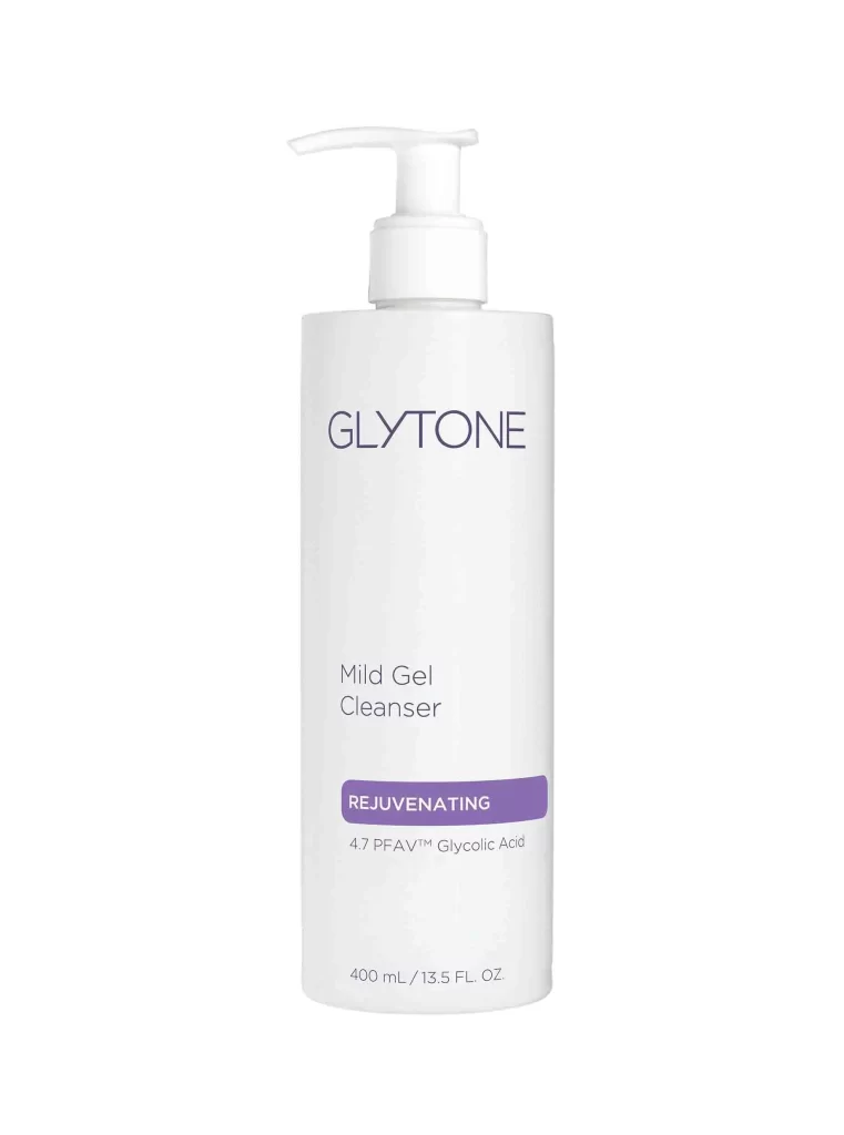
Glytone Mild Gel Cleanser 135 Fl Oz Cleanser Packaging
Topics
Details
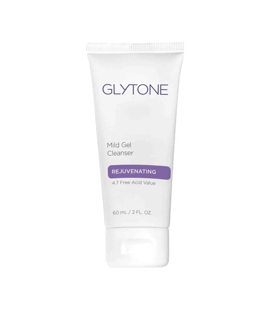
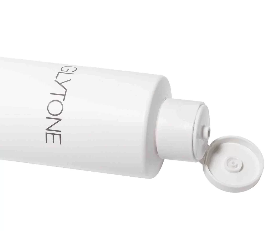
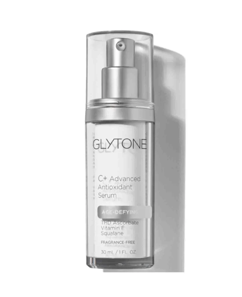
A tall, opaque white cylindrical bottle of Glytone Mild Gel Cleanser stands upright with a standard pump dispenser featuring a curved nozzle. The brand name 'GLYTONE' appears in thin uppercase sans-serif lettering above the product name 'Mild Gel Cleanser' and a purple rectangular badge reading 'REJUVENATING' that notes the 4.7 PFAV™ Glycolic Acid formula. Even lighting illuminates the 400 mL container against a white background, with the volume measurement printed at the base.
Visual hierarchy is established through the strategic isolation of color, where the singular purple element acts as the primary focal point amidst the otherwise achromatic scheme. The generous use of negative space around the central text creates a clinical, pharmaceutical aesthetic that suggests purity and professional-grade formulation. Such minimalism relies heavily on typographic precision and the exact placement of the pump mechanism to convey a sense of modern utility without unnecessary ornamentation.
Packaging designers analyzing market trends for dermatological products would utilize this composition to study how limited color palettes influence consumer perception of medical efficacy. Brand identity specialists might examine the specific weight and spacing of the typeface to understand how the company communicates authority and gentleness simultaneously. Furthermore, 3D artists requiring accurate references for cosmetic product modeling would find the clear definition of the pump mechanics and bottle curvature particularly useful for texture mapping and lighting tests.