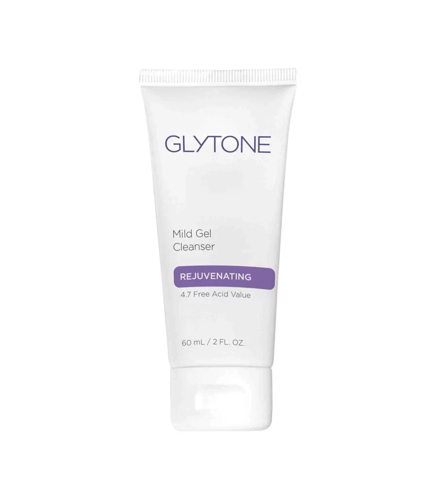
Glytone Mild Gel Cleanser 2 Fl Oz Cleanser Packaging
Topics
Details
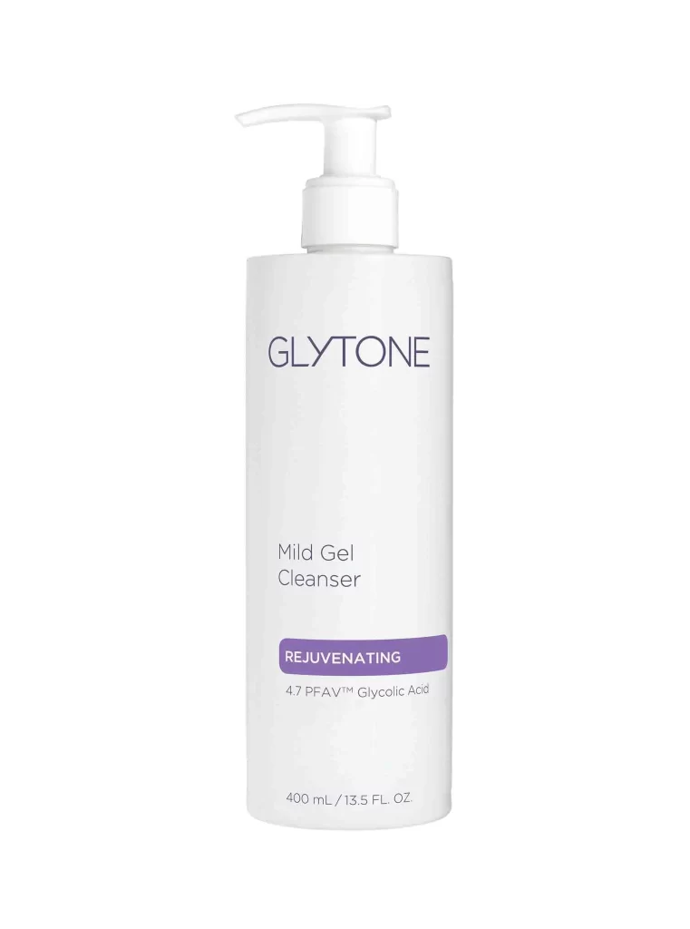
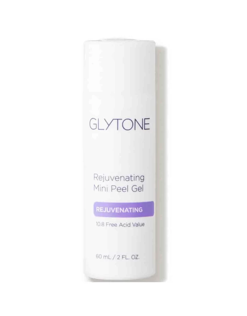
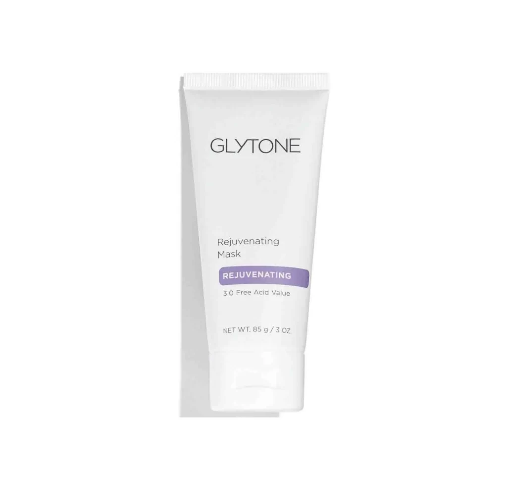
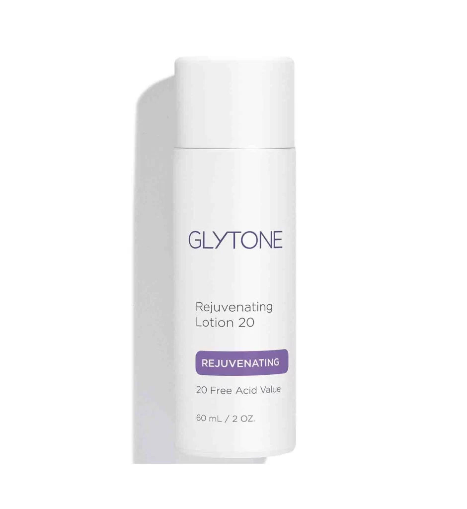
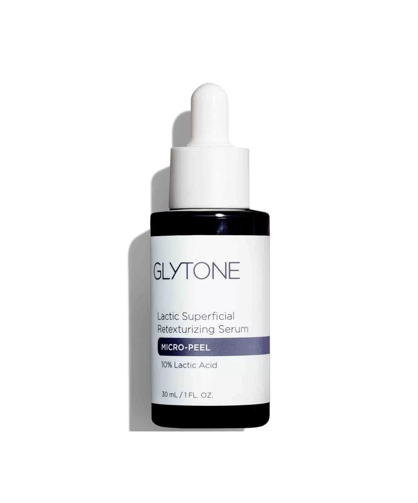
An opaque white plastic tube of Glytone Mild Gel Cleanser stands upright in a direct frontal view, featuring a ribbed screw cap at the base and a crimped seal at the top. Deep purple lettering spells out the brand name near the upper curve, while the product title and technical specifications appear in smaller black text below. The 60 mL container rests on a white surface, with a purple 'REJUVENATING' label and '4.7 Free Acid Value' notation visible on the lower portion.
Visual hierarchy plays a crucial role in this packaging layout, utilizing color contrast to guide the viewer’s eye from the brand identity down to the scientific claims. The choice of a muted purple for both the logo and the central callout creates a cohesive medical-aesthetic theme that suggests clinical efficacy without appearing harsh. Minimalist typography ensures that the essential information—product type, benefit category, and volume—remains legible even when viewed as a small thumbnail or from a distance on a crowded shelf.
Product photographers can utilize this shot to study standard e-commerce lighting techniques that eliminate distracting shadows while maintaining material texture. Packaging designers might examine the balance between the generous negative space and the dense information block to inform their own label layouts for skincare lines. Marketing teams reviewing this reference could analyze how specific color psychology is applied to convey gentleness alongside professional-grade results.