HELLO Cosmetic Product Box
Topics
Details
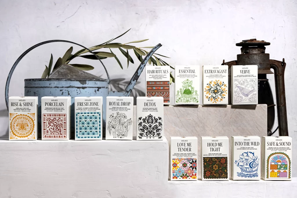
Arranged across two tiered concrete steps, twelve rectangular cosmetic boxes display a mix of serif and sans-serif typography against a rough, off-white plaster wall. The packaging features distinct color palettes ranging from mustard yellow and terracotta to deep teal and black, each adorned with intricate patterns like mandalas, botanical motifs, and geometric tiles. Soft, diffused lighting illuminates the scene from the left, casting gentle shadows beneath a weathered blue watering can holding olive branches and a rusted metal lantern positioned on the upper right.
Visual interest stems from the eclectic illustration styles that differentiate each product variant while maintaining a cohesive brand identity through consistent box dimensions and logo placement. The juxtaposition of rustic props—such as the peeling paint on the watering can and the aged patina of the lantern—against the crisp, modern graphic design creates a compelling textural contrast. Each box employs a unique ornamental border or central iconography, suggesting a curated collection where individual character supports the overall aesthetic unity.
Packaging designers studying layout balance and typographic hierarchy would find this arrangement useful for analyzing how multiple SKUs can coexist in a single promotional shot without visual clutter. Art directors planning lifestyle photography campaigns could reference the prop selection and spatial layering to achieve similar artisanal atmospheres in their own product presentations. Brand strategists might also examine how pattern variation communicates different product benefits while keeping the parent brand recognizable across diverse scent or formula lines.