iOS 17 Builtin Wallpaper Red Blue
Topics
Details
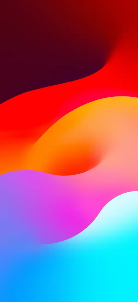
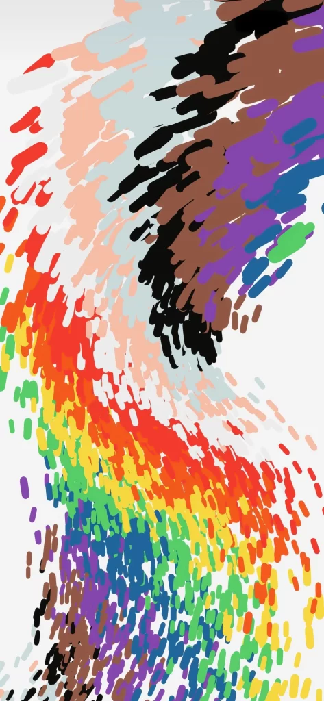
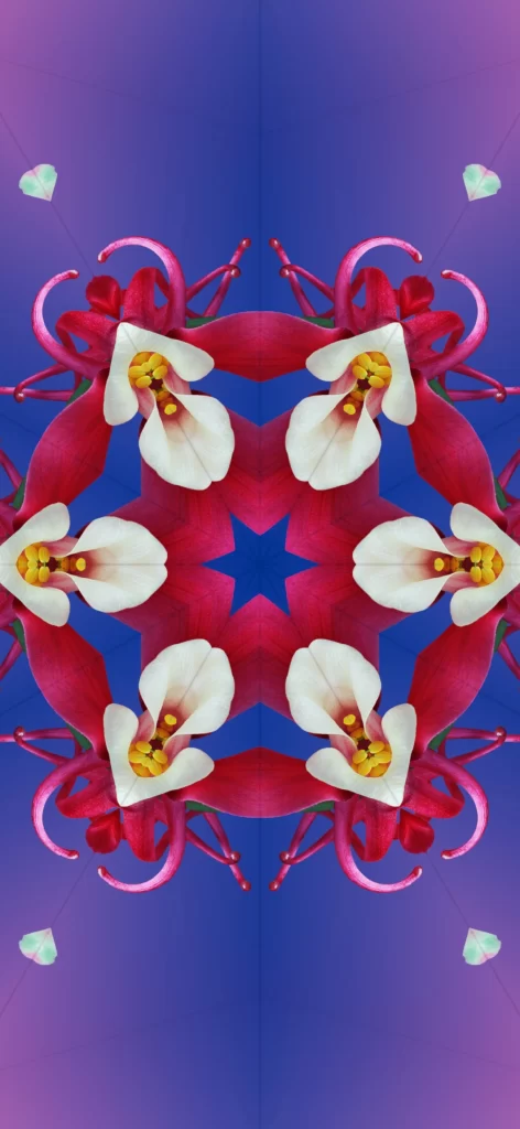
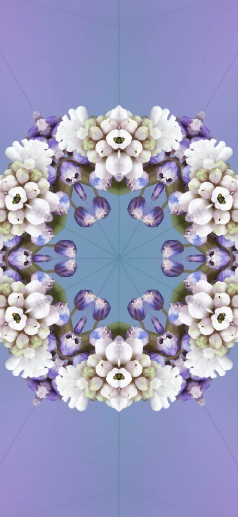
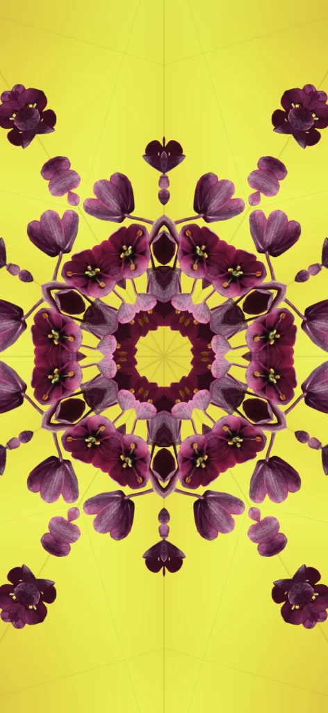
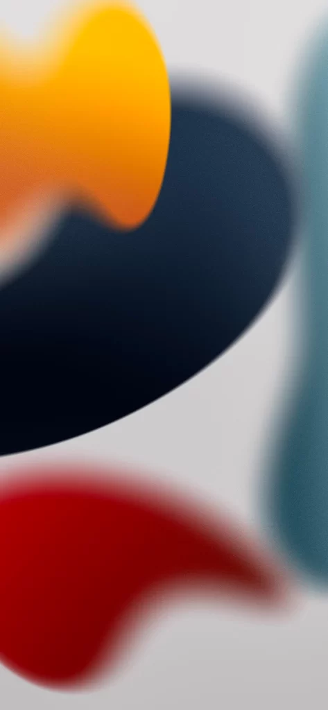
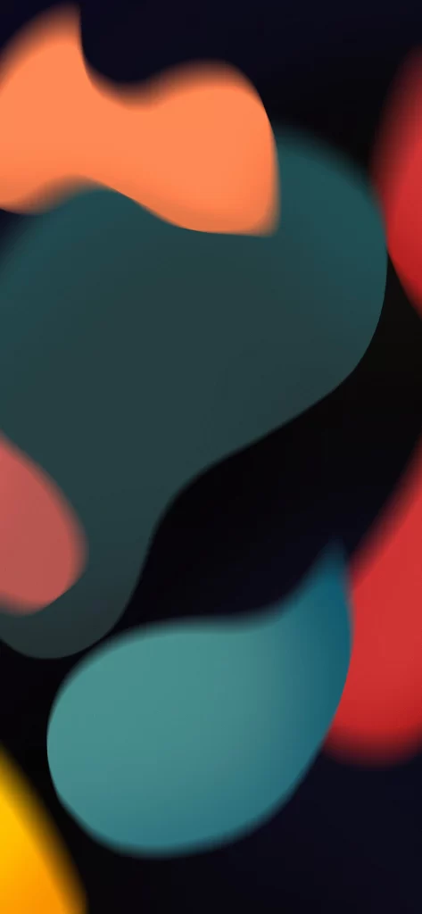
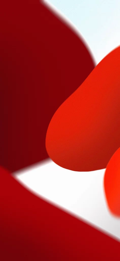
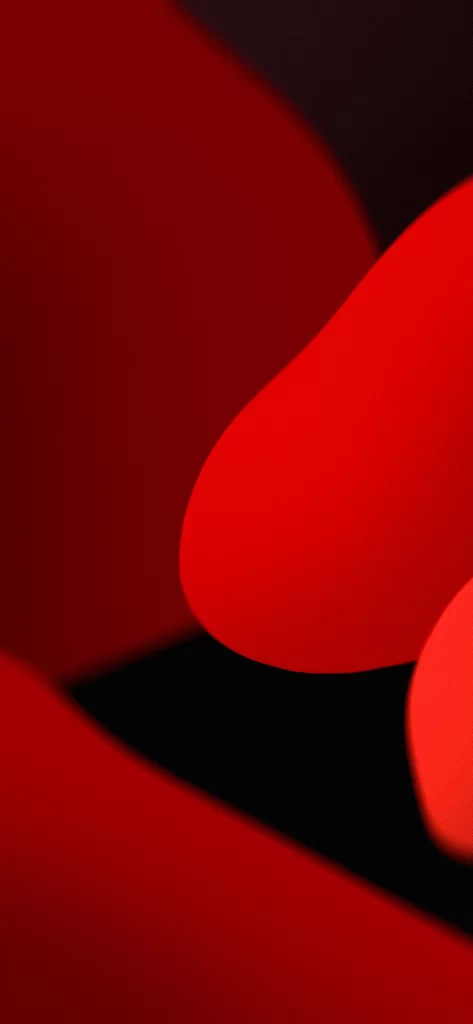
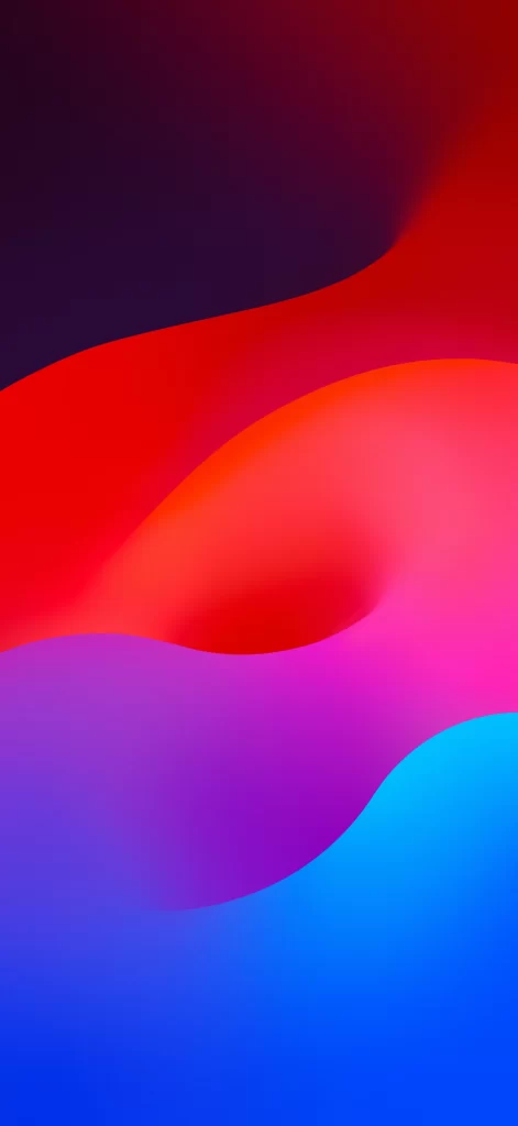
Deep navy shadows dominate the upper left corner, bleeding into a vibrant crimson wave that sweeps across the middle of the frame. Below this red expanse, a soft magenta-to-pink gradient forms a gentle, organic depression before transitioning into rich violet and finally a bright cyan at the bottom right. The entire composition features smooth, liquid-like curves with no hard edges or textural details, creating an abstract, flowing landscape of pure color.
What sets this particular wallpaper apart is its masterful use of color temperature contrast—cool blues and purples anchoring the bottom against the intense warmth of reds above. The seamless blending between these opposing hues creates a sense of depth and movement that feels both modern and calming. Unlike more complex abstract designs, this piece relies on subtle value shifts within each color zone to define its undulating forms.
Mobile interface designers might reference these specific color transitions when crafting custom app themes or widget backgrounds that complement Apple's default aesthetic. Color theorists could analyze the precise ratios between the magenta midpoint and cyan endpoint for studies in digital gradient harmonies. Anyone building a cohesive visual system around iOS 17's design language would find these exact hues invaluable for maintaining consistency across different screen elements.