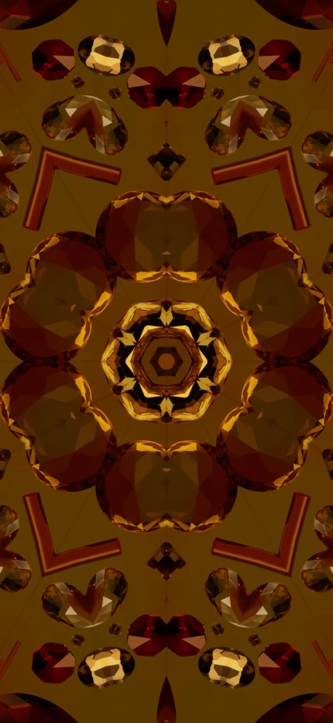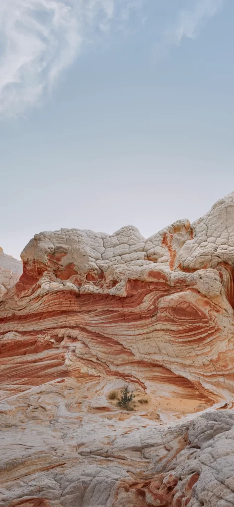
iOS 17 Builtin Wallpaper Red Orange
Topics
Details
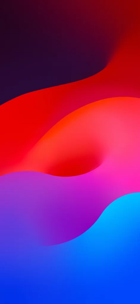
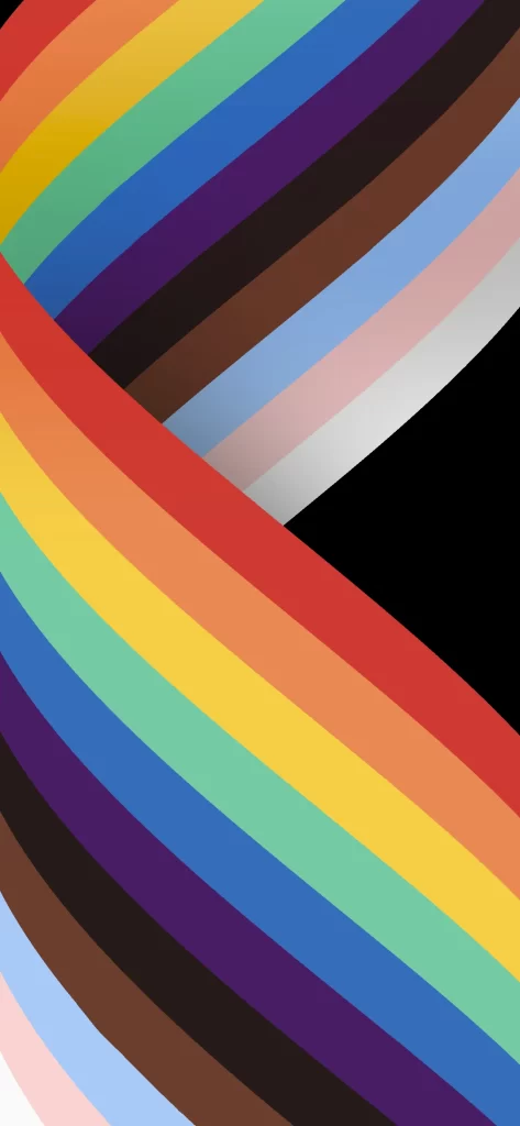
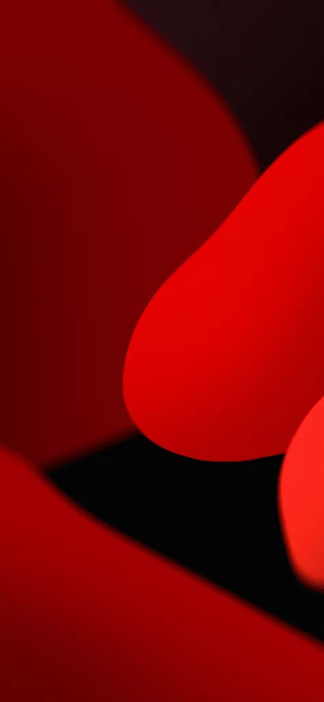
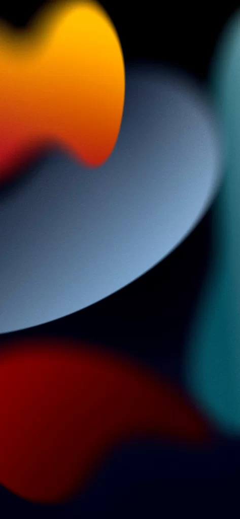
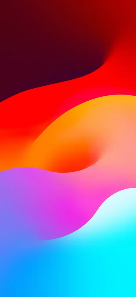
Deep burgundy occupies the upper register, yielding to a broad, undulating band of saturated crimson that curves diagonally across the frame. Below this primary wave, a warm orange swell transitions seamlessly into a soft magenta expanse, which finally dissolves into a luminous cyan at the bottom edge. The composition relies on smooth, organic gradients without discernible texture or sharp boundaries, creating an impression of fluid, light-emitting color fields viewed from a direct frontal perspective.
Visual interest derives from the deliberate chromatic progression through the spectrum, where each hue bleeds into the next with mathematical precision. The sinuous, wave-like forms introduce dynamic movement despite the abstract nature of the subject, while the absence of any representational elements focuses attention entirely on the interplay between temperature and saturation. Such controlled color blending demonstrates sophisticated digital rendering techniques that achieve depth without traditional shadow or highlight.
Interface designers might employ this palette study when constructing ambient display modes or system-wide appearance themes requiring harmonious yet vibrant tonal relationships. Color theorists could reference the specific gradient ratios when teaching principles of analogous and complementary color interaction in digital media. Mobile interface architects may find the composition useful for testing OLED screen uniformity across extreme brightness ranges and saturated color gamuts.