Jastrzebski Makaron Pasta Packaging
DownloadTopics
Details
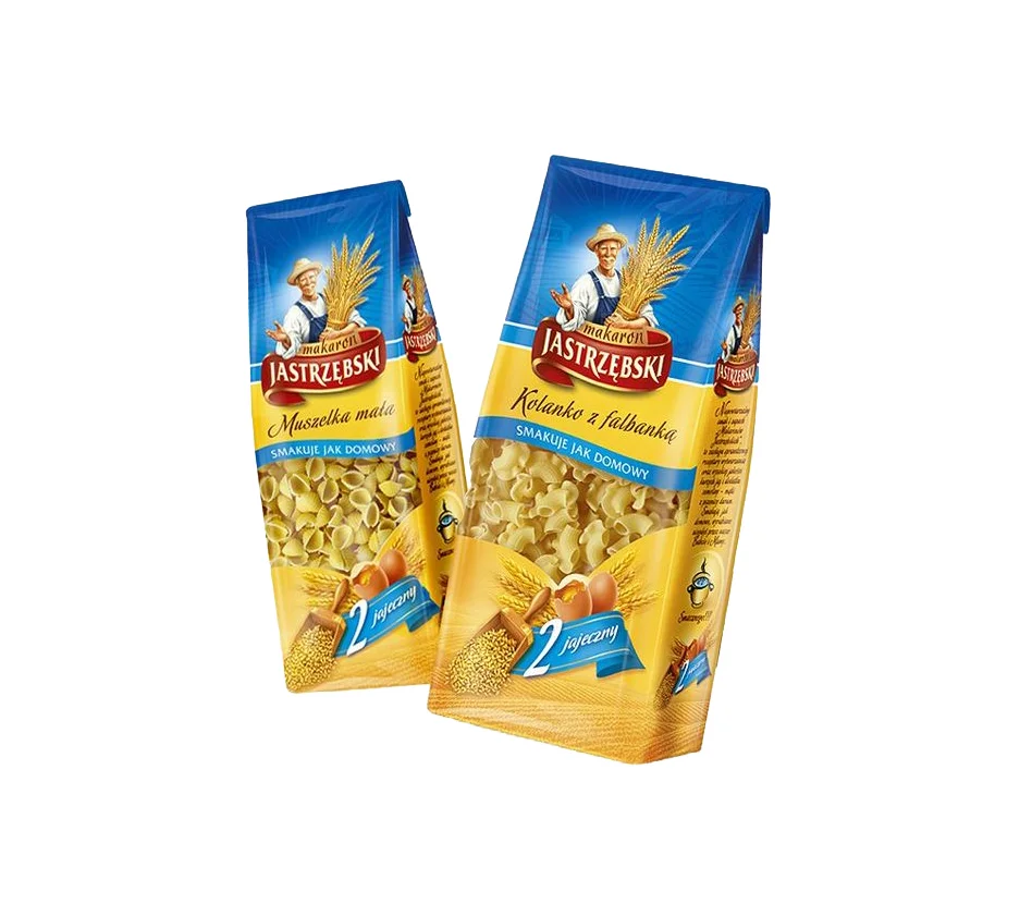
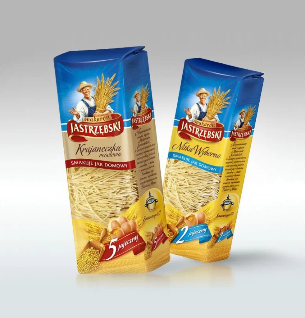
Two upright cartons of Jastrzebski pasta dominate the frame, angled slightly toward each other to reveal both front and side panels. The packaging features a vibrant blue top section that transitions into a warm golden-yellow base, with the brand name displayed prominently in a red serif banner above the product type. A cheerful farmer figure holding wheat stalks anchors the upper graphic area, while the lower portion showcases photographic images of the actual noodles alongside eggs and grain. Soft studio lighting creates gentle shadows beneath the boxes against a neutral gray gradient backdrop.
Visual hierarchy is established through a disciplined color-coded system that distinguishes the varieties at a glance: the left package utilizes deep crimson accents for its five-egg formula, while the right employs cool cyan tones for the two-egg version. This chromatic separation allows consumers to navigate the shelf quickly without reading fine print. The integration of realistic food photography with illustrative elements creates a tactile quality that bridges the gap between artisanal tradition and modern convenience. Designers can access the full-resolution source file to study these specific typographic and color choices in greater detail.
Packaging engineers analyzing structural integrity of tall rectangular formats will find the seam placement and fold lines particularly instructive for their own prototyping work. Brand strategists developing regional food identities might examine how the farmer mascot conveys agricultural authenticity without appearing dated. Illustrators tasked with creating similar pastoral imagery can reference the lighting on the wheat stalks and fabric textures to achieve comparable depth in their compositions. Students of commercial photography could deconstruct the subtle reflections on the glossy surfaces to understand how product materials interact with controlled studio environments.