Nongshim Seafood Ramyun Ramen Packaging
Topics
Details
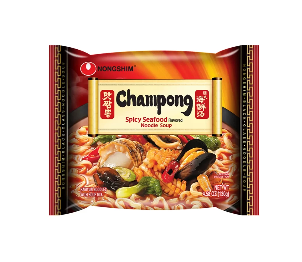
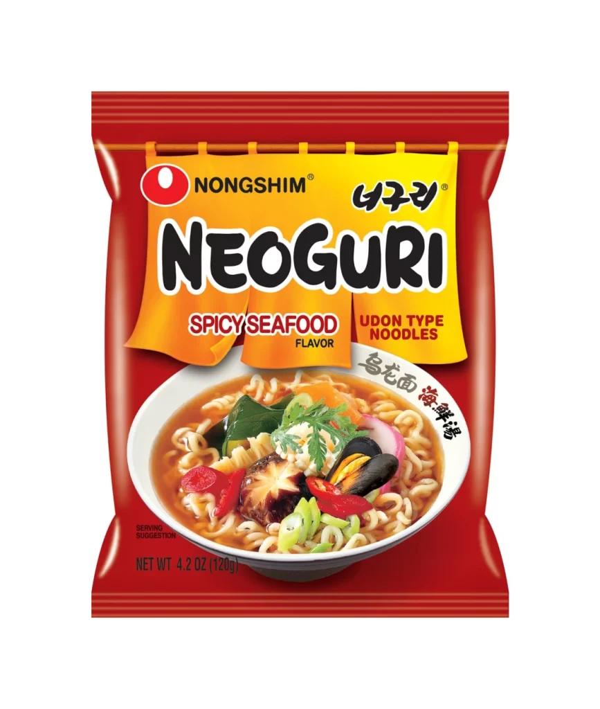
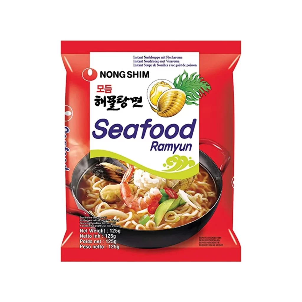
A vibrant red field dominates the composition, serving as a high-contrast backdrop for the central white label and the photographic food inset. The Nongshim logo anchors the upper quadrant, while bold purple sans-serif typography spells out 'Seafood Ramyun' beneath Korean characters and multilingual product descriptions. Below, an appetizing shot of noodles in a black pot occupies the lower half, featuring visible shrimp, mussels, and green vegetables in a rich broth.
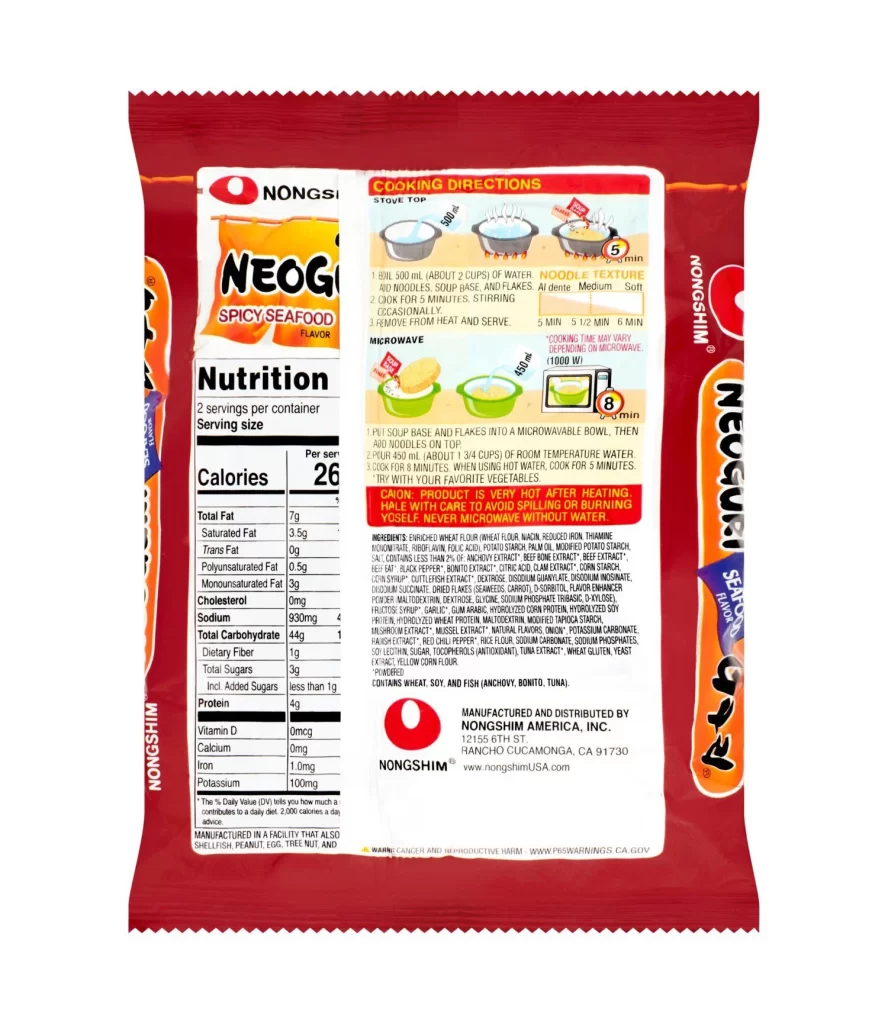
Visual hierarchy is established through the stark division between the saturated red packaging material and the clinical white information panel. The inclusion of realistic shellfish illustrations alongside the photographic bowl creates a layered approach to appetite appeal, bridging graphic iconography with literal representation. Green wave graphics act as a transitional element, softening the boundary between text and imagery while reinforcing the marine theme.
Brand strategists might analyze this layout to understand how color coding communicates flavor profiles within a larger product ecosystem. Packaging engineers could study the balance of negative space against dense nutritional data to optimize consumer readability on retail shelves. Food stylists may reference the specific arrangement of toppings to gauge standard presentation expectations for seafood noodle varieties.