Nongshim SHIN RAMYUN BLACK Ramen Variant 3 Packaging
Topics
Details
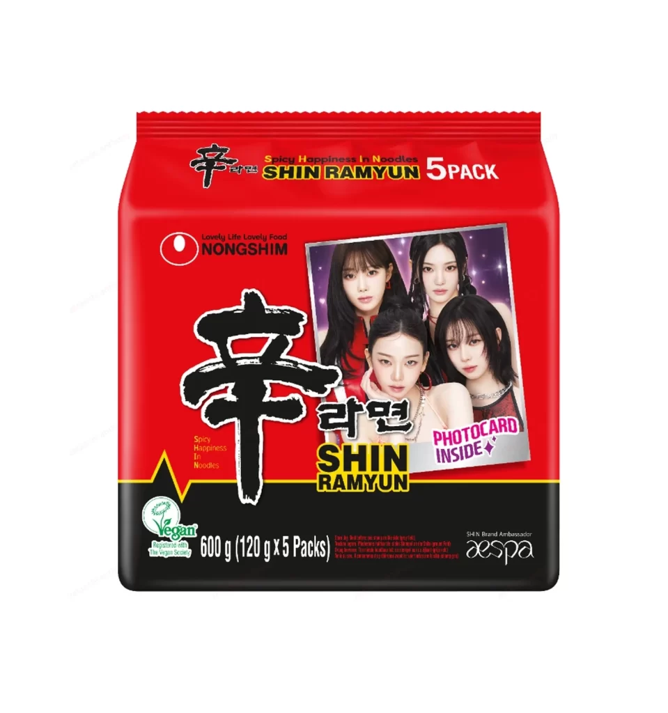
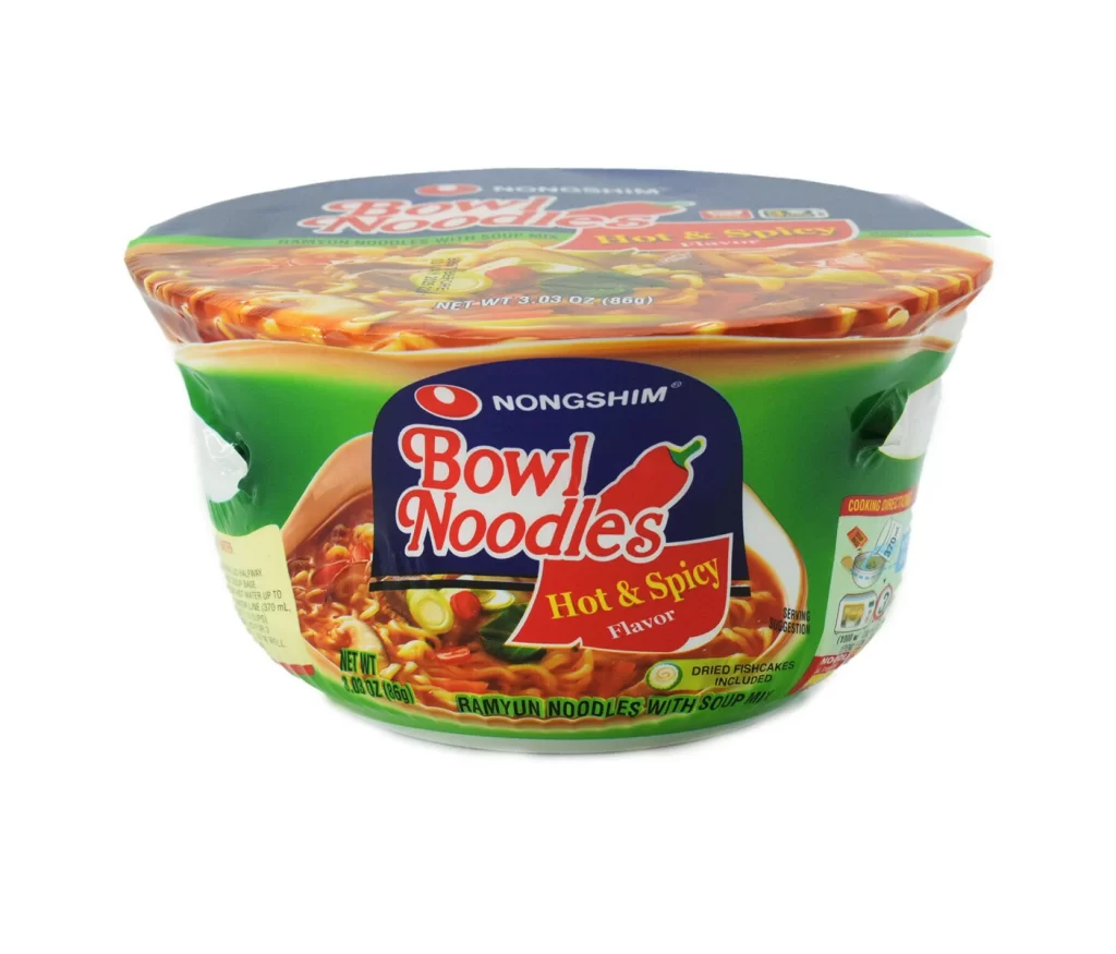
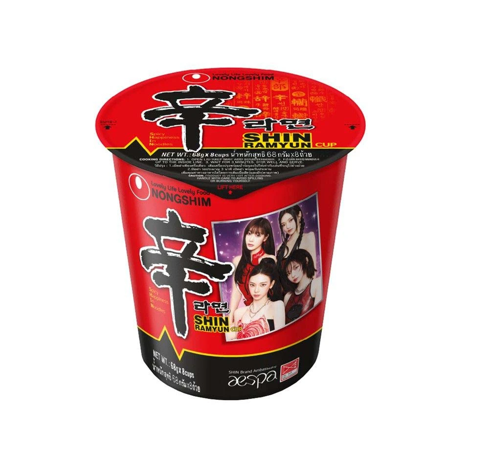
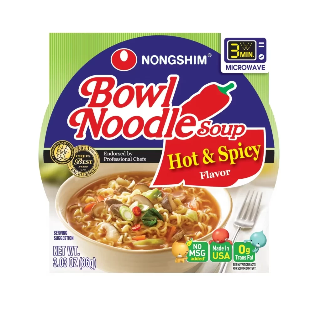
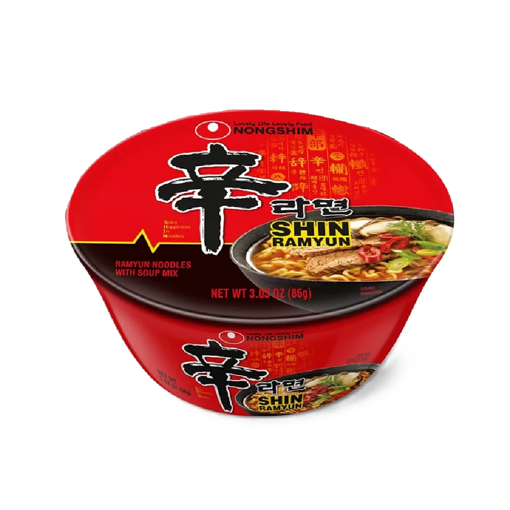
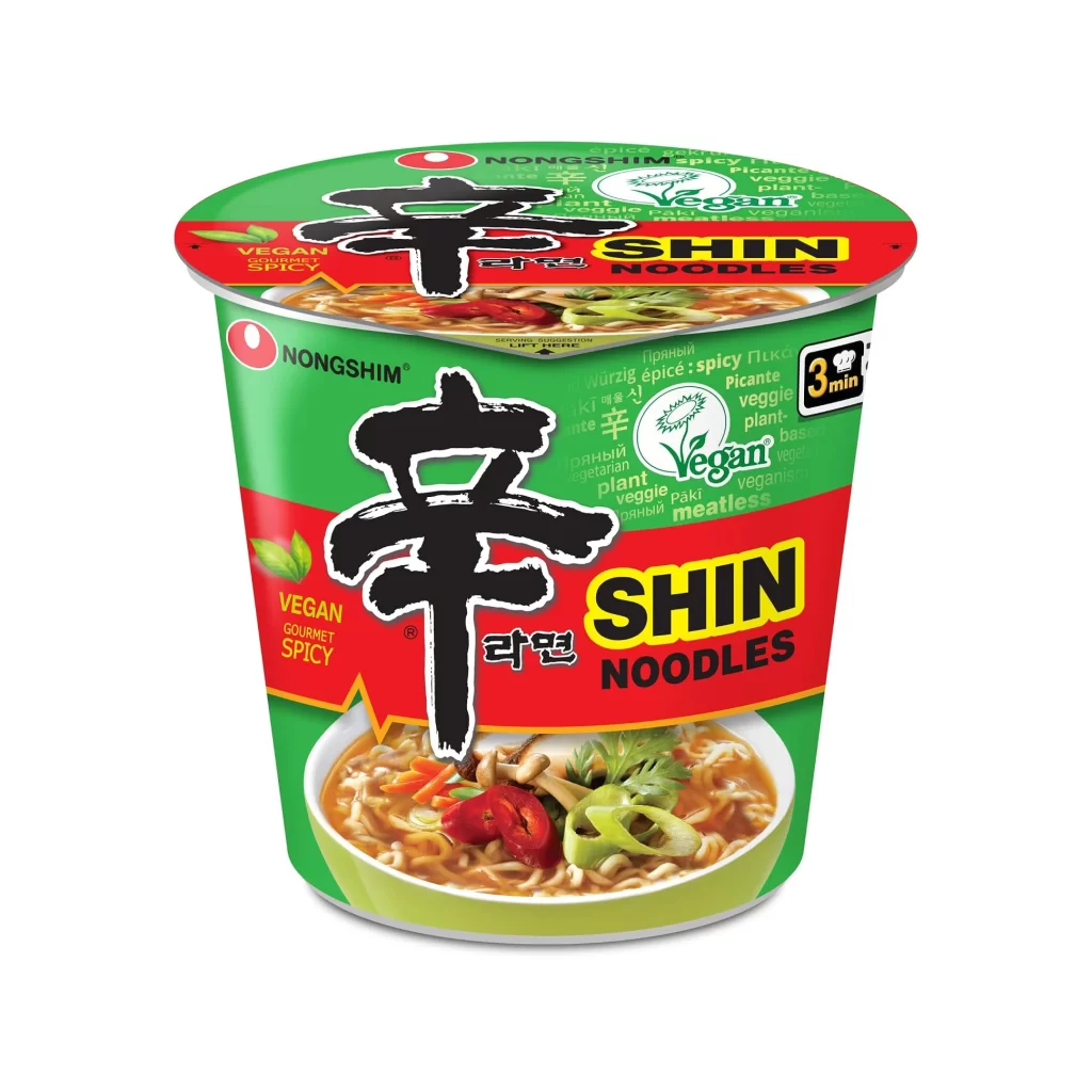
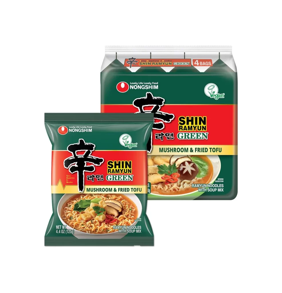
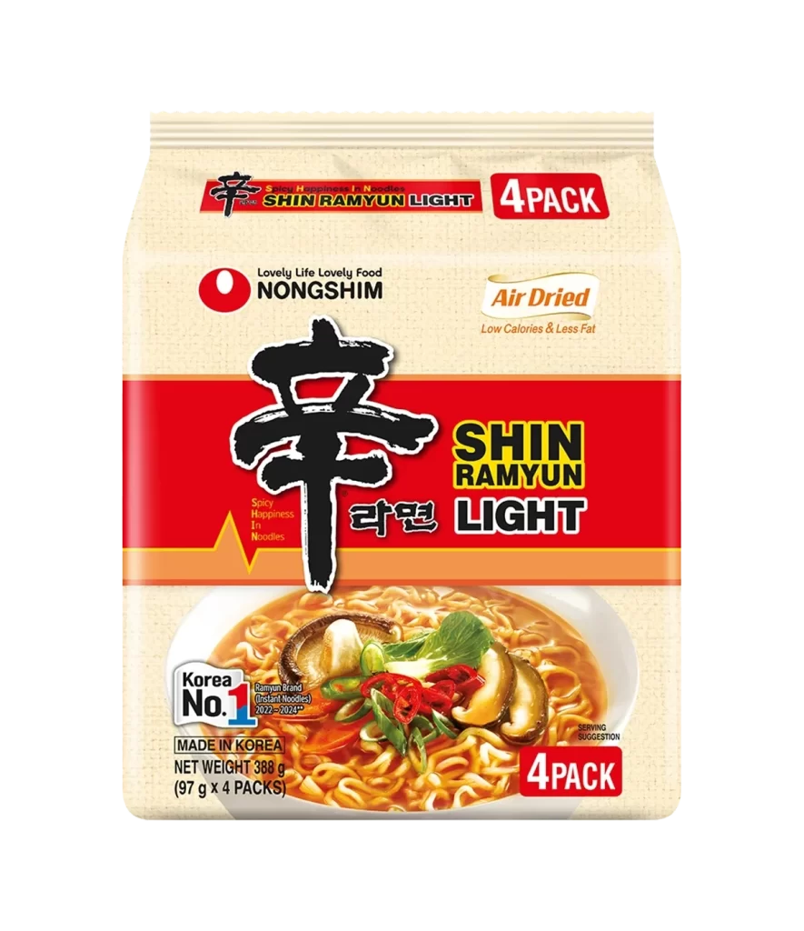
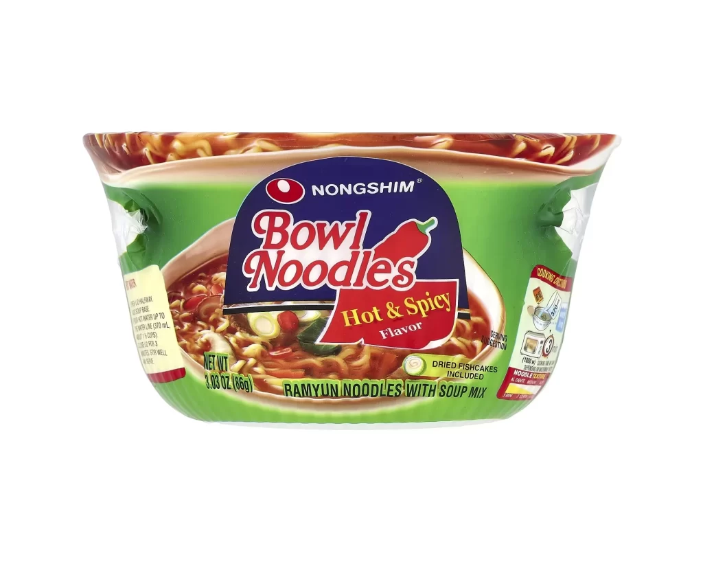
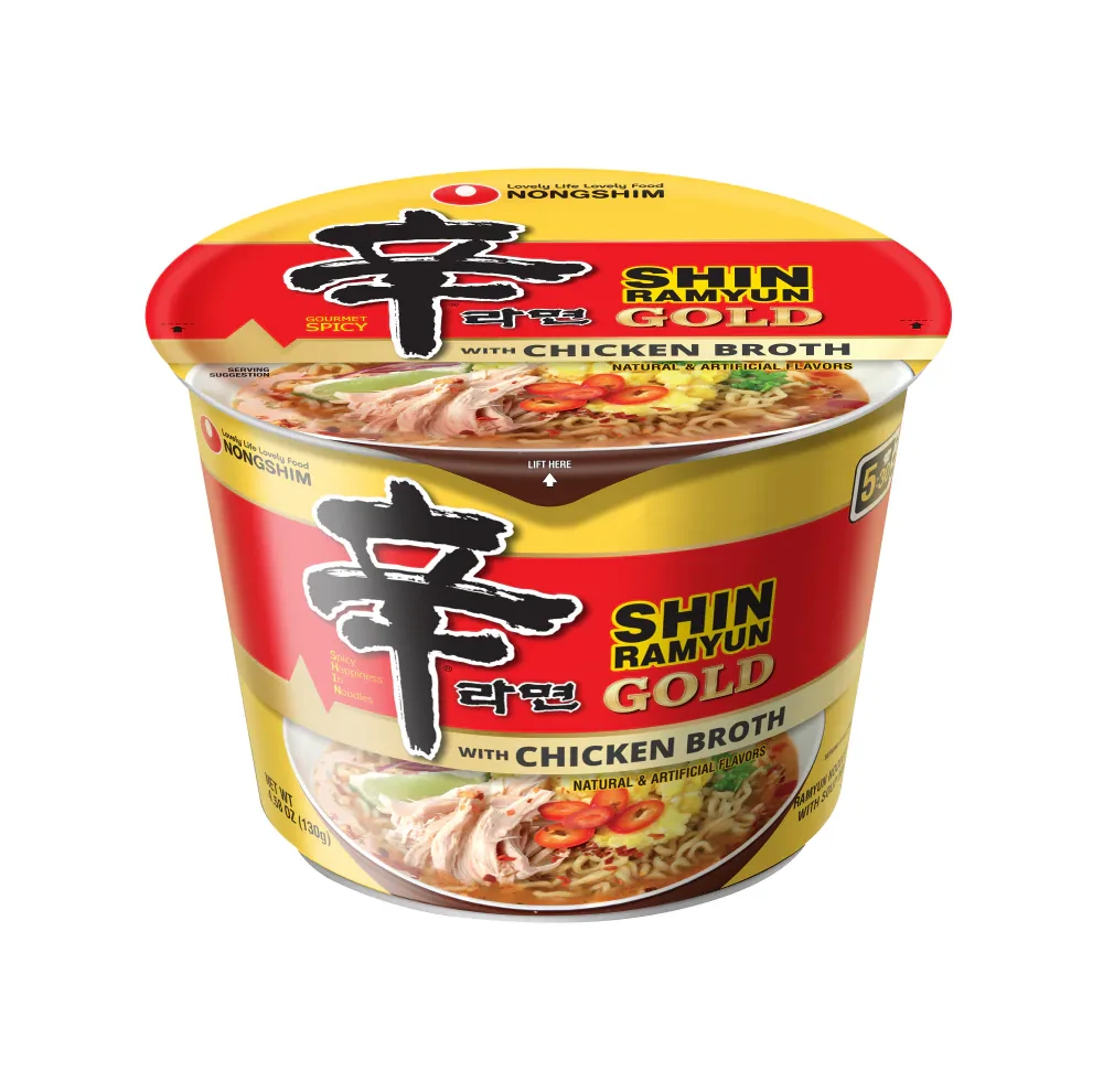
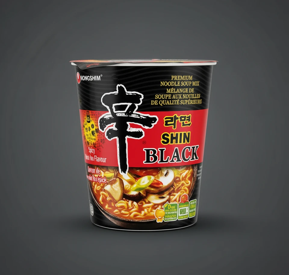
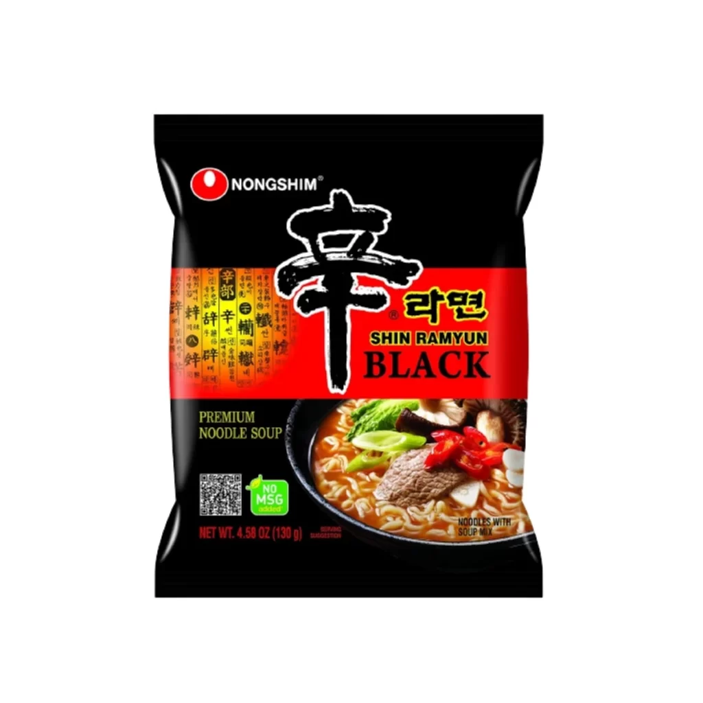
A glossy black plastic package of Nongshim Shin Ramyun Black dominates the view, its surface reflecting light with a subtle sheen. A bold red horizontal band bisects the upper half, featuring the iconic white Korean character '辛' (Shin) rendered in large brushstroke style alongside yellow Korean text and the English words 'SHIN RAMYUN BLACK'. Below the red section, a photographic inset displays the prepared noodle soup with visible beef slices, mushrooms, green onions, and red peppers, while text indicates this is a premium MSG-free product weighing 4.58 oz (130g).
Visual hierarchy here operates through aggressive color blocking, with the crimson stripe creating immediate focal tension against the deep black background that signals premium positioning within the product line. The juxtaposition of traditional calligraphy alongside modern sans-serif English typography bridges cultural aesthetics, while the photographic food styling at the bottom grounds the abstract branding in tangible appetite appeal. Notably, the ‘BLACK’ designation in heavy serif lettering differentiates this variant from standard offerings through typographic weight alone.
Brand strategists analyzing Asian market packaging conventions would examine this as a case study in luxury-tier signaling within commodity food products. Packaging engineers might reference the material finish and structural proportions when developing premium instant-food lines requiring shelf presence differentiation. Culinary photographers could deconstruct the lighting setup on the bowl imagery to understand how steam and gloss are rendered in commercial food photography without losing text legibility.