Nongshim SHIN RAMYUN Ramen Variant 2 Packaging
Topics
Details
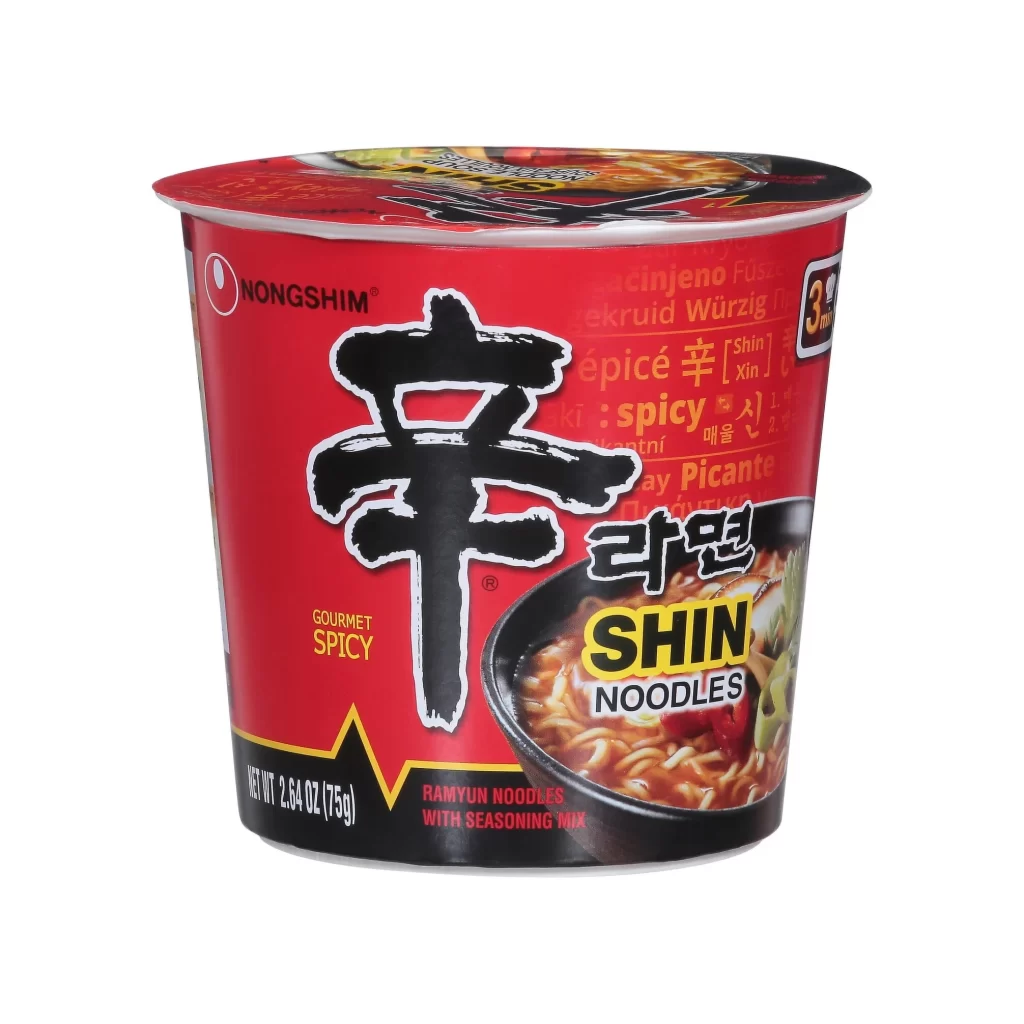
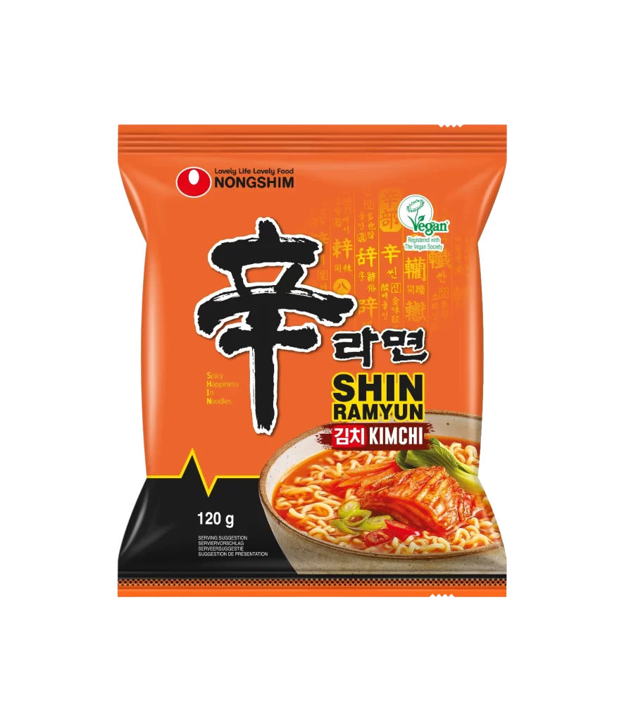
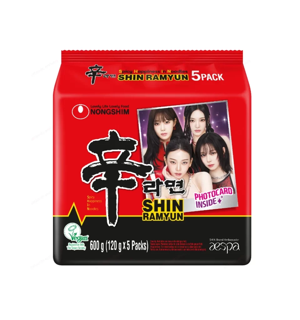
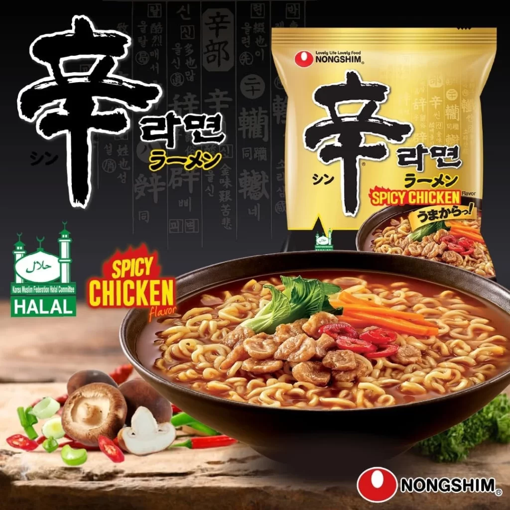
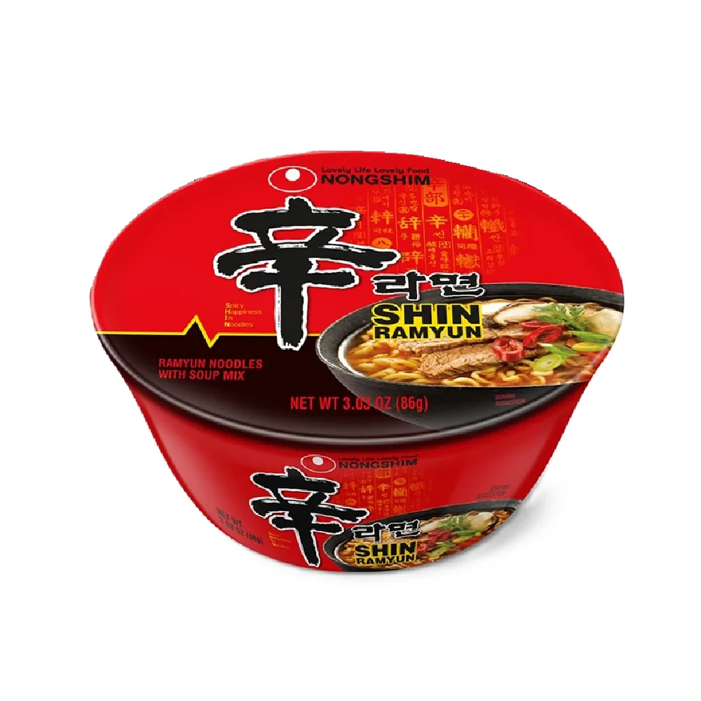
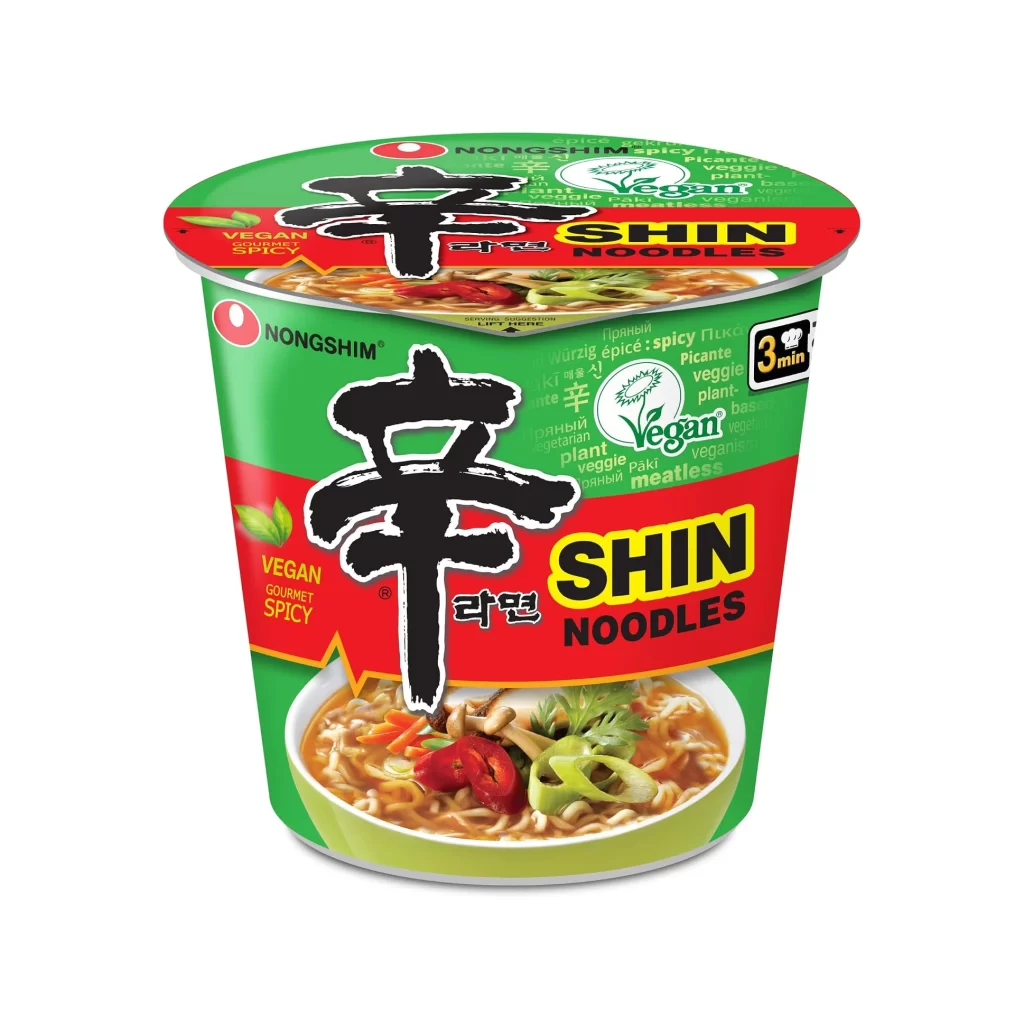
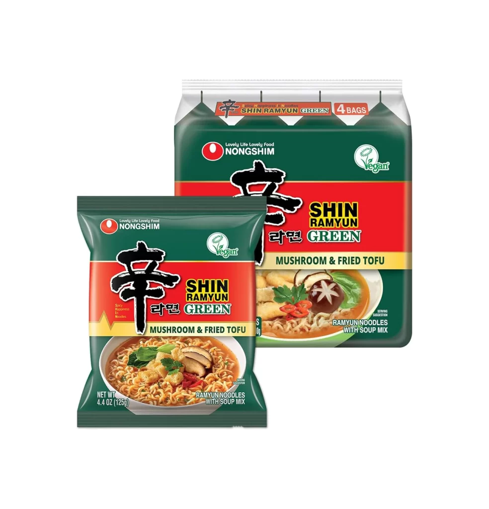
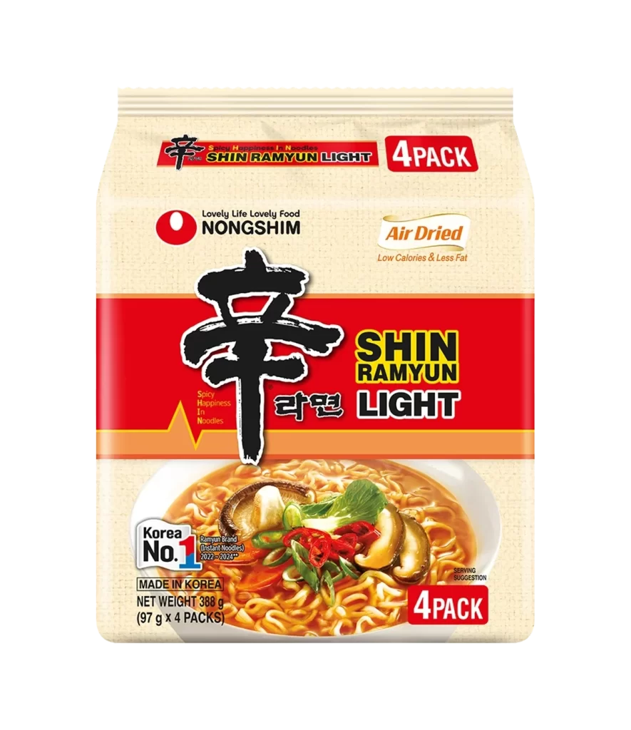
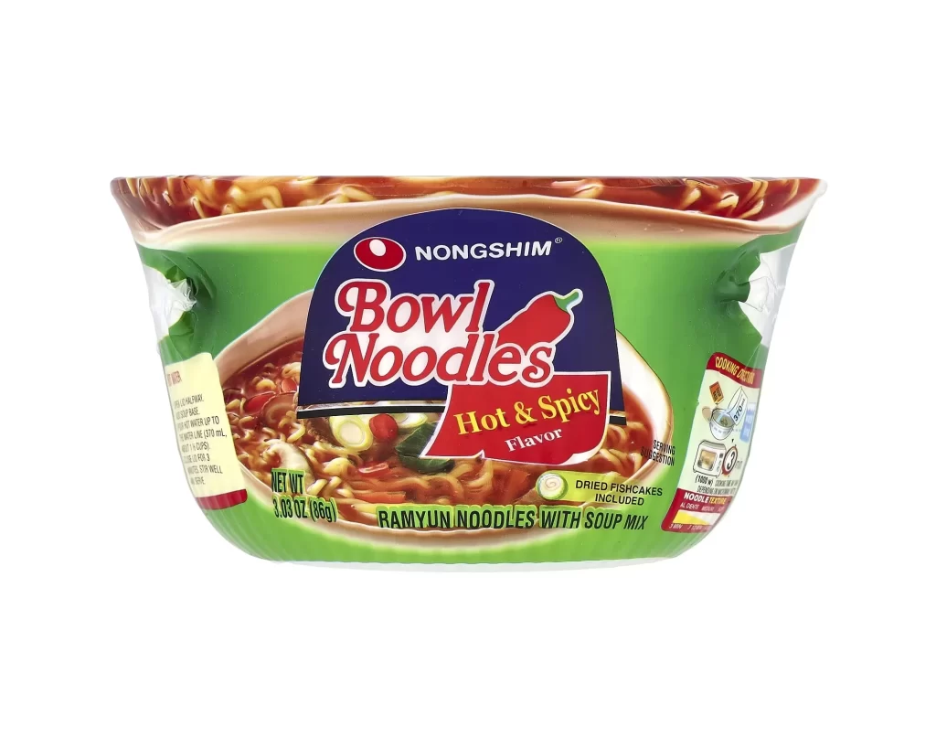
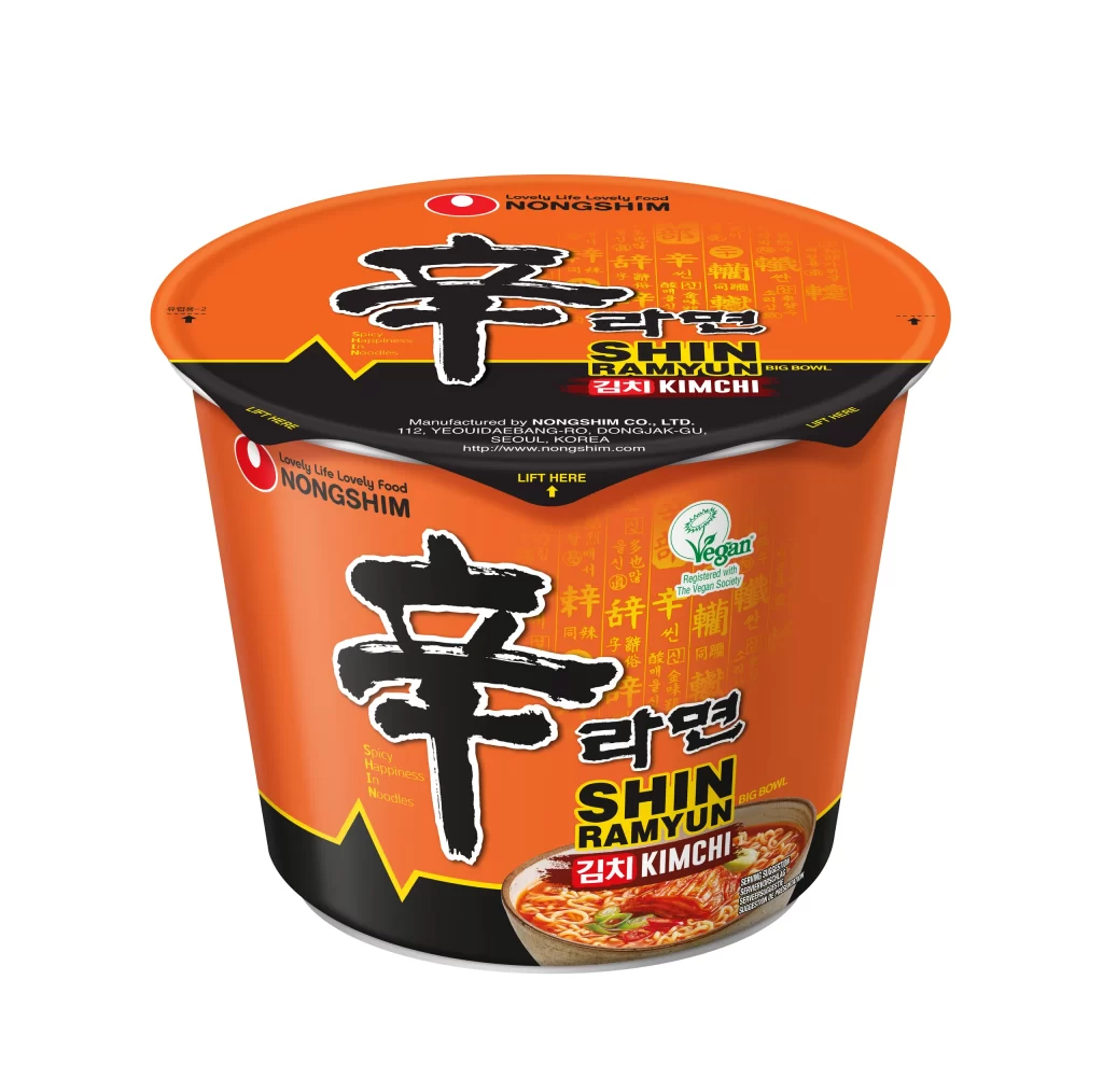
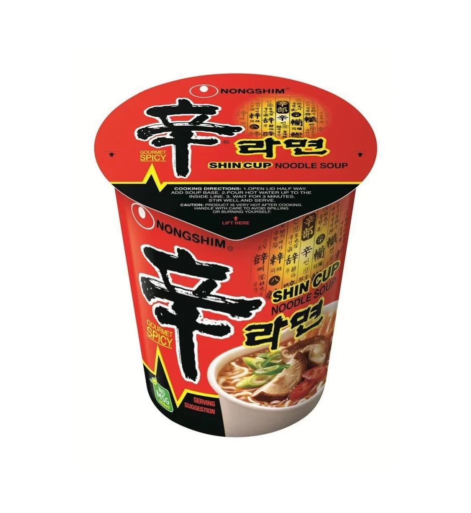
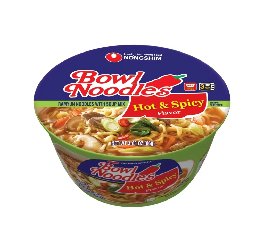
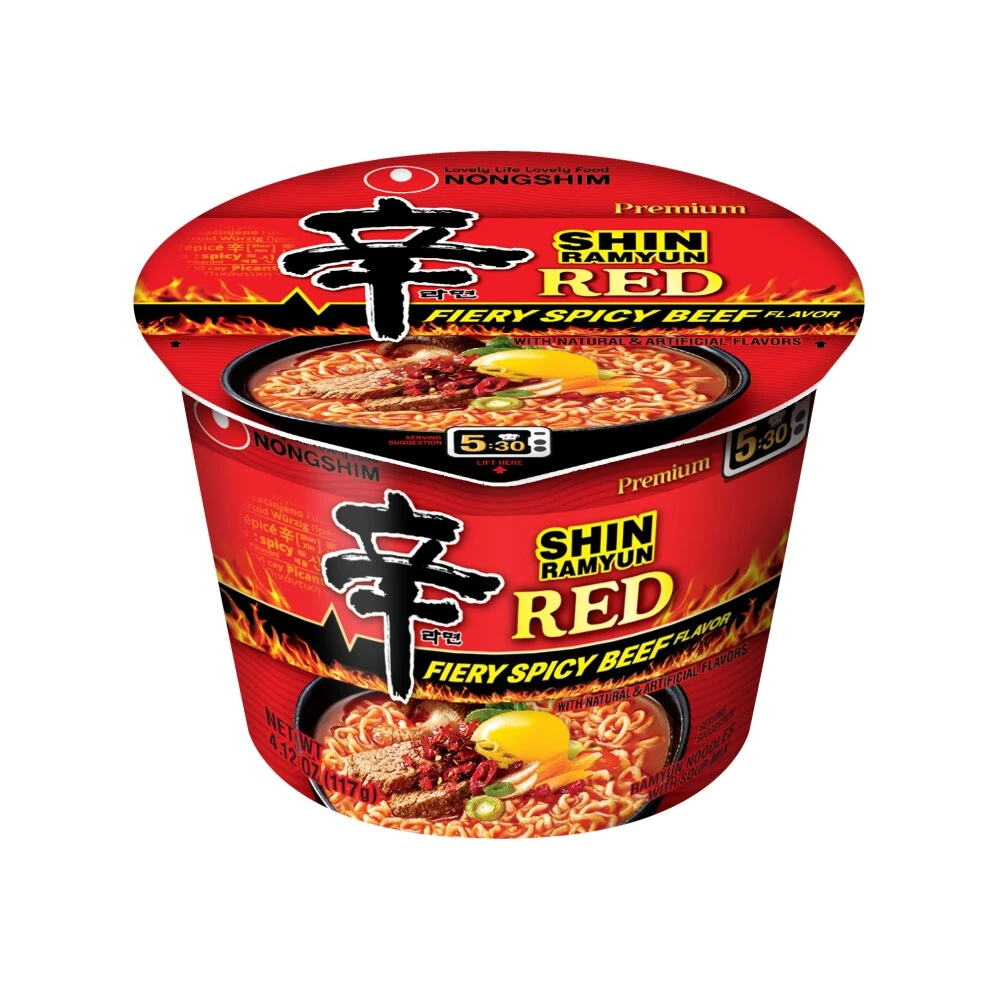
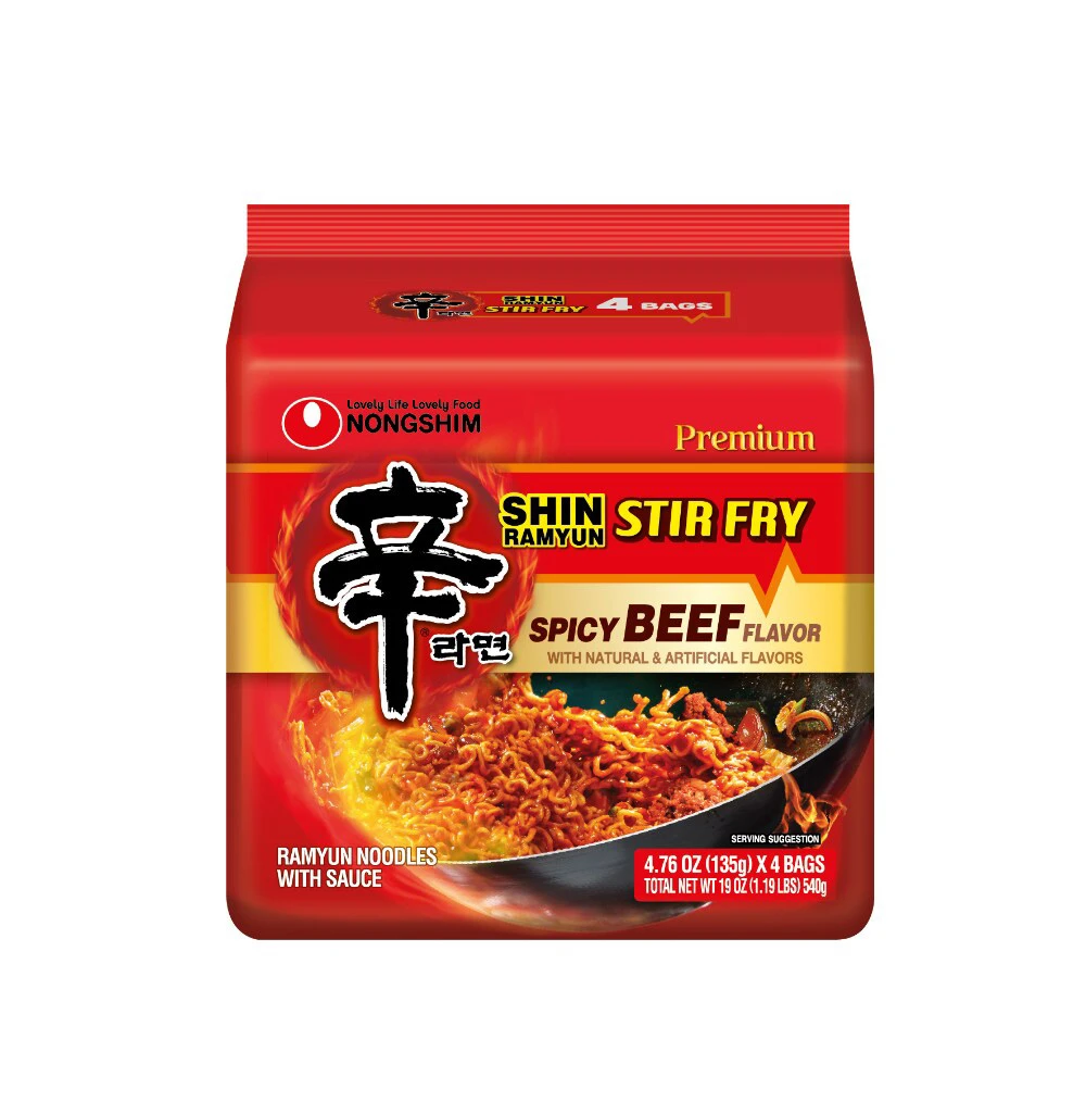
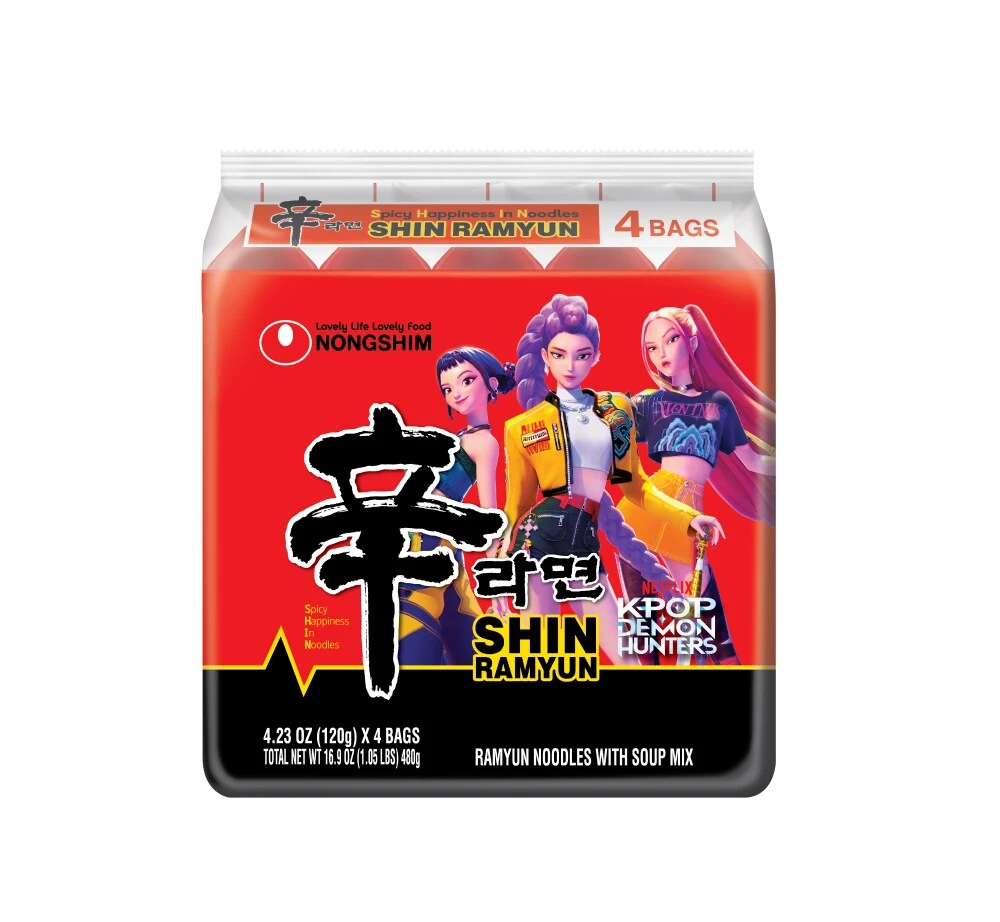
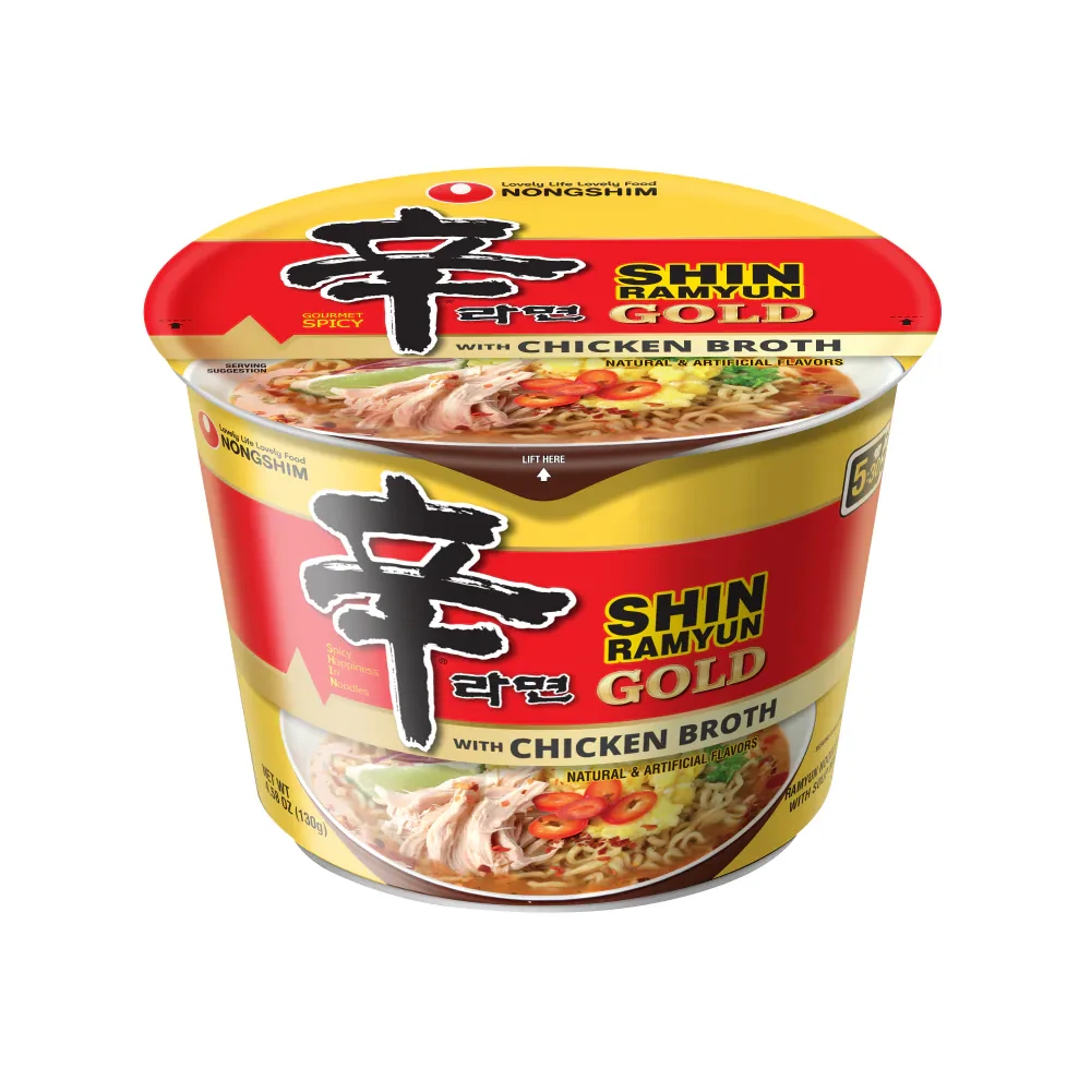
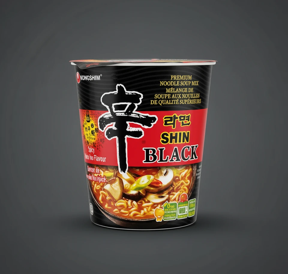
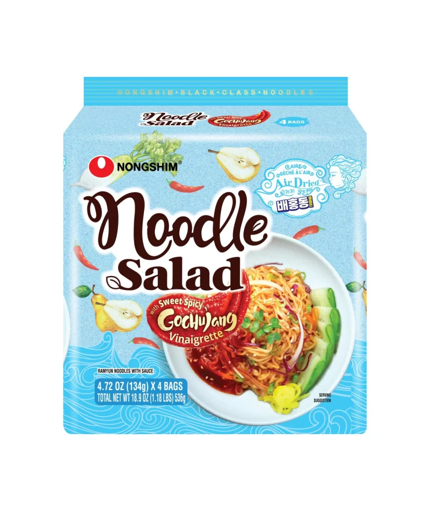
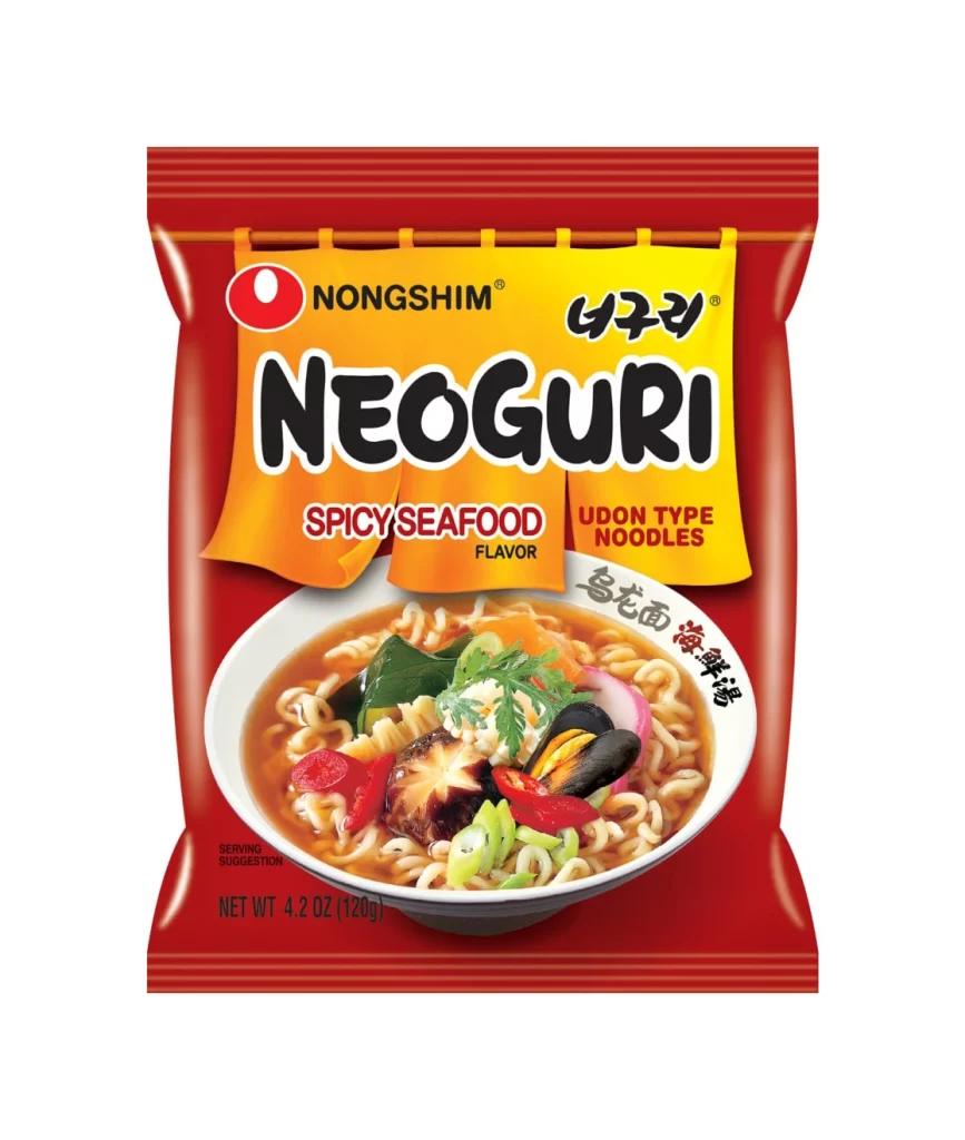
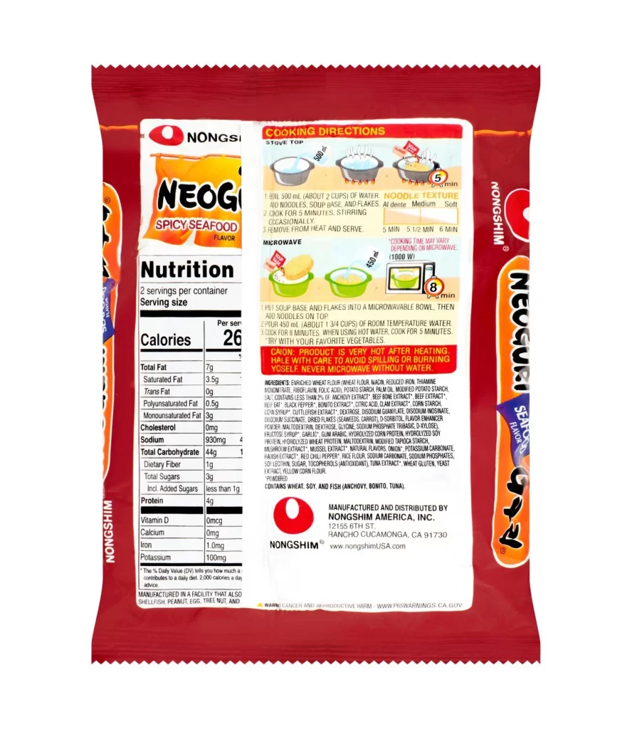
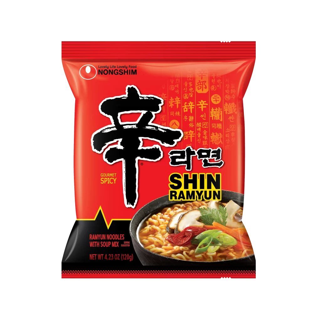
A vibrant crimson red dominates the flexible pouch, serving as the primary backdrop for the iconic black calligraphy of the 'Shin' character. The packaging features the Nongshim logo in white at the upper left, while bold yellow English text spells out SHIN RAMYUN beneath the Korean script. At the bottom right, a photographic inset displays a steaming bowl of noodles garnished with mushrooms and green onions, all set against a clean white studio background with soft, even lighting that eliminates harsh shadows.
Visual hierarchy is established through the dramatic contrast between the massive brushstroke font and the smaller typographic elements scattered across the surface. Subtle orange Hanja characters create a textured pattern in the background, adding cultural depth without overwhelming the main branding. The inclusion of a realistic food photograph anchors the product's identity, bridging the gap between traditional East Asian aesthetics and modern commercial appetites.
Food stylists might study this composition to understand how to balance text-heavy layouts with appetizing imagery. Brand strategists could analyze the color psychology of using aggressive reds to signal spice levels to global consumers. Packaging engineers may reference the structural fold lines visible at the top seal when developing their own stand-up pouch designs for similar dry goods.