Nongshim Shin Ramyun Stir-Fry Noodles Packaging
Topics
Details
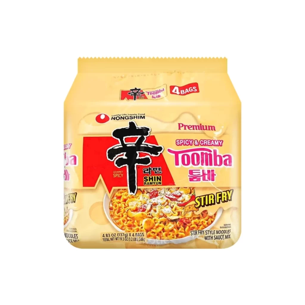
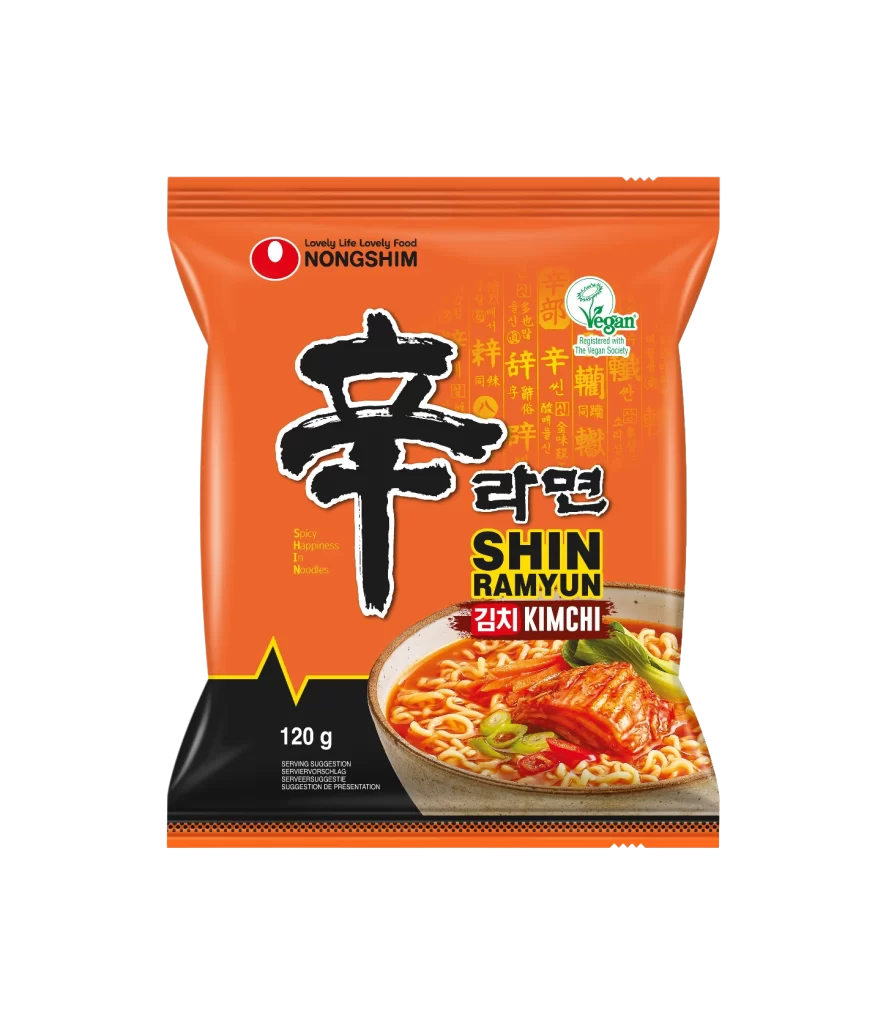
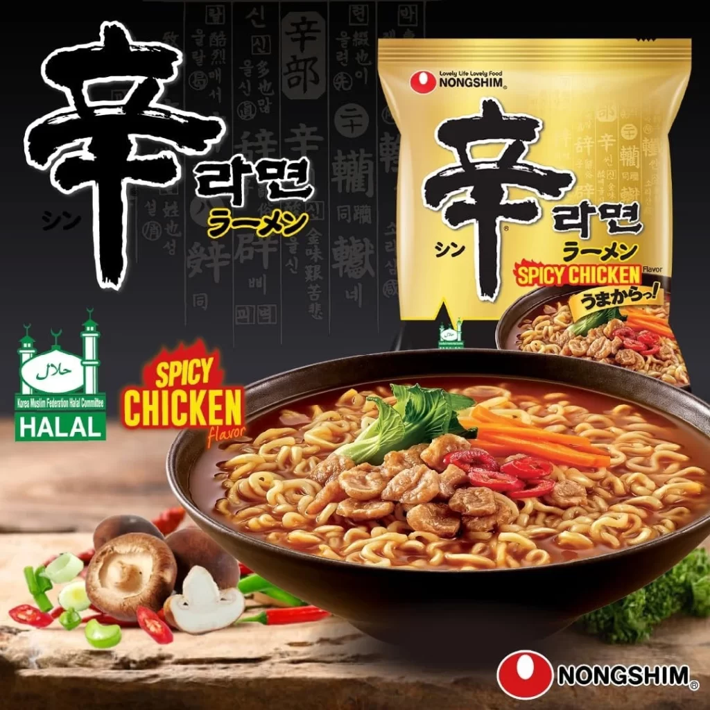
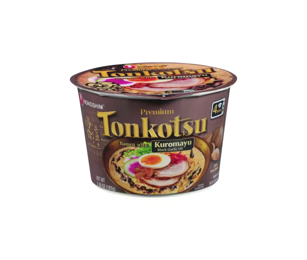
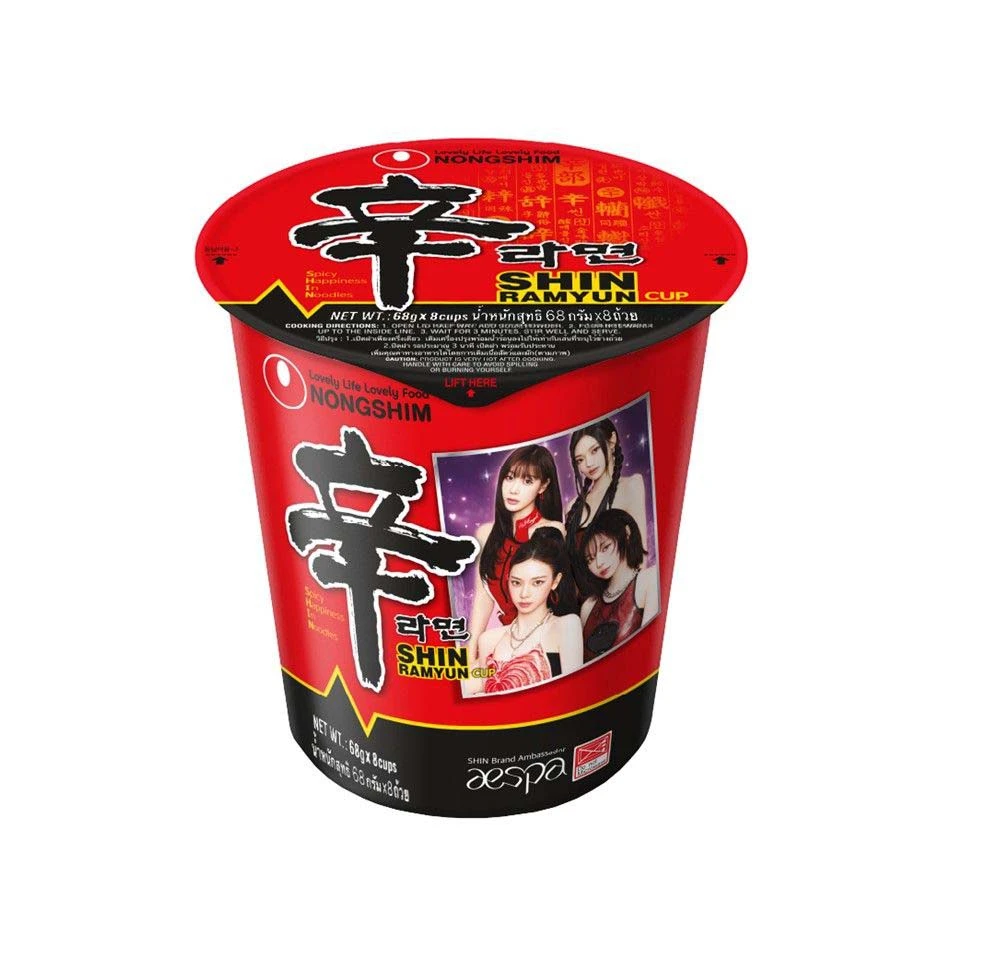
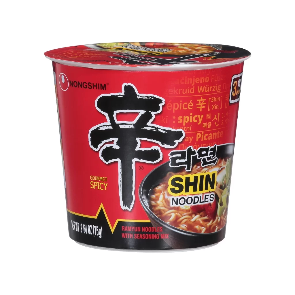
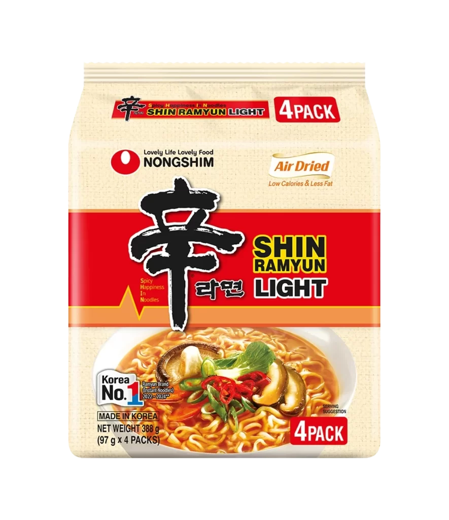
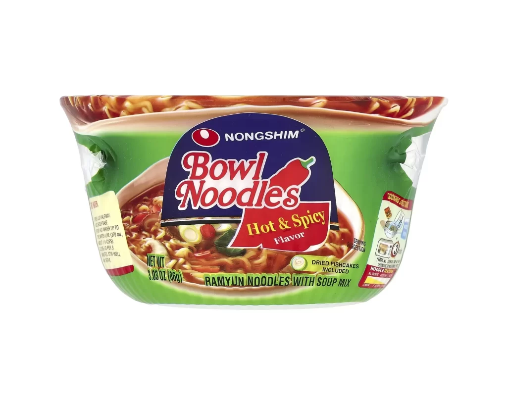
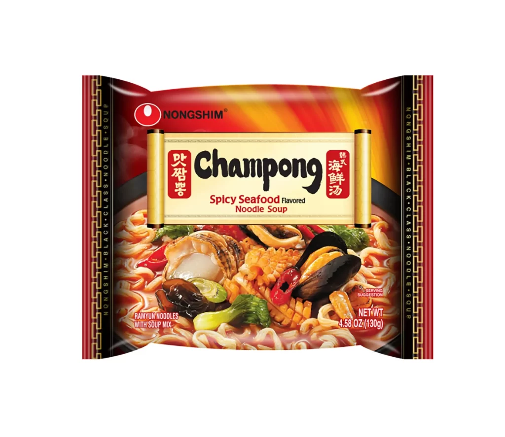
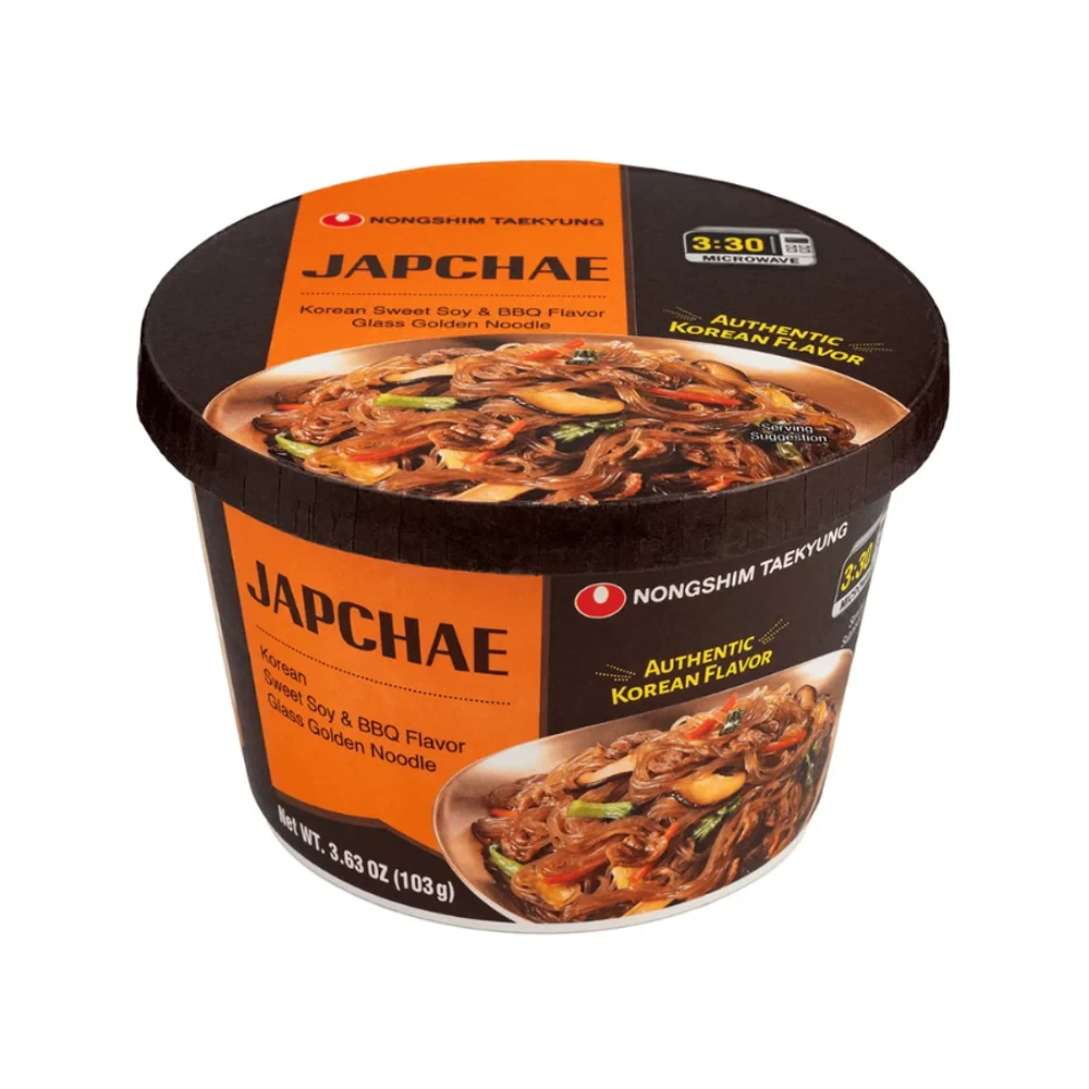
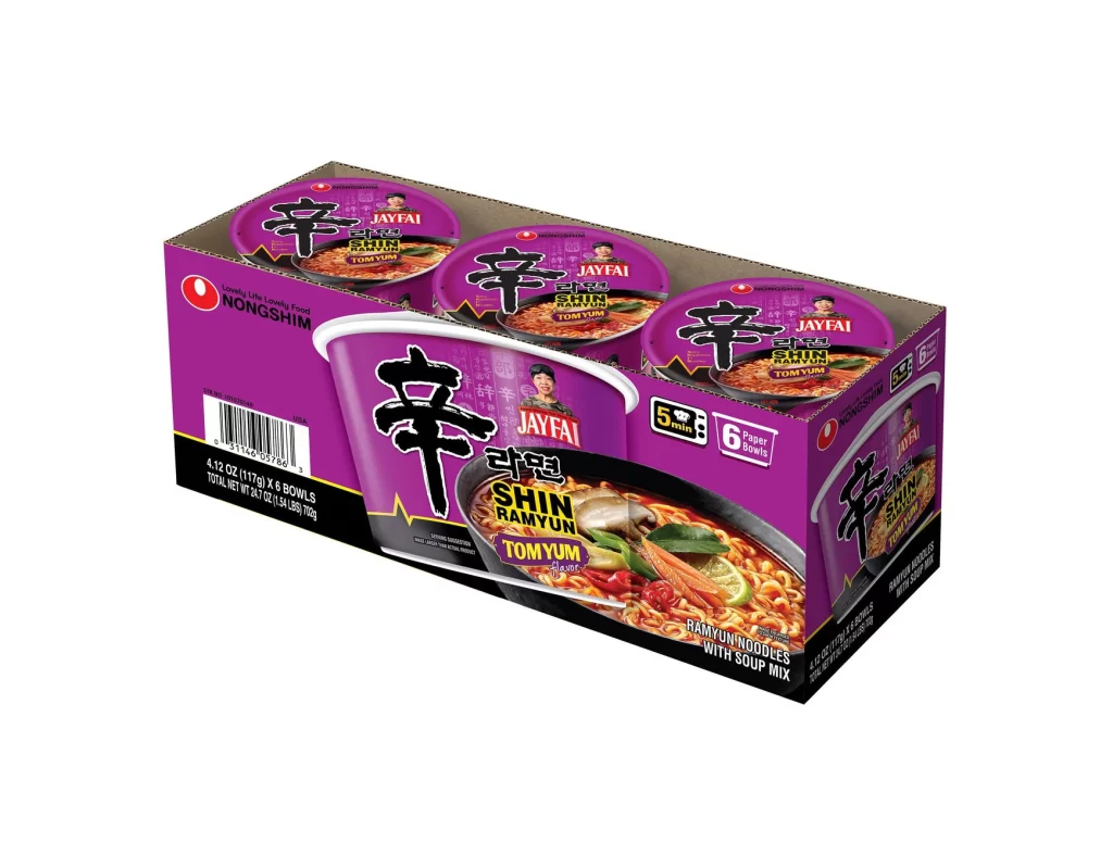
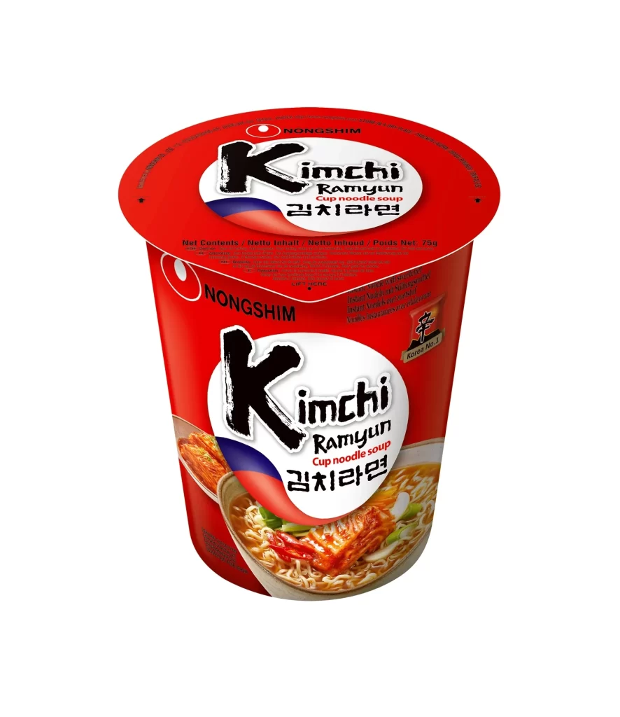
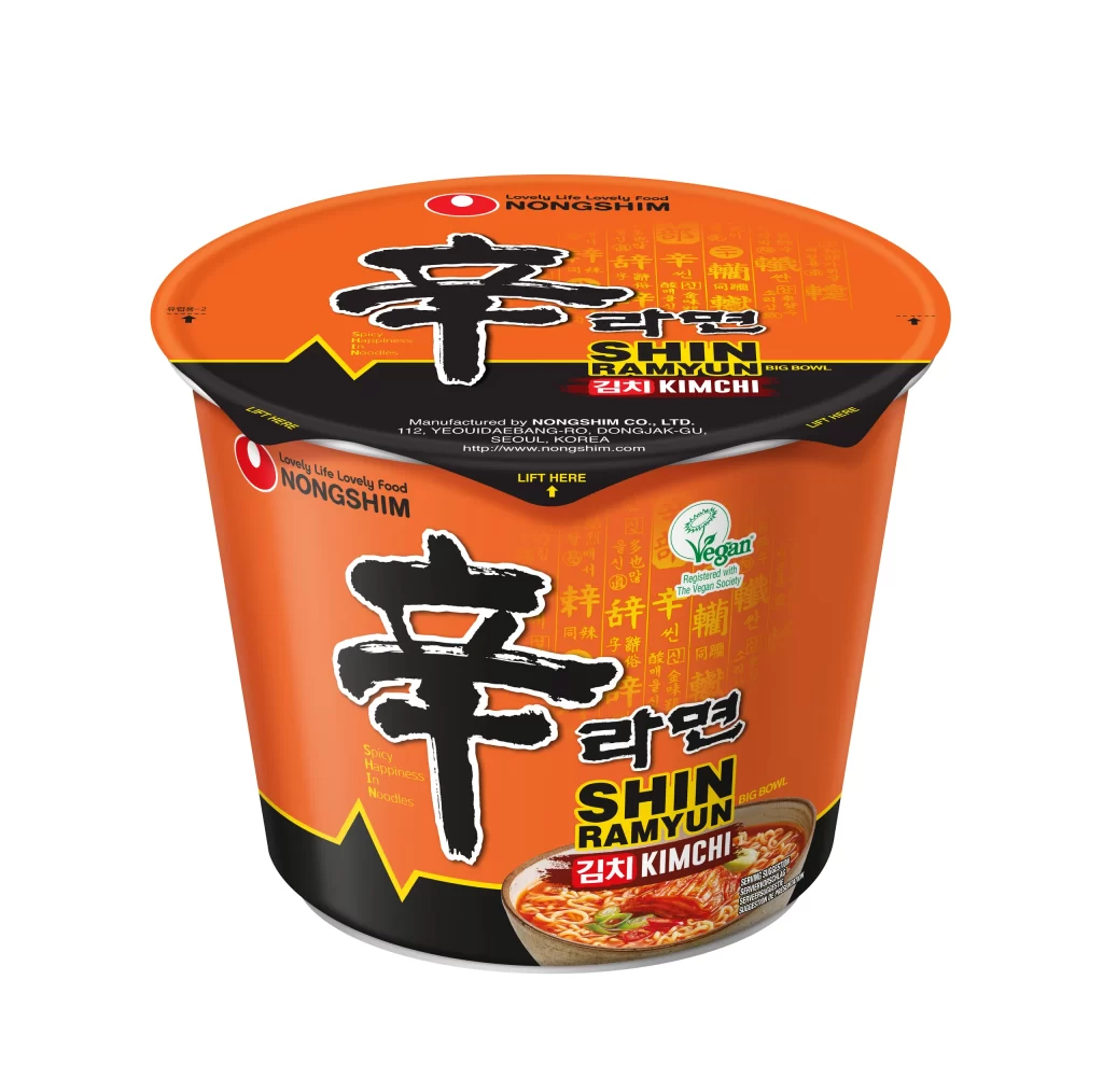
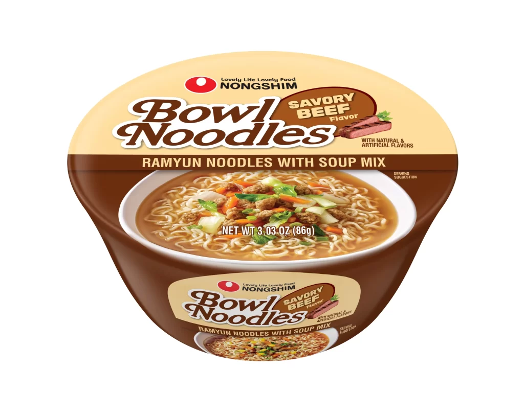
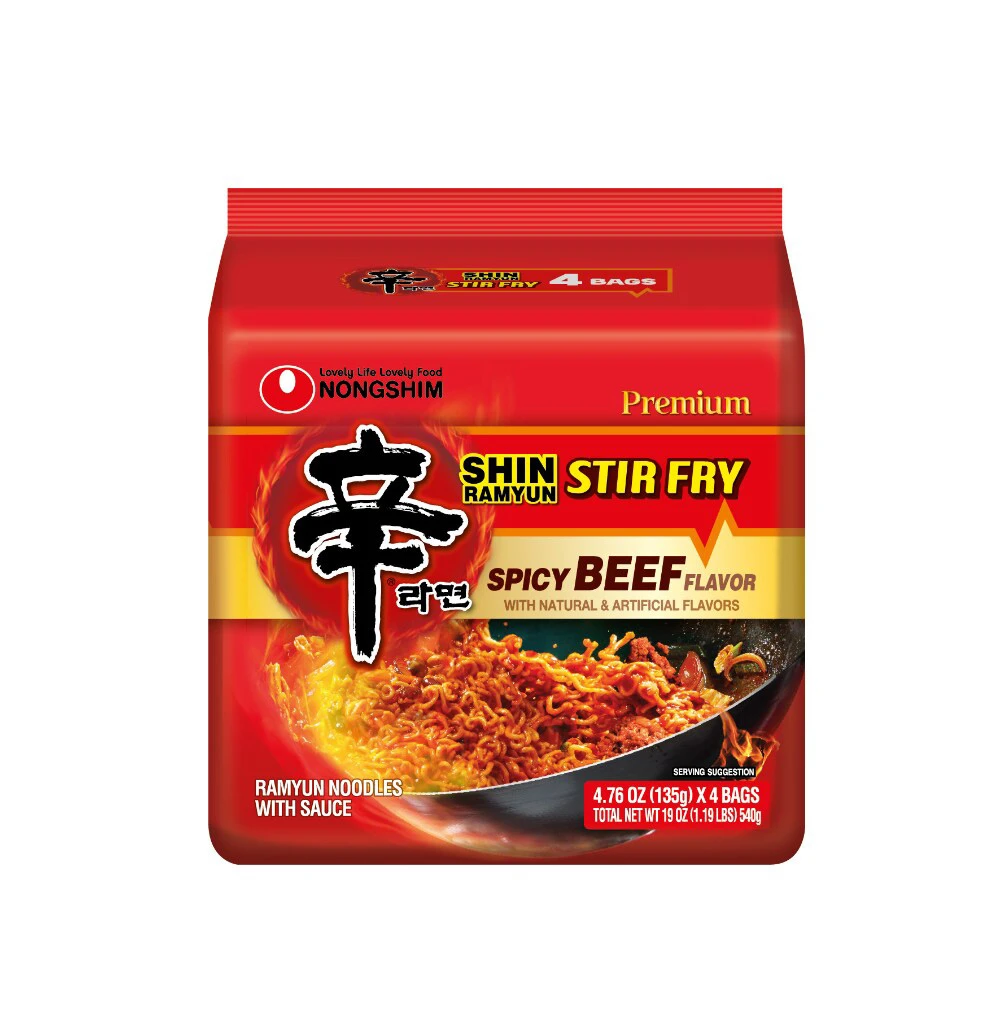
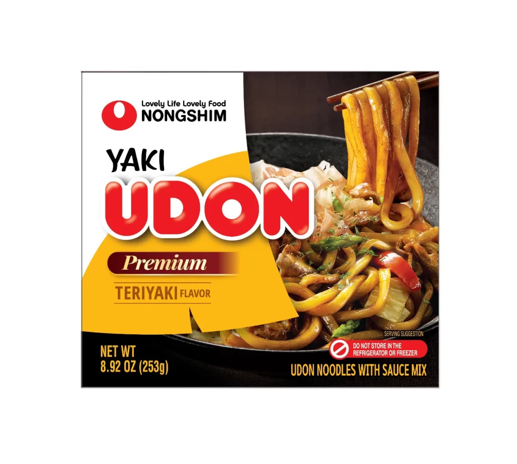
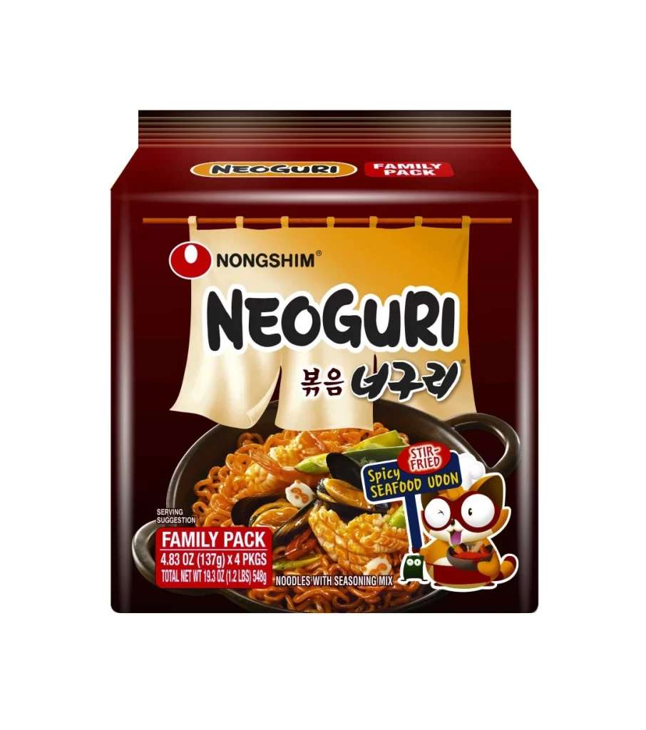
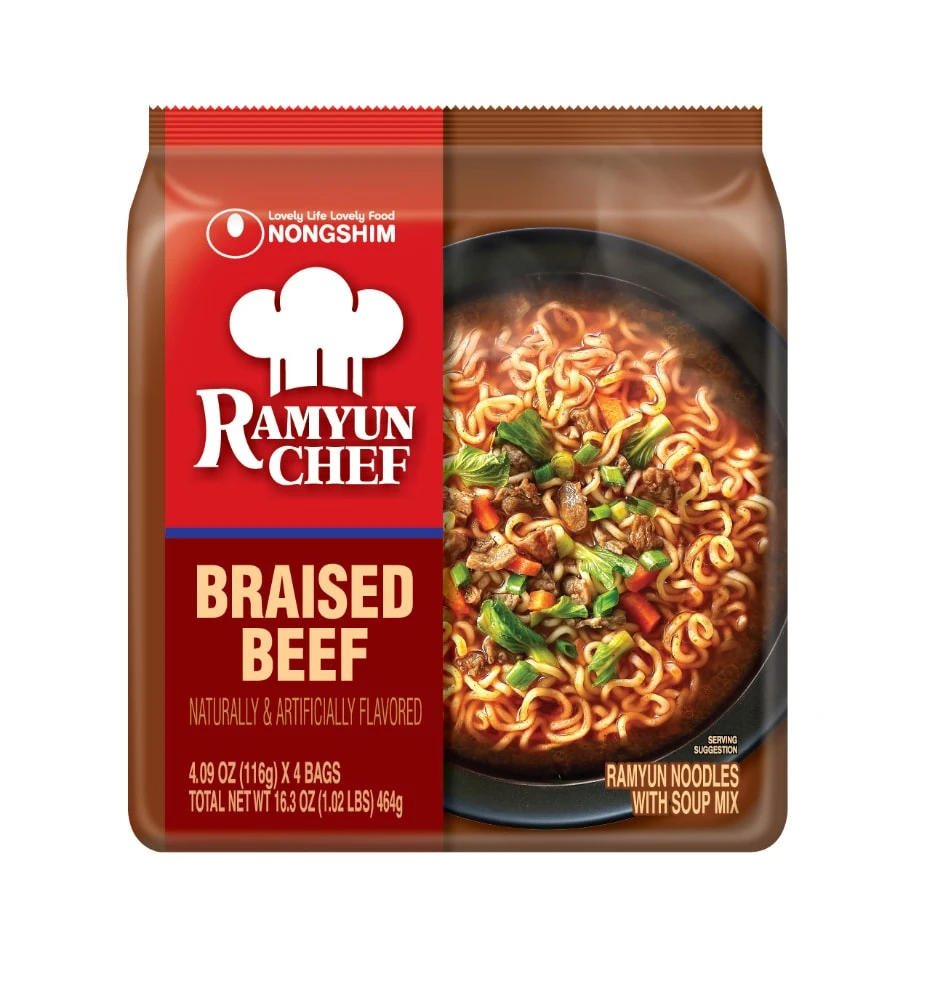
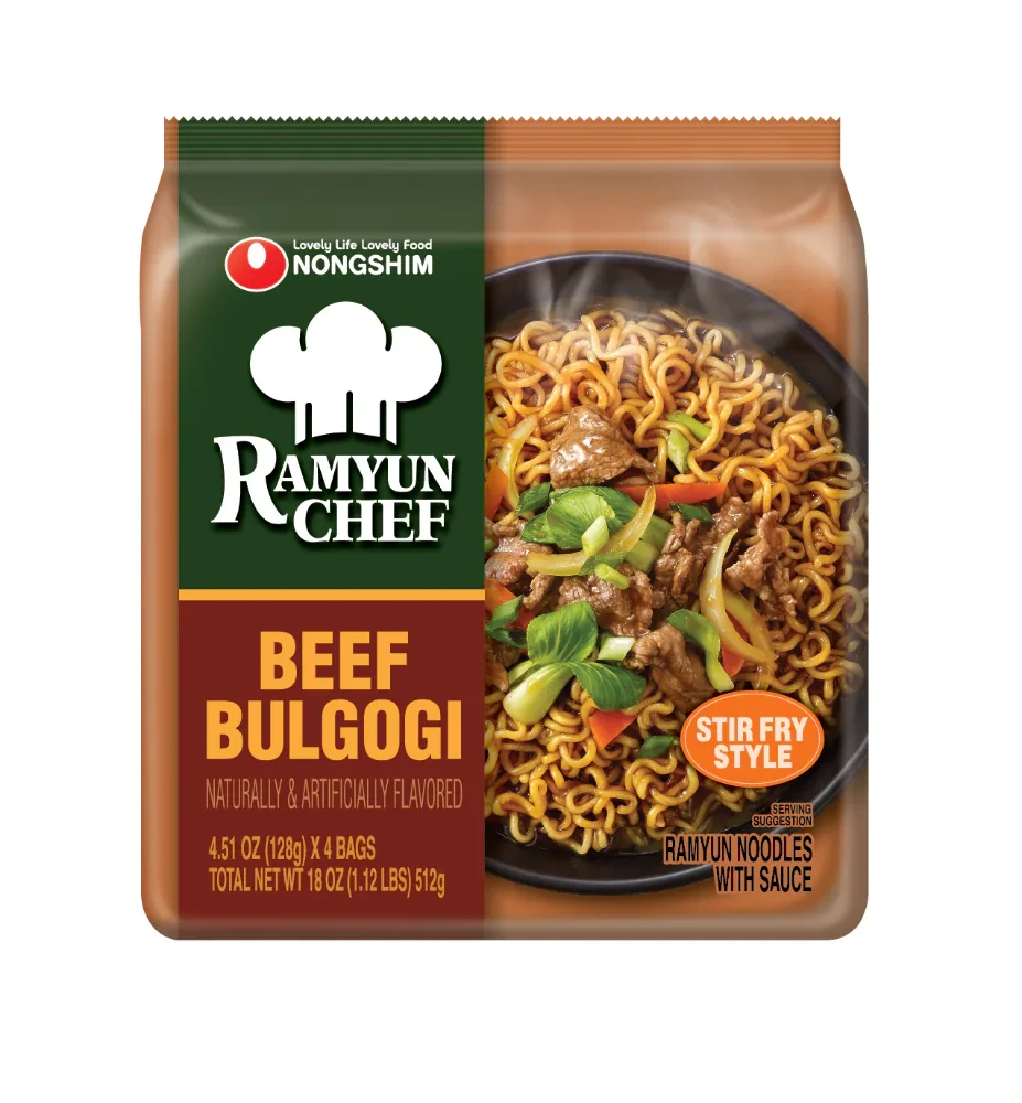
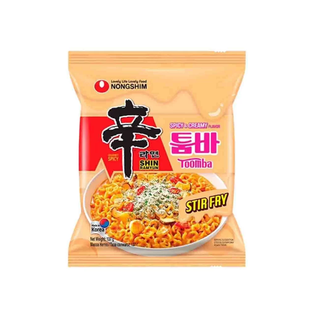
A vibrant orange plastic pouch dominates the frame, sealed at the top with horizontal crimping that suggests a flexible, lightweight material. The composition centers on a bold red triangular graphic behind the large black Korean character '辛', while the Nongshim logo sits quietly in the upper left corner. Below, an oval photographic inset displays golden-hued noodles garnished with red chili slices and white powder, all set against a clean white background with even studio lighting eliminating any harsh shadows.
Visual hierarchy here relies on the aggressive contrast between the saturated red wedge and the surrounding peach-toned field, forcing the eye toward the spicy flavor indicator before drifting to the pink 'Toomba' typography. The stir-fry variant distinguishes itself through the yellow diagonal banner cutting across the lower right quadrant, introducing a tertiary accent that breaks the otherwise symmetrical layout. Subtle textural details in the noodle photography—specifically the glistening oil sheen and scattered herb particulate—add tactile credibility to the two-dimensional surface.
Packaging analysts might deconstruct this layout to understand how Korean food brands balance traditional calligraphy with contemporary English sub-branding for international markets. Color theorists could examine the specific CMYK values of the orange-to-red gradient to replicate this appetite-stimulating palette in their own snack-product concepts. Typography students would benefit from studying how the rounded 'Toomba' letterforms soften the angularity of the main Hangul script, creating a cohesive yet dynamic visual language across the entire face.