Nongshim Shin Ramyun Tom Yum Ramen Packaging
Topics
Details
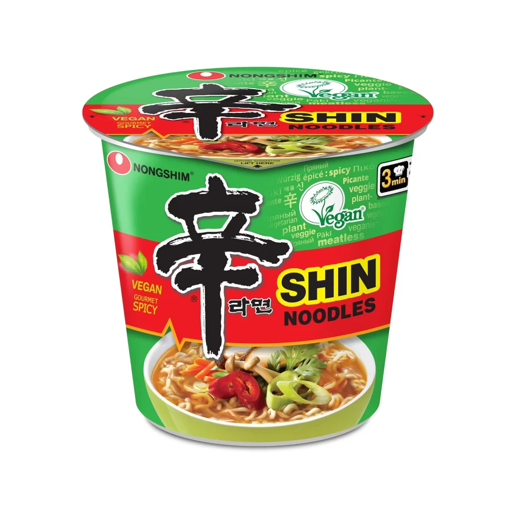
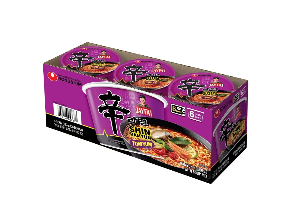
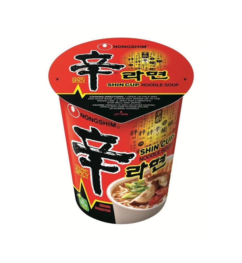
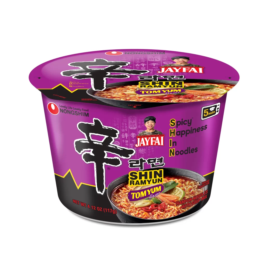
A vibrant purple cylindrical cup dominates the frame, featuring a black lower band that creates a sharp visual contrast. The packaging displays the iconic bold, black calligraphic 'Shin' character prominently on both the lid and the body, set against the saturated violet background. Visible text includes 'NONGSHIM', 'JAYFAI', and 'TOM YUM flavor' in yellow and white typography, alongside a photographic image of the prepared ramen with visible lime slices and chilies. The object is photographed from a slight three-quarter angle against a clean white studio background, utilizing even, shadowless lighting that highlights the glossy finish of the plastic material.
Distinctive design elements set this Tom Yum variation apart from the standard red Shin Ramyun through its unconventional color palette and celebrity endorsement integration. The purple hue immediately signals the sour-spicy flavor profile while maintaining brand recognition through the consistent placement of the large Korean logotype. Jay Fai's portrait adds an authentic culinary authority to the product, bridging Korean noodle technology with Thai gastronomic tradition in a single cohesive visual statement.
Brand managers analyzing cross-cultural food marketing strategies would examine this artifact for its effective use of color psychology in flavor differentiation. Packaging engineers might study the structural layout of the lid versus body graphics to optimize information hierarchy for retail shelf impact. Culinary historians could document this specific collaboration as a case study in how global instant food brands localize products through regional chef partnerships.