Nongshim Super Spicy Ramen Packaging
Topics
Details
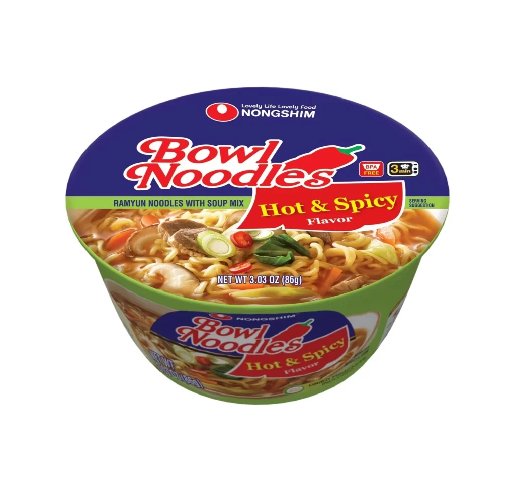
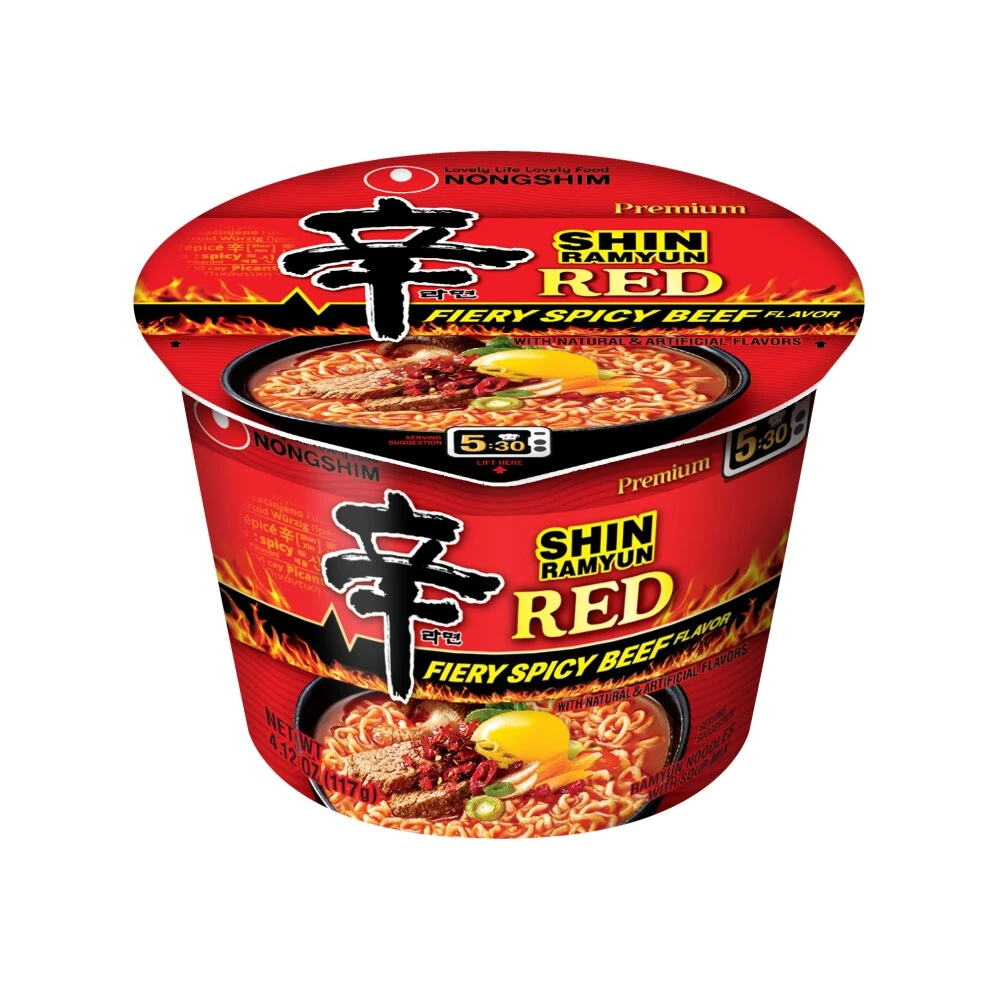
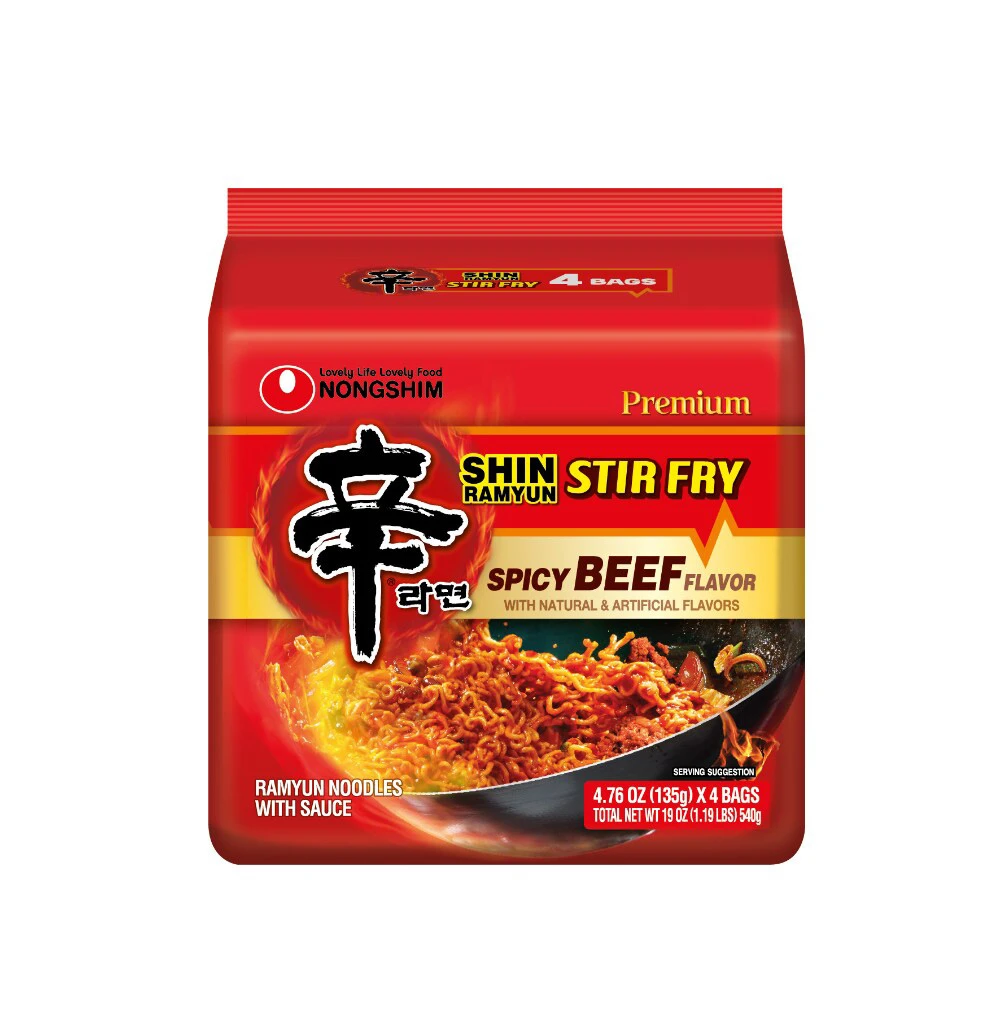
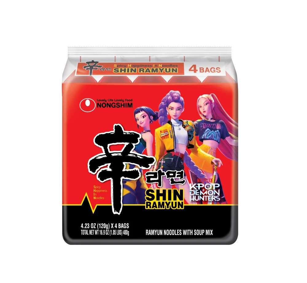
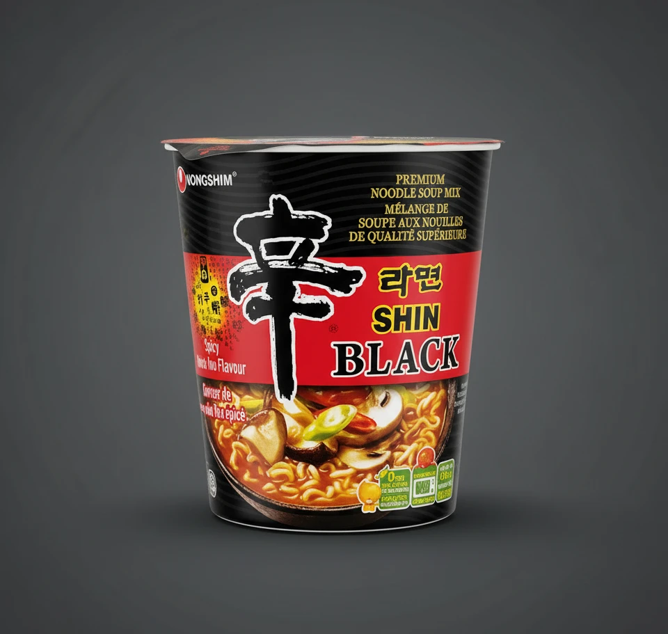
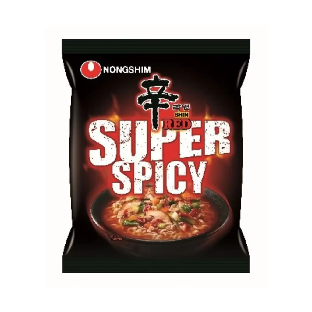
A glossy black plastic pouch serves as the canvas for the Nongshim Super Spicy Ramen packaging, featuring a red circular logo and white sans-serif brand name in the upper left corner. The large Korean character '辛' dominates the upper center, positioned above 'SHIN RED' and the massive, distressed white typography of 'SUPER SPICY' that glows with an intense red aura. A photographic image of ramen in a black bowl, showing noodles, vegetables, and a reddish broth, anchors the bottom portion of the design.
Visual intensity defines this particular variant through its aggressive typographic hierarchy and saturated color palette. The distressed texture applied to the English text suggests ruggedness and extreme heat, distinguishing it from standard ramen packaging. By placing the product photography within a fiery halo effect, the design creates an immediate sensory association with spiciness before the consumer even reads the flavor description.
Food packaging analysts might examine this asset to study how color psychology influences perceived spice levels in snack marketing. Brand identity specialists could reference the typography when developing edgy sub-brands for existing product lines. Illustrators working on culinary projects often look to such compositions for guidance on balancing photographic realism with graphic text overlays.