Pasta Packaging Sapore Colorful Modern
DownloadTopics
Details
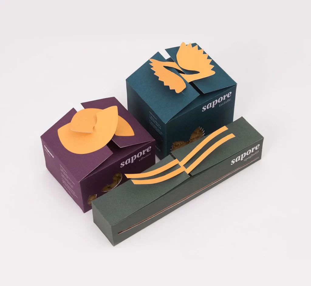
Three pasta boxes from the brand 'sapore' cluster together on a light surface, each rendered in a distinct matte hue—deep plum, forest teal, and charcoal gray. The packaging features die-cut paper shapes in a warm ochre tone that mimic the actual pasta forms: ravioli, farfalle, and spaghetti strands, respectively. White sans-serif typography identifies the brand name alongside smaller text indicating the specific pasta variety, while soft studio lighting casts gentle shadows that emphasize the tactile quality of the uncoated cardboard.
Clever structural cutouts transform the box lids into three-dimensional representations of the product inside, creating an immediate visual shorthand between container and contents. The restrained palette of earthy tones against the darker base colors lends the collection a sophisticated, artisanal feel that stands apart from conventional grocery store aesthetics. Designers seeking to study this interplay of form and function can access the full-resolution file at no cost through our resource library.
Packaging architects will find value in analyzing how these folding mechanisms integrate decorative elements with functional closure systems. Brand strategists might reference the color-coded differentiation when developing premium food product lines that require shelf distinction without relying on photography. Art directors working on editorial spreads about contemporary Italian gastronomy could employ this imagery to illustrate trends in sustainable, minimalist branding.