Pasta Re-olive Modern Minimalist
DownloadTopics
Details
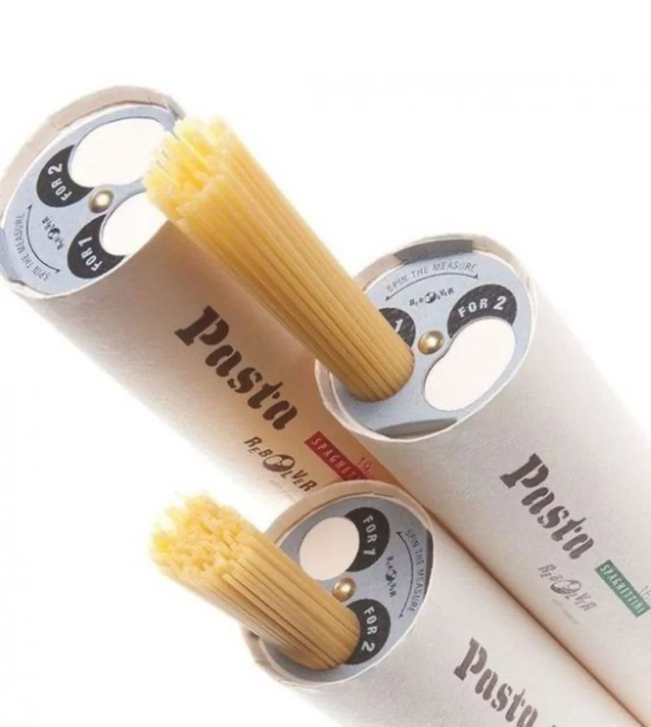
Three cylindrical pasta containers intersect at dynamic angles, their off-white cardboard bodies bearing the word "Pasta" in bold black serif type alongside the stylized brand name "Re-Oliver." Each tube features a metallic silver end cap with a rotating dial mechanism marked with portion indicators—"FOR 1," "FOR 2," and "FOR 4"—surrounding a central brass rivet. Bundles of pale golden spaghetti protrude from the openings, their uncooked strands catching soft diffused light that eliminates harsh shadows across the composition.
The packaging distinguishes itself through that integrated measuring dial, transforming a standard food container into an interactive kitchen tool with industrial design sensibilities. Typography choices balance the heavy weight of the product name against delicate secondary text reading "SPAGHETTI" and "SPAGHETTINI," while the silver hardware introduces a tactile material contrast against the matte paper substrate. Designers studying this reference can access the complete high-resolution file at no cost to examine those mechanical details up close.
Packaging engineers developing portion-control mechanisms for dry goods would find specific value in how the dial integrates structurally with the cylinder's end cap. Brand identity specialists might analyze the typographic hierarchy between primary product labeling and variant specifications. Photographers working on e-commerce catalogues could study the lighting setup that maintains texture visibility on both the cardboard surface and individual pasta strands without creating distracting glare.