RawBlends Dog Food Bag
Topics
Details
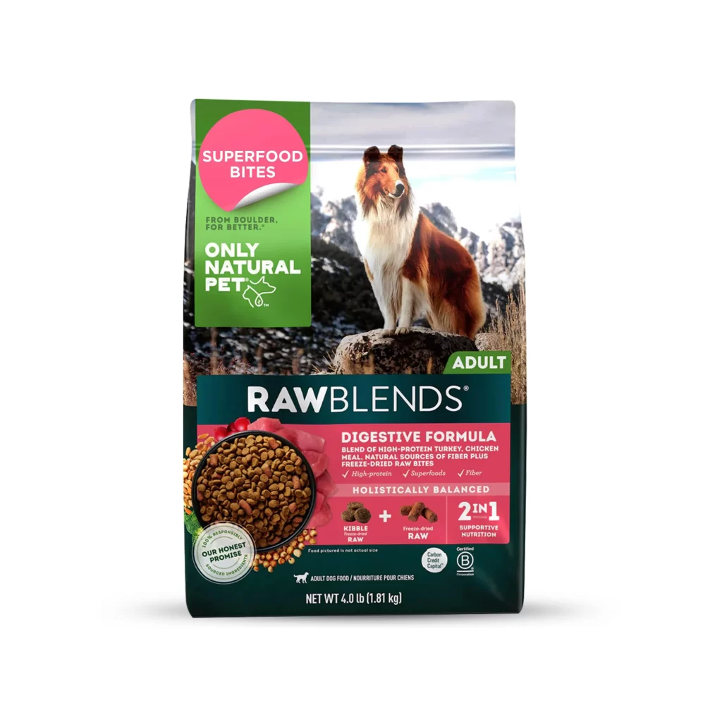
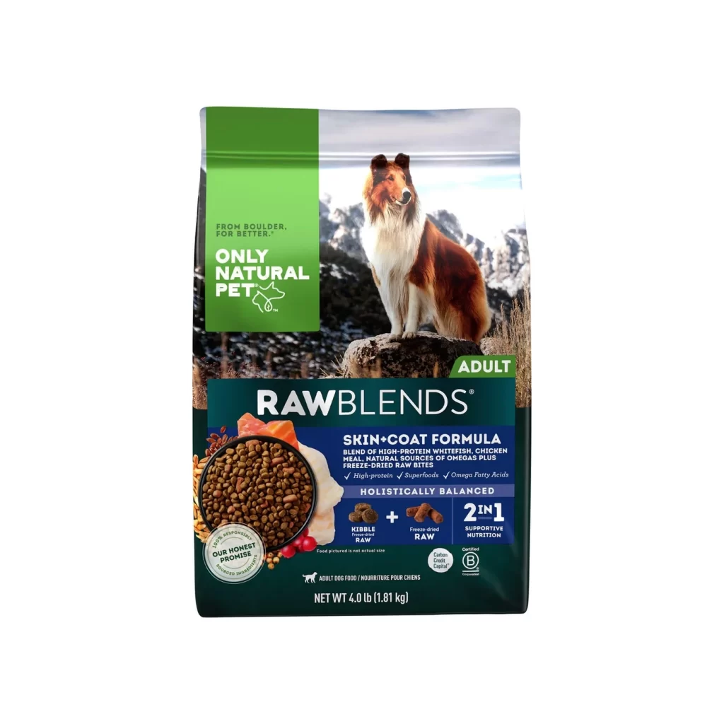
Dominating the left third of the package is a vibrant forest-green vertical panel bearing the 'Only Natural Pet' brand name in bold white sans-serif type. To the right, a photographic image features a Rough Collie sitting atop a rocky outcrop against a backdrop of snow-dusted mountains under a pale sky. The lower section transitions to a deep navy-blue field where the product name 'RAWBLENDS' appears in large white capitals above a circular window displaying the brown kibble mixed with freeze-dried raw pieces.
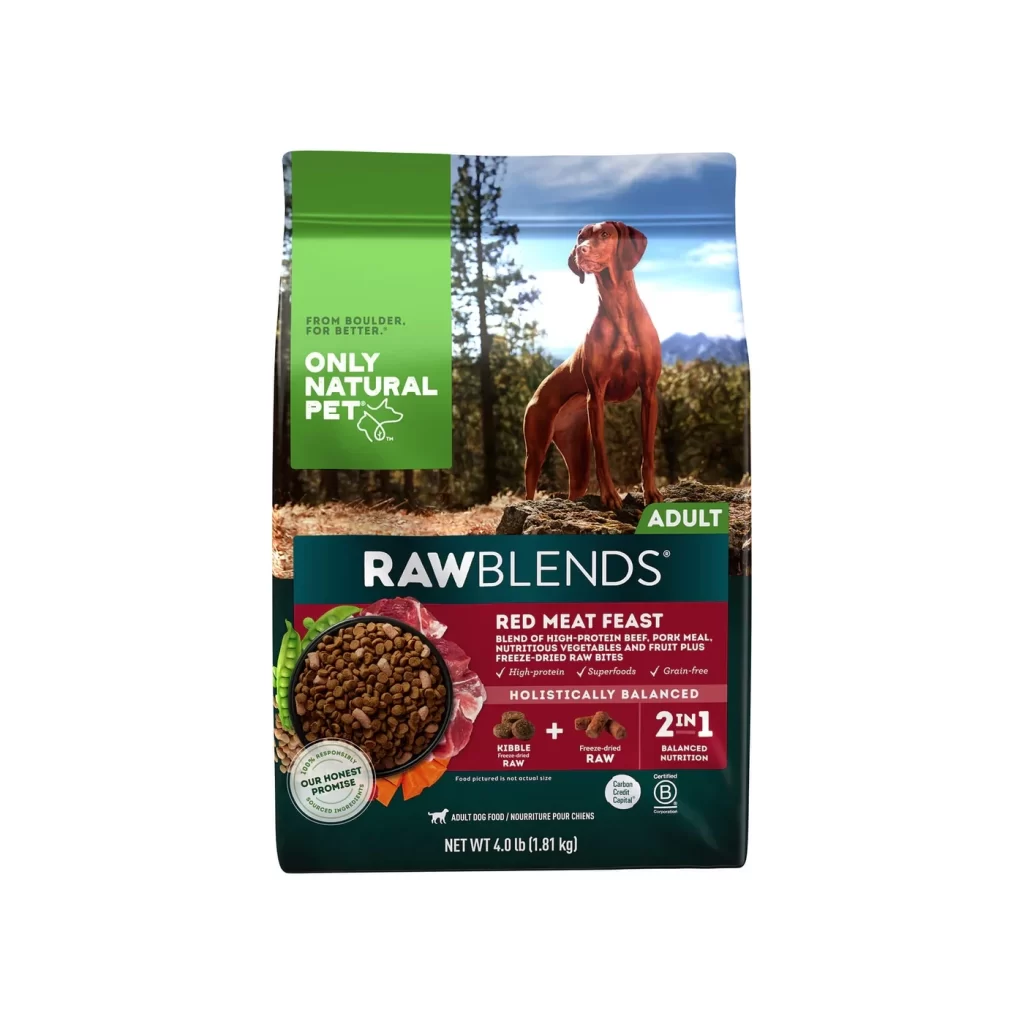
Visual hierarchy on this bag relies heavily on the contrast between the organic green branding block and the realistic nature photography that occupies the majority of the real estate. The dark teal footer anchors the composition with dense informational text and iconography, including a '2 in 1' badge and certification marks like the B Corp logo. This layout effectively balances lifestyle imagery with technical nutritional claims, using color blocking to guide the eye from brand identity down to specific formula benefits.
Packaging designers studying pet food market trends would find this example useful for analyzing how premium brands communicate holistic health benefits through typography and color choice. Marketing teams could reference the specific placement of the 'Skin + Coat Formula' callout when planning their own shelf-ready designs. Additionally, 3D artists requiring accurate texture references for synthetic packaging materials or printed paper finishes might study the surface details visible across the different colored zones.