Shiseido Synchro Skin Self-Refreshing Foundation Packaging
Topics
Details
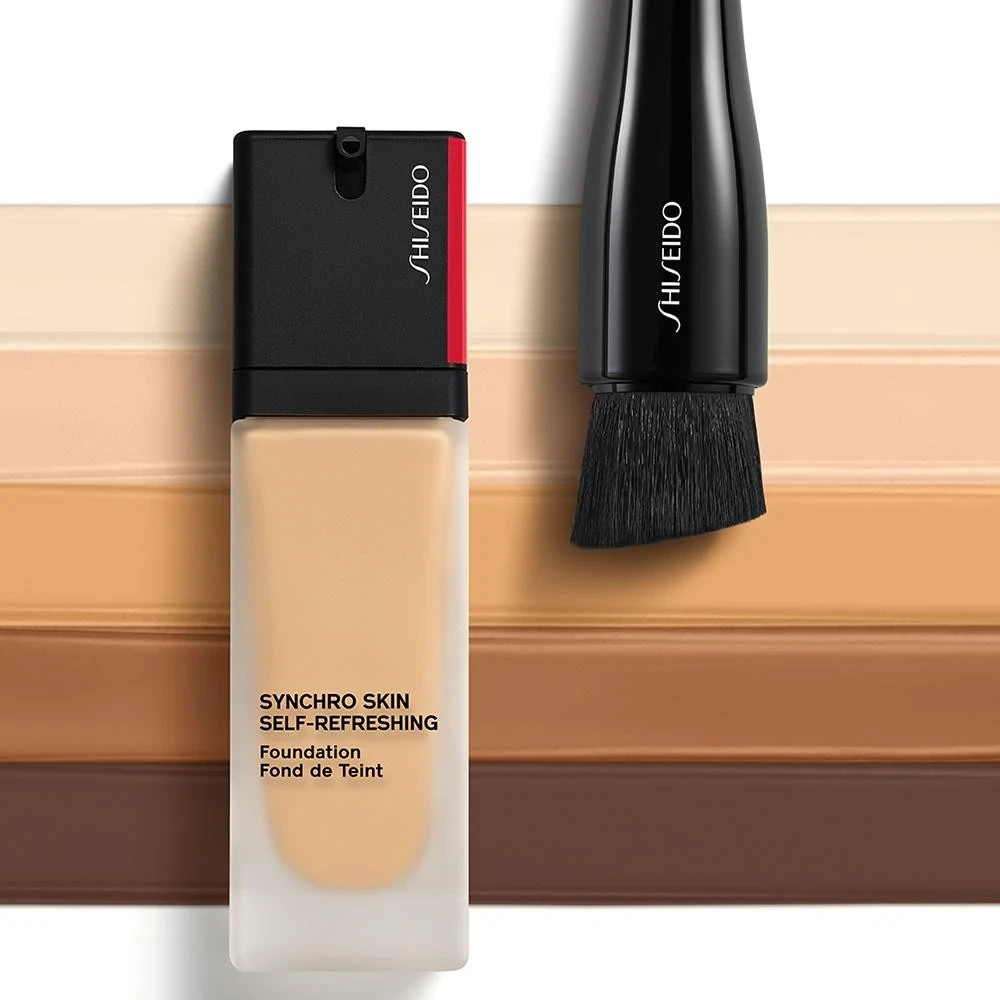
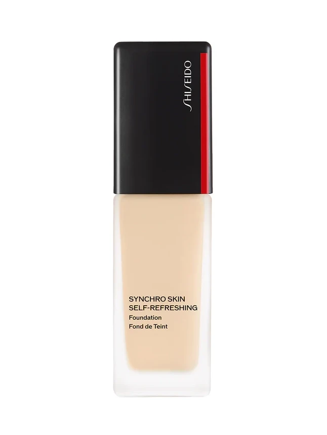
This post features a single foundation bottle packshot centered on a plain solid white background. Even studio lighting highlights the product with no props or people present. The bottle contains a light beige foundation visible through its frosted translucent material. It is a clean and straightforward product photograph for design study.
The design language centers on a rectangular bottle with slightly rounded edges that tapers at the bottom and widens at the top where the cap sits. A flat black cap features a vertical red stripe with SHISEIDO printed on it. The lower body displays SYNCHRO SKIN SELF-REFRESHING Foundation alongside the French line Fond de Teint. A pump-style dispenser typical of liquid foundations completes the functional aesthetic.
Designers can study the bilingual text placement and how the typography balances on the tapered frosted surface. The contrast between the flat black cap and the light beige liquid offers insight into color blocking in cosmetic packaging. The vertical red stripe provides a minimal yet bold accent worth examining. Additionally the pump-style dispenser integration demonstrates practical hardware meeting visual restraint.