Snack Packaging Asian Inspired Vibrant Floral Typography
Topics
Details
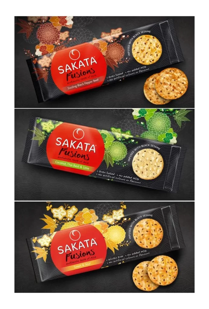
Three distinct varieties of Sakata Fusions snack packaging appear stacked vertically, each featuring a sleek black wrapper adorned with a bold red circular logo containing the brand name in white sans-serif type. The top package displays autumnal floral motifs in burnt orange and rust, while the middle variant showcases emerald green botanical patterns, and the bottom edition presents golden yellow chrysanthemum-inspired graphics. Actual crackers rest beside each wrapper, revealing a golden-baked texture speckled with black sesame seeds, all photographed from a slight three-quarter angle against a dark charcoal background with subtle geometric patterning.
Visual distinction emerges through the strategic fusion of traditional Asian aesthetic elements with contemporary snack-food branding, where intricate floral illustrations wrap around modern typography to create cultural depth. Each flavor variant employs a specific color-coded botanical theme that immediately communicates taste profiles while maintaining cohesive brand identity across the product line. The interplay between the matte black packaging substrate and vibrant accent colors creates sophisticated contrast, drawing the eye toward both the central logo and the realistic food photography positioned at the edges of the frame.
Brand managers developing premium snack lines for multicultural markets could analyze this composition to understand how regional visual languages translate into mass-market packaging appeal. Packaging designers tasked with creating flavor-differentiated product families within a single brand umbrella would benefit from studying how consistent structural elements accommodate varied decorative motifs. Marketing teams launching artisanal or health-conscious food products might reference these layouts when balancing nutritional claims—such as gluten-free and no-added-MSG notations—with ornamental design choices that suggest authenticity and craft quality.