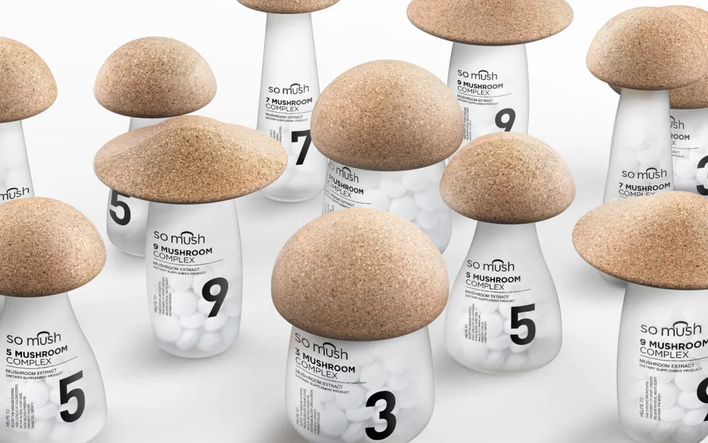
somush Mushroom Complex Jar Design
Topics
Details
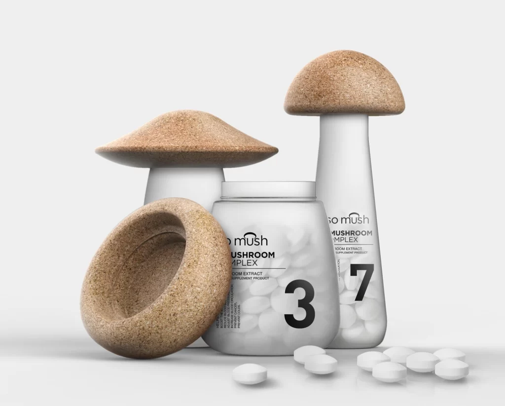
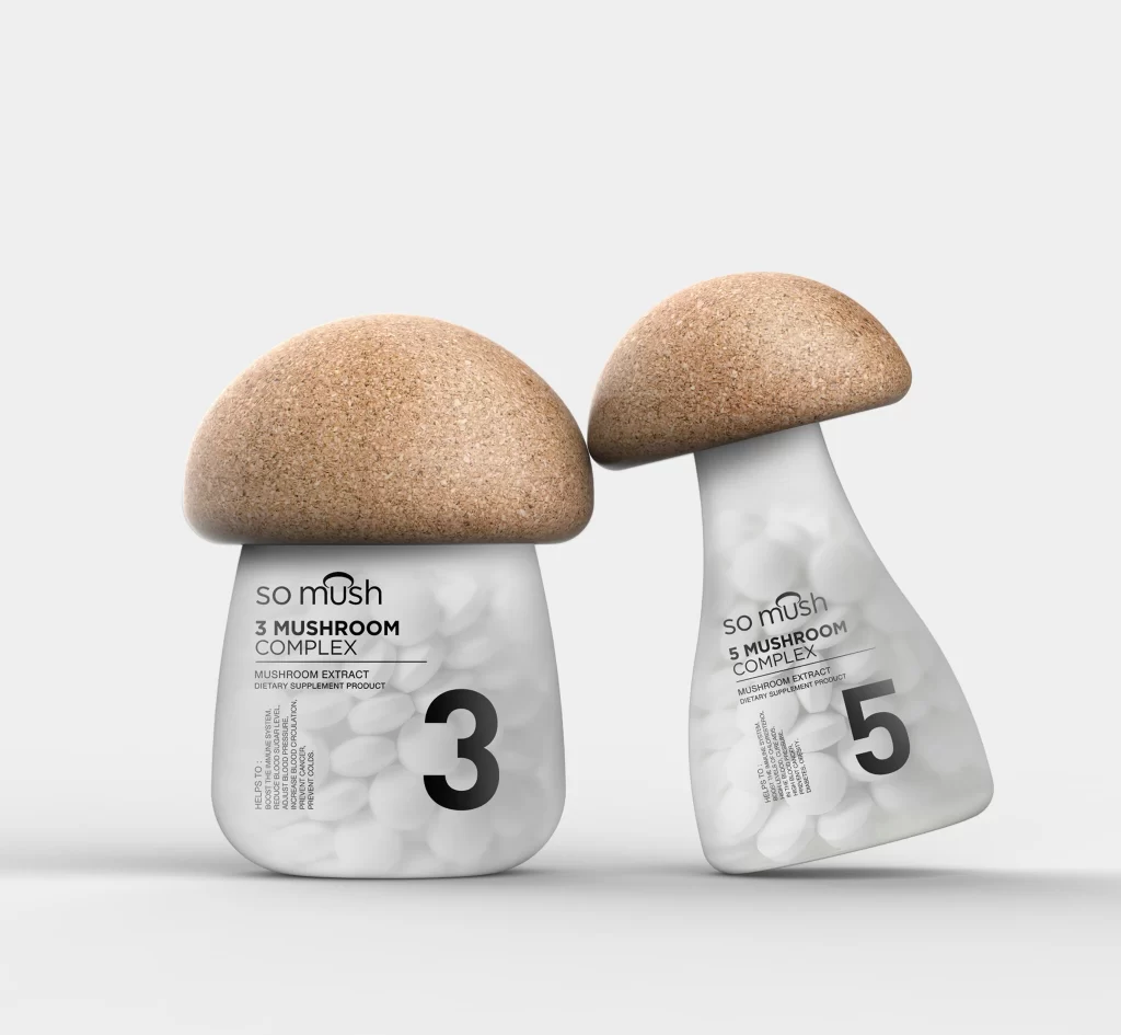
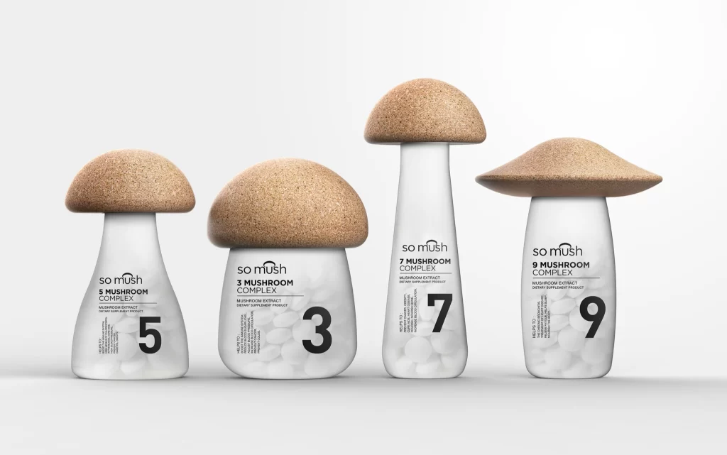
Frosted glass bottles shaped like mushroom stems support oversized cork caps that mimic natural toadstool tops, creating a whimsical forest of supplement containers. Bold black typography displays the brand name 'so mush' alongside product variants like 3, 5, 7, and 9 Mushroom Complex, while white capsules fill the translucent interiors. Soft studio lighting illuminates the scattered arrangement from a slightly elevated angle, highlighting the organic texture of the cork against the smooth matte finish of the glass.
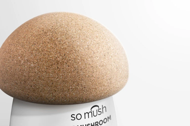
Material juxtaposition drives the visual intrigue here, contrasting the organic, granular surface of the cork against the smooth, clinical transparency of the pharmaceutical-grade glass. The playful literalization of the product’s contents through form—transforming a standard supplement jar into a whimsical toadstool—creates immediate shelf presence while maintaining functional elegance. Subtle variations in cap diameter across the numbered series suggest a systematic yet tactile approach to product differentiation within the line.
Industrial designers studying sustainable closure mechanisms would benefit from analyzing how the cork integrates structurally with the glass neck. Packaging strategists could reference this case when developing visual identity systems for nutraceutical brands seeking to balance scientific credibility with approachable, nature-inspired aesthetics. Art directors working on wellness campaigns might also draw upon the composition’s rhythmic repetition of forms to inform their own spatial arrangements.