Una Tuna Omega-3 Zinc Chelate D3 Vitamin Mg B6 Forte Max Iron Gen Bottle
Topics
Details
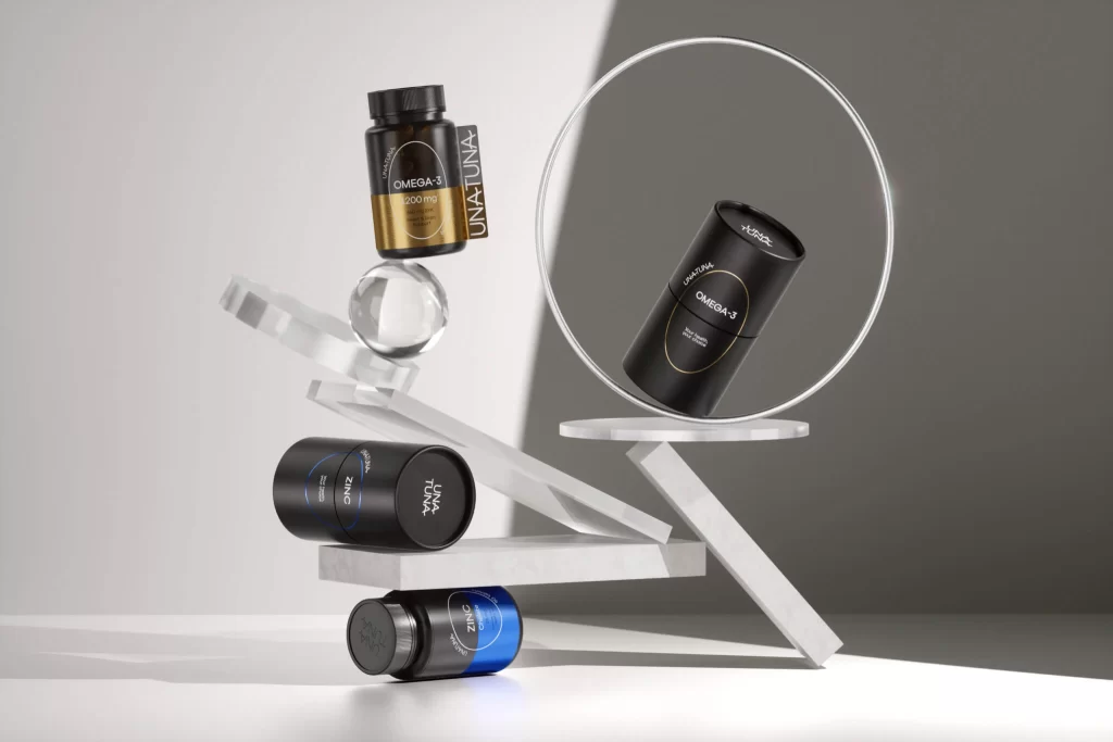
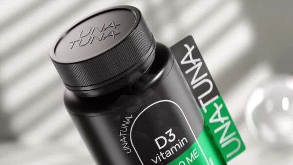
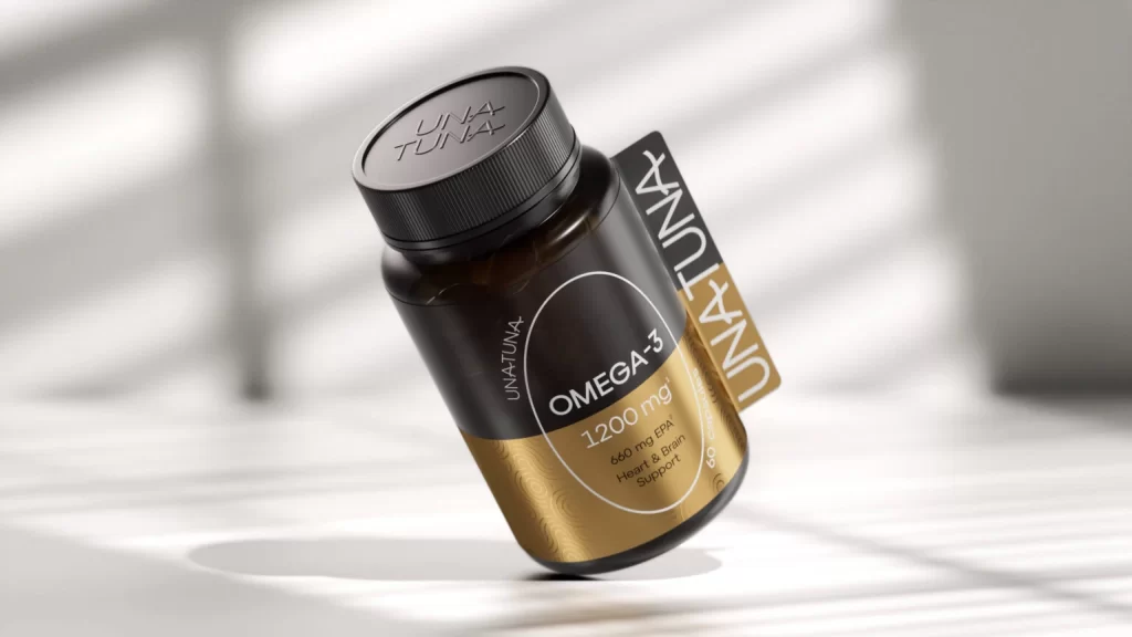
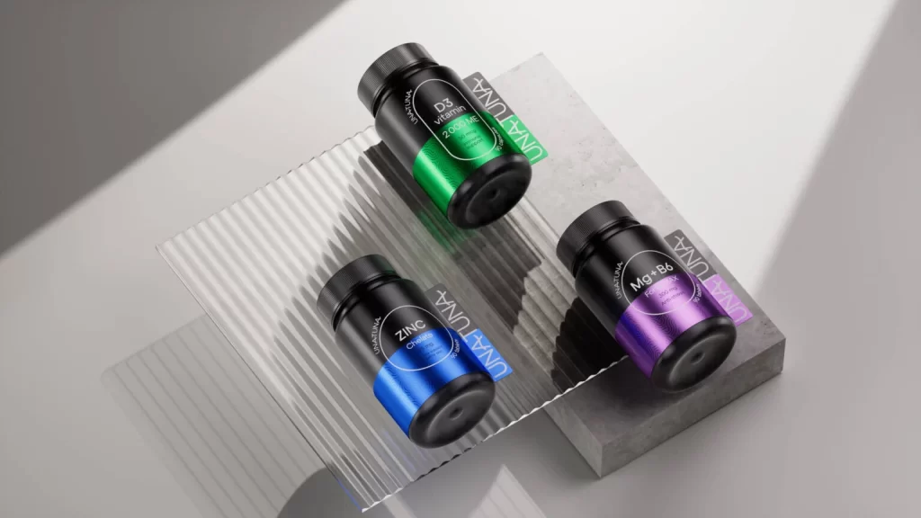
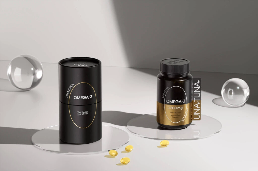
Five cylindrical supplement bottles stand in a neat row against a pale gray backdrop, each featuring a matte black upper half and a metallic lower section that shifts in hue from gold to blue, green, purple, and silver. Soft, diagonal light stripes cast across the scene from the upper left, creating subtle shadows that emphasize the smooth texture of the plastic containers and their screw-on caps. Every bottle displays the brand name 'UNA TUNA' vertically on a side tab, while the front labels clearly identify the contents as OMEGA-3, ZINC Chelate, D3 vitamin 2000MC, Mg+B6 Forte MAX, and IRON Gen respectively.
What sets this lineup apart is the sophisticated color-coding system that assigns a distinct metallic finish to each nutritional formula, turning a standard product range into a visually cohesive spectrum. The consistent use of an oval white graphic element on every label provides structural unity, while the vertical branding tabs add a modern, architectural flair that breaks the monotony of typical supplement packaging. This approach transforms functional health products into collectible design objects where color serves as an immediate visual identifier for the specific vitamin or mineral inside.
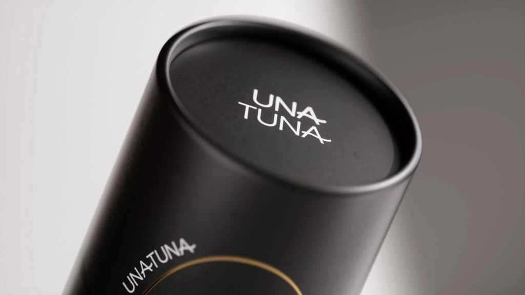
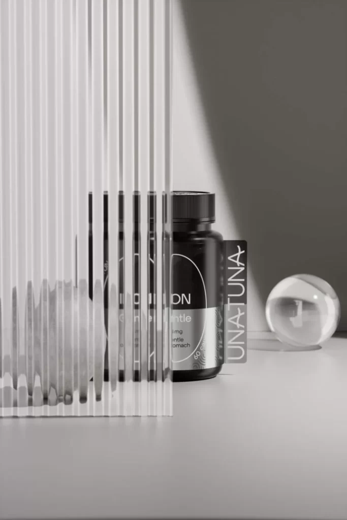
Product photographers studying commercial lighting setups will find the gradient shadows and reflective surfaces particularly useful for understanding how to shoot glossy packaging without harsh glare. Packaging designers working on premium wellness brands can study how metallic accents and minimalist typography combine to convey both scientific credibility and luxury appeal. 3D artists building mockups for client presentations might reference the precise material contrasts between the matte black caps and the shimmering lower bodies to achieve realistic renderings of cosmetic containers.