somush Mushroom Extract Jar
Topics
Details
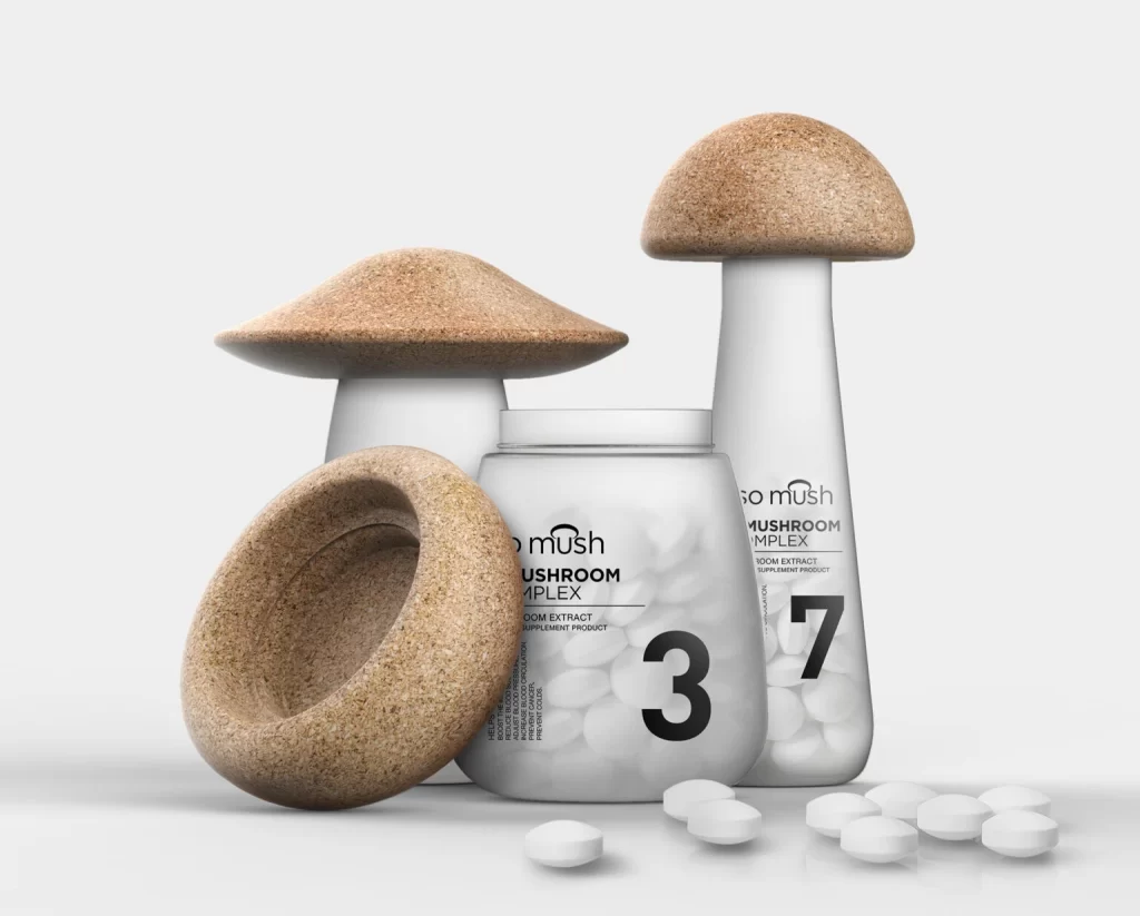
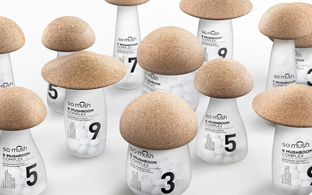
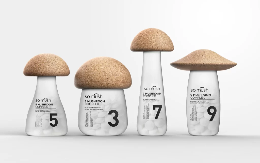
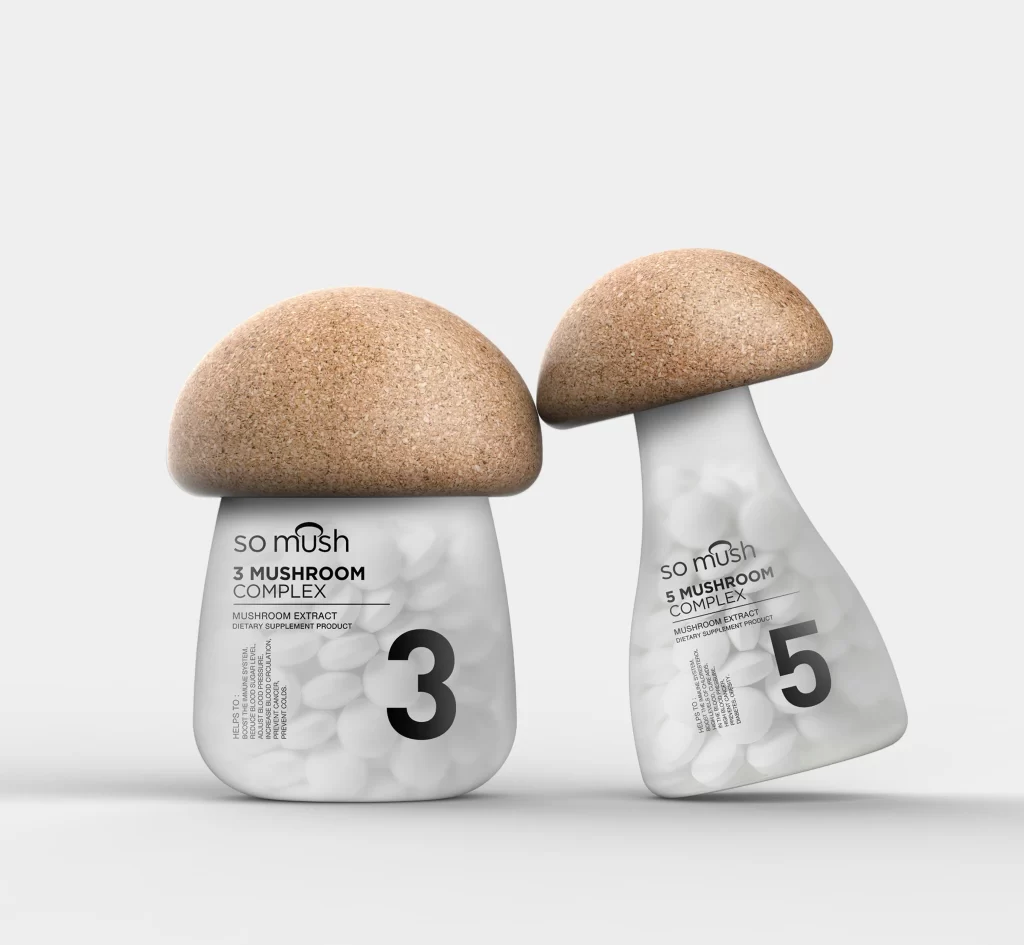
Two mushroom-shaped supplement containers stand side by side, each featuring a translucent white frosted glass body filled with pale capsules and topped with a natural cork-textured cap resembling a mushroom's dome. The left jar displays 'so mush 3 MUSHROOM COMPLEX' in bold black typography with a prominent numeral 3, while its right counterpart mirrors the design with '5 MUSHROOM COMPLEX' and the number 5, both set against a clean white background with soft studio lighting that highlights their organic curves and material contrast.
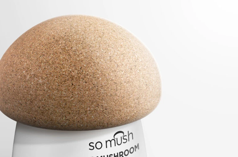
What sets this packaging apart is its literal interpretation of the product’s botanical origins, transforming a standard supplement bottle into a playful, sculptural object that immediately communicates its contents without relying on photography. The tactile contrast between the grainy, natural cork caps and the smooth, clinical transparency of the lower sections creates a sophisticated visual tension between earthy authenticity and modern wellness aesthetics. By varying the proportions between the ‘3’ and ‘5’ versions, the design establishes a clear visual hierarchy while maintaining strong family resemblance across the product line.
Product designers working on functional food or nutraceutical branding could study how this concept bridges whimsy with shelf presence, particularly when developing ranges that need to feel both approachable and premium. Packaging engineers might reference the structural execution of those weighted cork lids to explore how unconventional closures can become defining brand assets rather than mere afterthoughts. Anyone crafting visual identity systems for organic or fungi-based goods would find valuable lessons here in balancing literal imagery with minimalist typography to avoid looking gimmicky.