somush Mushroom Complex Jar View
Topics
Details
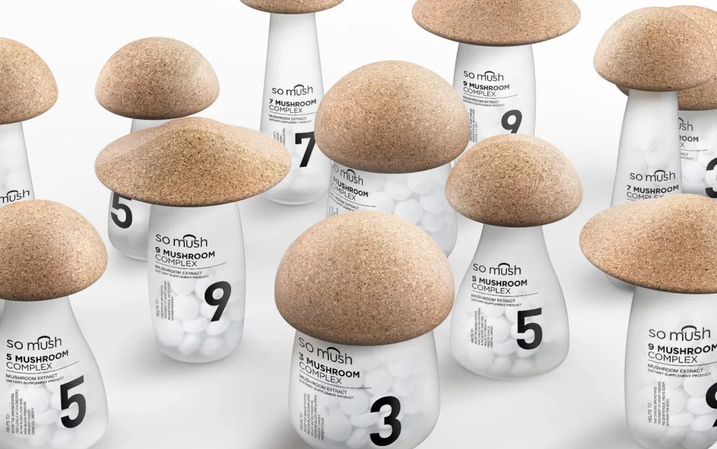
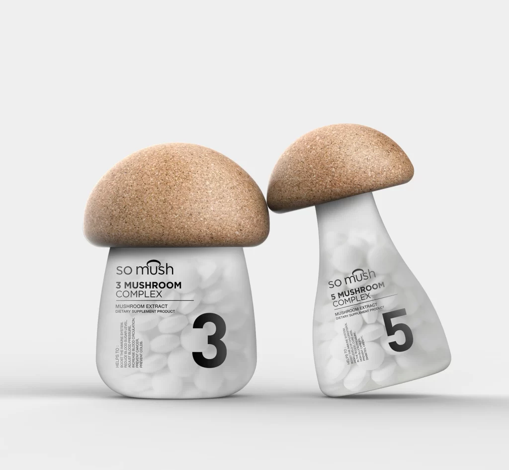
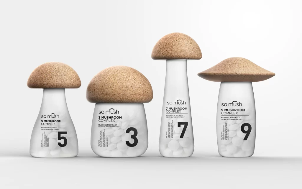
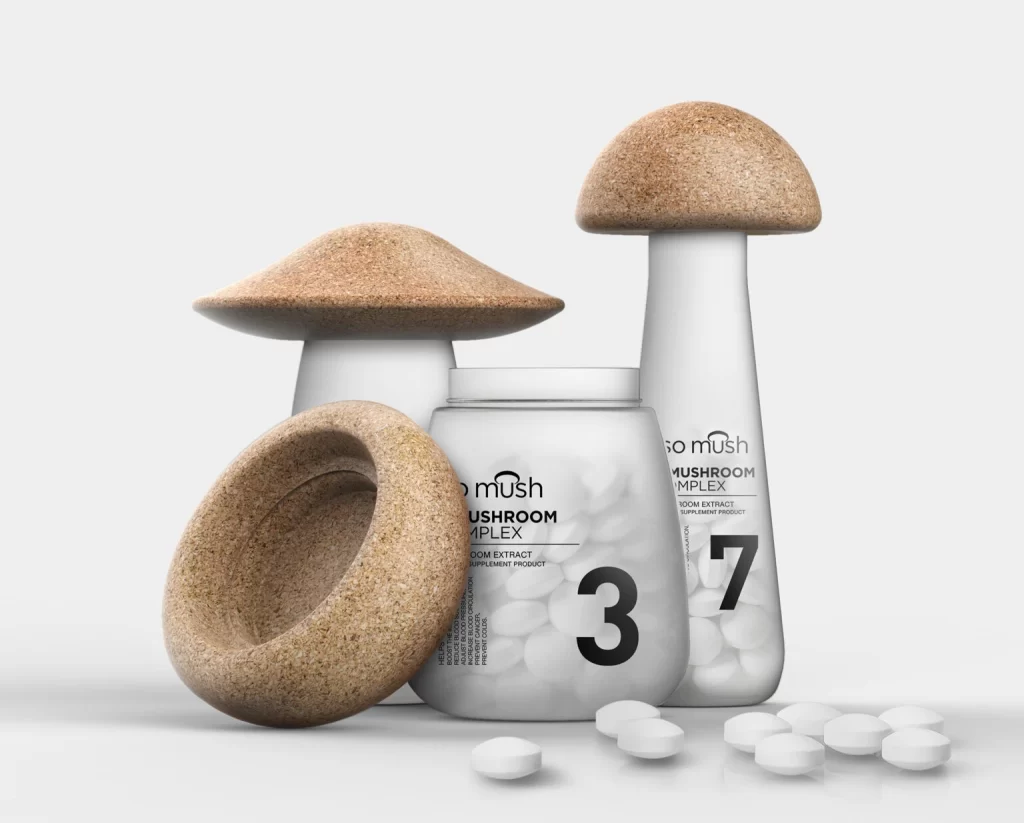
Three white supplement containers shaped like mushroom stalks stand in a staggered arrangement, each topped with a textured cork-like cap in warm tan. The central jar displays bold black typography reading 'so mush MUSHROOM COMPLEX' alongside a large numeral '3', while the taller bottle to its right features the number '7' and identical branding. Soft, diffused lighting illuminates the matte white surfaces and scattered white tablets resting on the clean white ground plane, creating subtle shadows that emphasize the organic curvature of the cork lids.
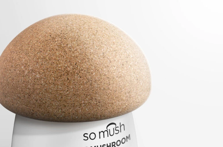
What distinguishes this packaging concept is its literal interpretation of the product’s botanical source through sculptural form. The cork material choice for the caps not only mimics the porous surface of fungal fruiting bodies but also introduces a tactile, sustainable element that contrasts sharply with the clinical purity of the white pharmaceutical-grade vessels. Typography remains minimal and modern, with the lowercase “somush” brand name and clean sans-serif numerals allowing the silhouette to carry the visual narrative rather than relying on elaborate graphic decoration.
Product designers developing wellness or nutraceutical lines could study this composition to understand how organic metaphors can elevate utilitarian packaging into conversation pieces. Brand strategists might analyze the color palette and material juxtapositions when crafting visual identities for natural health products that need to feel both scientific and earthy. 3D artists and render specialists could examine the lighting setup and material shaders to replicate similar photorealistic product visualizations for their own client presentations or portfolio work.