somush Mushroom Complex Jar
Topics
Details
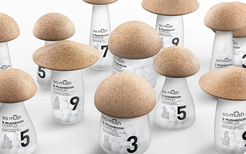
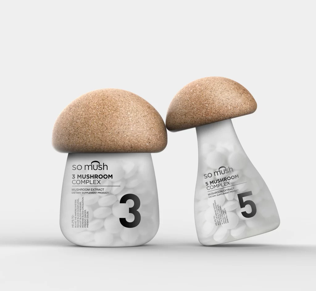
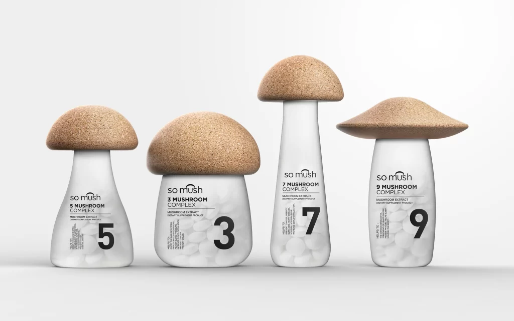
Four distinct mushroom-shaped containers stand in a neat row against a seamless white backdrop, each featuring a frosted white glass body topped with a natural cork cap that mimics the texture and color of a real fungal cap. The brand name "so mush" appears in a clean, lowercase sans-serif font above bold numerals—5, 3, 7, and 9—that identify each variant as a different Mushroom Complex. Soft, diffused lighting creates gentle shadows beneath the curved bases while highlighting the speckled grain of the cork lids and the translucent quality of the jars, all captured from a straight-on eye-level perspective that emphasizes their playful yet pharmaceutical silhouette.
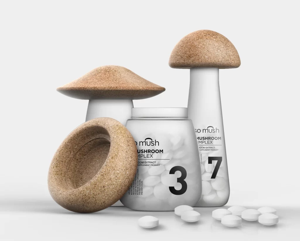
What sets this packaging apart is its literal interpretation of the product's botanical source, transforming functional supplement containers into whimsical sculptural objects through material contrast. The juxtaposition of organic, porous cork against smooth, clinical glass creates a tactile visual tension that bridges nature and modern wellness aesthetics. Varying proportions across the four sizes—from stout and rounded to tall and slender—add rhythmic diversity to the lineup while maintaining cohesive branding through consistent typography and monochromatic restraint.
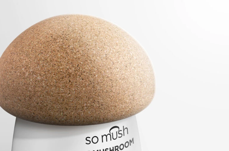
Product designers studying biomimetic packaging solutions will find valuable lessons in how these jars balance novelty with shelf-ready functionality. Marketing teams developing natural health brands could analyze the color palette and typographic hierarchy to understand how minimalism conveys purity without sacrificing personality. 3D artists tasked with creating cosmetic or nutraceutical visuals might study the subsurface scattering on the glass and the micro-texture of the cork to achieve similar material realism in their own renderings.