Toyo Suisan Udon Rich Flavor Purple White Red
Topics
Details
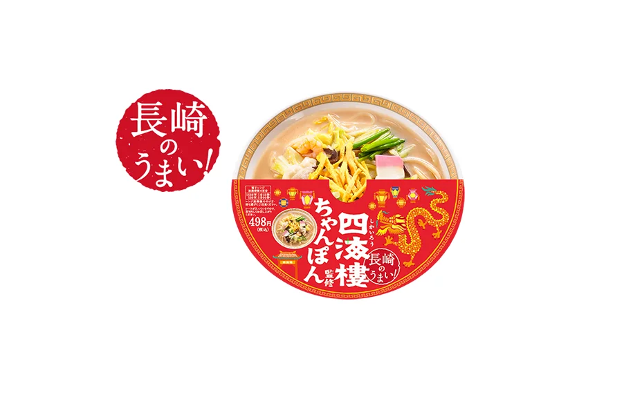
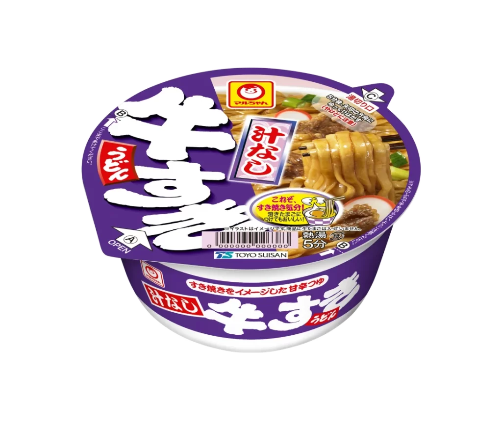
A round plastic cup of Toyo Suisan instant udon dominates the frame, featuring a deep purple lid and body accented by bold white Japanese characters and red rectangular labels. The packaging displays the Maruchan logo in yellow and red at the top, alongside a photographic window revealing thick noodles, beef slices, and green onions. White directional arrows marked 'A' for opening and 'C' for peeling sit on the left and right edges of the lid, while a barcode and the manufacturer's name appear near the bottom curve.
Vibrant purple serves as the dominant brand color here, creating strong contrast against the oversized white kanji typography that spells out 'Gyusuki' across the surface. The design balances traditional Japanese food photography with modern graphic elements like the comic-style speech bubble highlighting the five-minute cooking time. Red accent boxes containing vertical text add visual anchors that break up the purple field and guide the eye through the product information hierarchy.
Packaging designers studying Japanese convenience store aesthetics could analyze the typographic weight distribution and color blocking strategies used on this container. Brand identity specialists might reference the specific shade of purple and its interaction with red warning-style labels when developing Asian market food products. Illustrators requiring accurate depictions of contemporary noodle cup architecture could utilize the structural details visible in the rim shape and label placement.