Nissin Cup Noodle Black Oil Ramen Red Black Japanese Characters
Topics
Details
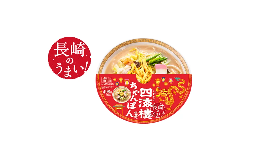
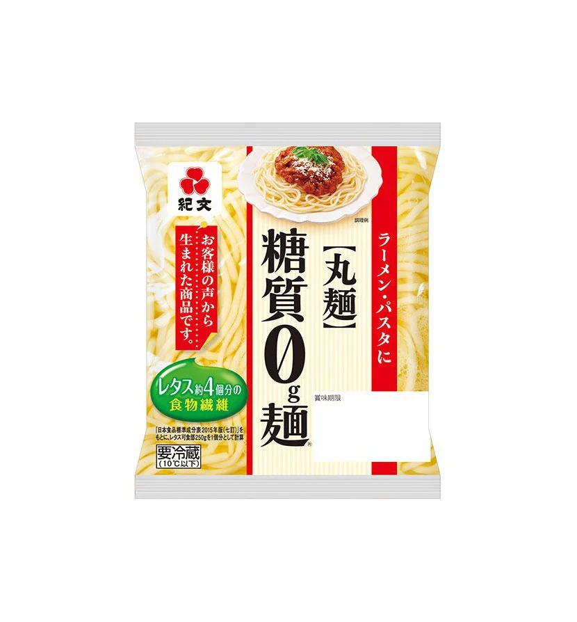
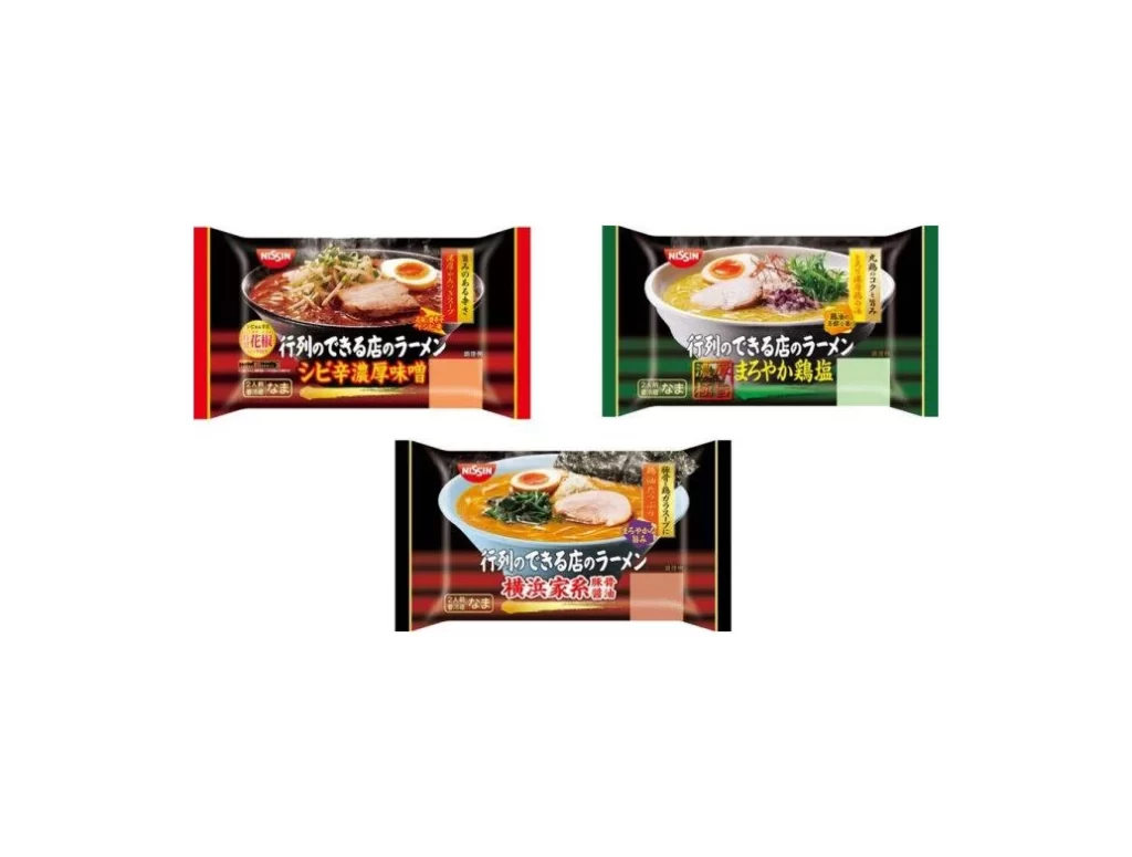
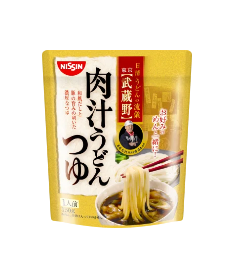
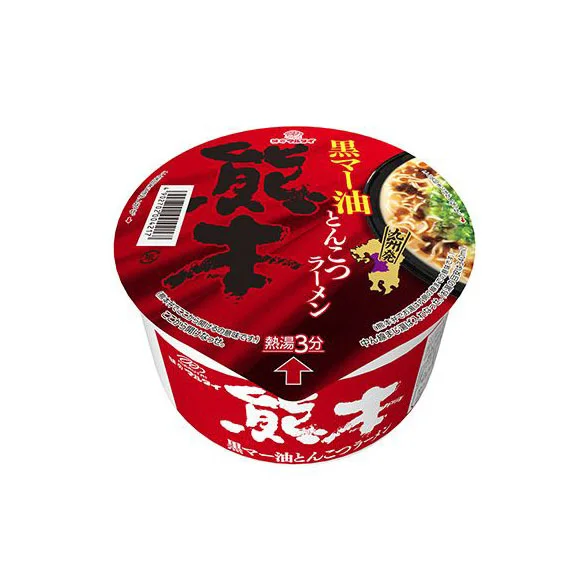
A cylindrical Nissin Cup Noodle container dominates the frame, wrapped in a deep crimson sleeve that contrasts sharply with bold black calligraphy and white sans-serif typography. The lid features the large kanji character '範' in a brushstroke style, flanked by vertical yellow text reading '黒マー油とんこつラーメン' (Black Ma Oil Tonkotsu Ramen) and a small photographic inset of the prepared dish garnished with green onions. A red arrow points upward toward the center, accompanied by the instruction '熱湯3分' (Hot water 3 minutes), while a barcode sits on the left edge and a purple regional map icon appears on the right.
Visual hierarchy relies on the aggressive interplay between the saturated red base and the heavy black ink strokes, creating immediate shelf impact through high-contrast color blocking. The circular composition draws the eye inward from the outer text ring to the central branding character, while the inclusion of realistic food photography alongside graphic elements bridges appetite appeal with product information. Typography mixes traditional Japanese calligraphy with modern instructional fonts, establishing a balance between cultural authenticity and contemporary convenience-food aesthetics.
Packaging designers studying Asian market trends would examine this object to understand how color psychology and typographic layering communicate flavor intensity and preparation speed. Industrial photographers could reference the lighting setup for capturing reflective plastic surfaces without losing legibility of fine print details. Brand strategists might analyze the spatial distribution of logos, nutritional information, and visual cues to optimize consumer decision-making at the point of sale.