Nissin Ramen Japanese Traditional Black White
Topics
Details
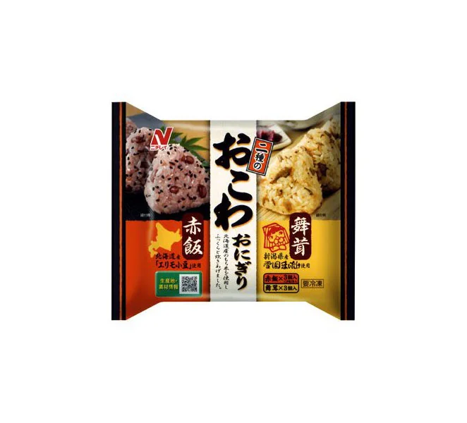
A sealed Nissin onigiri package displays a tripartite color scheme of deep orange, white, and golden yellow, divided by bold vertical black borders. The central white panel features large black kanji for 'Okowa Nikumaki' above smaller text and a red badge indicating two varieties. Flanking panels showcase photographic close-ups of the rice balls—left revealing pinkish-red 'Akameshi' with visible grains, right depicting the golden-brown 'Maimeshi' texture—while the Nissin logo anchors the upper left corner against a neutral light backdrop.
Visual hierarchy relies on the stark contrast between traditional Japanese calligraphy and modern commercial photography, creating immediate regional product recognition. The saturated warm tones of the side panels draw the eye toward the specific flavor indicators, while the central typography maintains brand authority through scale and weight. Such deliberate color blocking separates distinct flavor profiles within a single retail unit, making shelf differentiation efficient for consumers.
Packaging designers studying Japanese convenience-store aesthetics will find value in this composition's balance of textual density and food imagery. Marketing teams analyzing regional flavor differentiation can reference how color coding communicates variety without overwhelming the primary brand identity. Culinary photographers might examine how the lighting accentuates rice grain texture to inform their own product shoot setups.