Yakisoba Cup Noodle Spicy Yellow Red Dynamic
Topics
Details
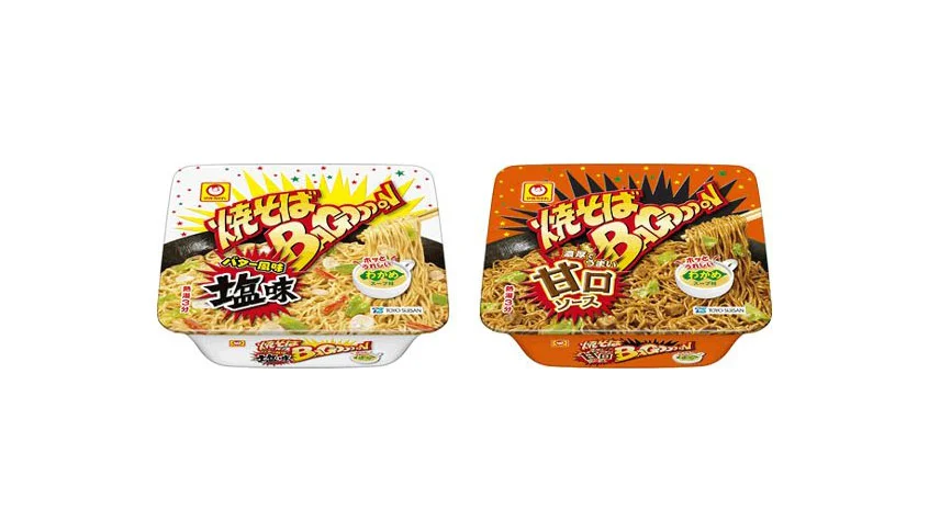
Two rectangular plastic bowls of instant yakisoba sit side by side, their lids displaying bold, explosive graphic treatments. The left container features a white base with yellow and orange starburst accents, while the right one is saturated in a deep orange-red hue. Both display the prominent 'Yakisoba BIG' logotype in stylized yellow and red characters, with additional Japanese text indicating salt flavor on the left and sweet sauce flavor on the right. The packaging photography showcases glistening stir-fried noodles mixed with cabbage and pork, all captured from a direct frontal perspective under even studio lighting that eliminates harsh shadows.
Visual energy radiates from the jagged, comic-book style bursts that frame the product names, creating an immediate sense of heat and intensity. The color coding serves as an intuitive flavor signaling system, where the cooler white and yellow palette suggests a lighter taste profile, while the aggressive orange and red tones promise a richer, sweeter experience. Typography plays a crucial role here, with the oversized, slightly italicized 'BIG' lettering conveying both portion size and bold appetite appeal through its dynamic, forward-leaning stance.
Food packaging analysts might study this comparative layout to understand how color psychology influences consumer perception of flavor intensity within a single product line. Brand strategists could examine the consistency of the visual language across variants to maintain family recognition while differentiating individual SKUs. Illustrators working on snack food concepts would find value in analyzing how the burst graphics and food photography are integrated to maximize shelf impact without cluttering the essential nutritional and brand information.