Kagome Instant Noodle Sugar-Free Udon Yellow Red Japanese
Topics
Details
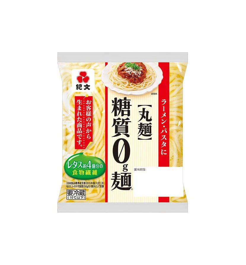
A vertical rectangular package of Kagome sugar-free udon noodles dominates the frame, featuring a bold color palette of cream, red, and yellow. The central composition displays large black kanji characters for "Sugar 0g Noodles" and "Udon" against a pale background, flanked by a vivid red vertical banner on the right containing white Japanese text for pasta and pasta sauce. A photographic image of udon topped with a rich meat sauce sits in the upper right quadrant, while the left side features a green oval badge highlighting dietary fiber content equivalent to four servings of lettuce.
Visual hierarchy is established through the dramatic scale contrast between the oversized product claims and the smaller supporting text elements. The tri-color scheme creates distinct zones of information, with the warm yellow noodle texture forming an organic backdrop that contrasts sharply with the geometric precision of the red accent bar and green nutritional callout. Typography varies significantly in weight and size, drawing immediate attention to the zero-sugar proposition while maintaining readability for secondary details about refrigeration requirements and ingredient sourcing.
Packaging designers analyzing Japanese food marketing strategies would examine this layout to understand how health claims are visually prioritized within constrained retail spaces. Brand identity specialists could reference the specific placement of the Kagome logo—a red triple-circle mark positioned prominently above the primary product name—when developing similar instant food packaging systems. Culinary photographers might study the styling choices for the hero image, particularly how the sauce's texture and garnish placement are composed to suggest appetizing freshness within a relatively small visual footprint.