Nissin Yakisoba Japanese Style Red Yellow Green
Topics
Details
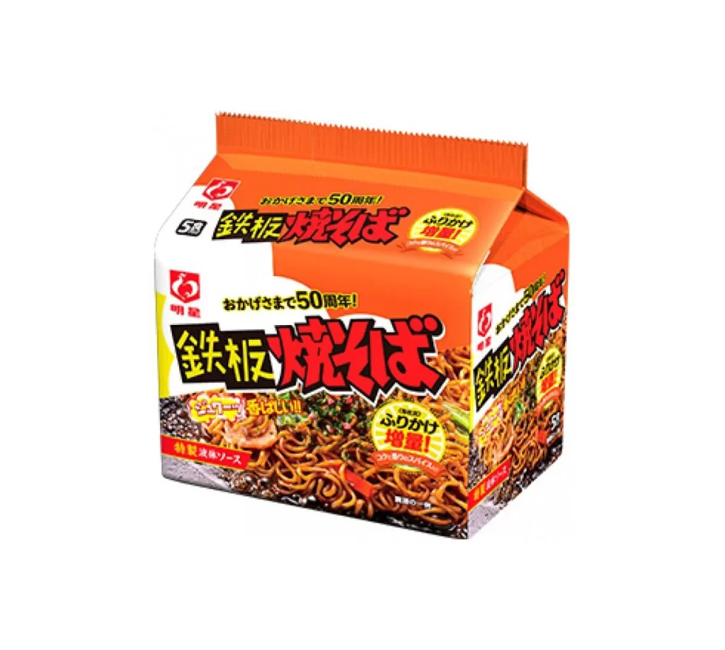
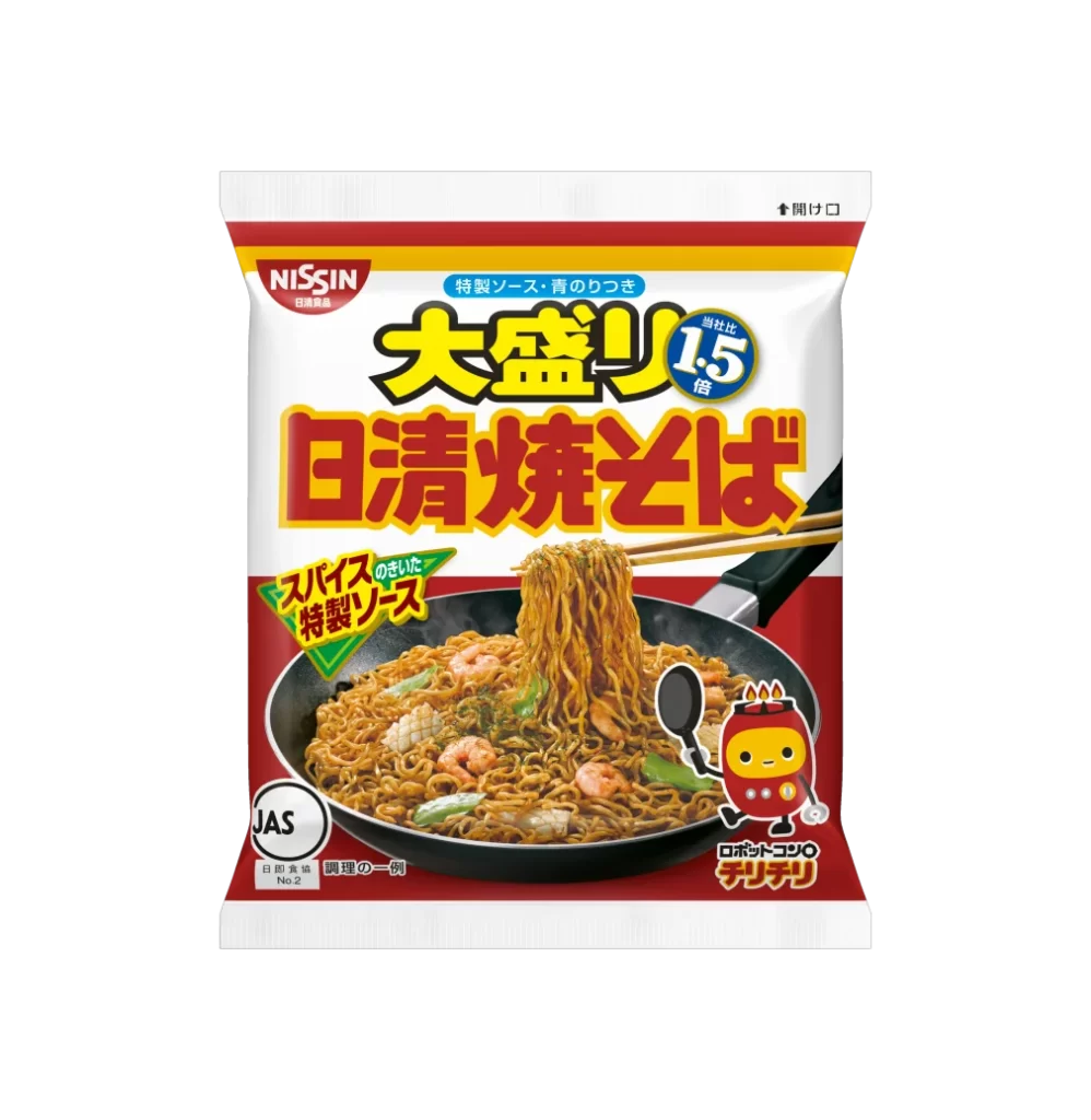
A vibrant red, yellow, and white package of Nissin Yakisoba dominates the frame with bold Japanese typography and a central photograph of stir-fried noodles in a black frying pan. The packaging features the iconic Nissin logo in a red oval at the top left, while large yellow characters for 'Oomori' (large serving) sit above massive red text spelling out 'Nissin Yakisoba'. A blue circular badge on the right announces '1.5 times' the standard portion size, and a green triangular label highlights 'Spicy Special Sauce' as a key flavor component. The lower half showcases glistening golden-brown noodles mixed with shrimp and vegetables, accompanied by chopsticks lifting a generous portion, plus a cheerful red mascot character holding a spoon near the bottom right corner.
The visual hierarchy relies heavily on contrasting primary colors that create immediate shelf impact, with the saturated red background making the yellow and white text pop dramatically. What sets this particular variant apart is its aggressive use of scale in typography—the oversized kanji characters communicate abundance before any text is even read. The inclusion of the cute robotic mascot adds a playful brand personality element that balances the bold, almost aggressive color blocking of the main design fields.
Food packaging designers studying Japanese market conventions would find this useful for analyzing how portion-size claims integrate into overall layout systems without cluttering the visual field. Illustrators working on commercial food art could reference the specific lighting techniques used to make the noodles appear glossy and appetizing within a confined product shot space. Brand identity specialists might examine how the mascot character's placement reinforces brand recognition while maintaining clear sightlines to the actual product photography.