Nissin Cup Noodle Hokkaido Yakisoba Yellow Green
Topics
Details
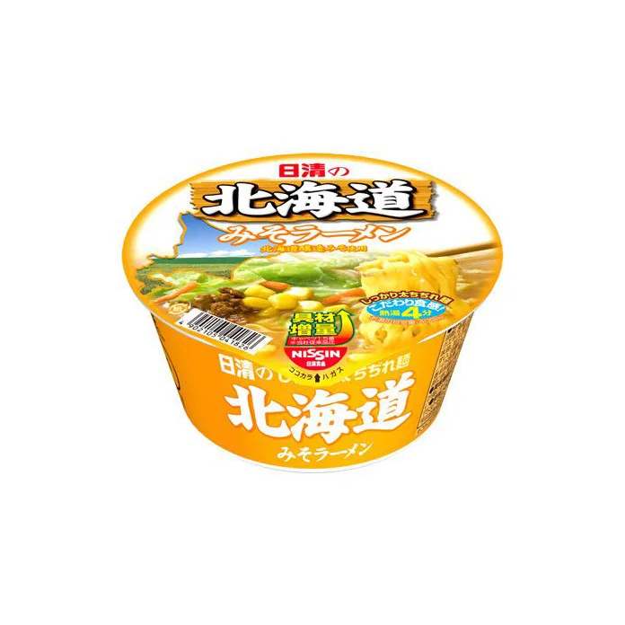
A cylindrical instant noodle cup dominates the frame, its body wrapped in a vibrant orange-yellow gradient that transitions to a lighter cream tone near the rim. The lid features bold Japanese typography reading '日清の北海道' (Nissin's Hokkaido) in black and red, with 'みそラーメン' (Miso Ramen) rendered in a softer white script below. A photographic window on the lid displays a steaming bowl of noodles topped with corn and green vegetables, while the side of the container repeats the regional branding alongside a green '塩分控えめ' (reduced salt) badge and the Nissin logo.
Visual hierarchy relies on the contrast between the warm orange base and the crisp white lettering, ensuring legibility from multiple angles. The inclusion of a scenic landscape photograph behind the food imagery creates a sense of geographic authenticity specific to the Hokkaido region. Subtle design elements like the blue circular sticker indicating microwave compatibility add functional information without cluttering the primary marketing message.
Product photographers might study the lighting setup used to eliminate glare on the curved plastic surface while maintaining color accuracy across the gradient. Packaging designers could analyze how the brand balances traditional Japanese typography with modern nutritional labeling requirements. Marketing teams evaluating regional product variations would find this useful for comparing visual strategies between standard national releases and limited-edition local flavors.