Title

Nissin Cup Noodle Light Purple Traditional Japanese Art


Topics

Food Packaging Logos

Details

Uploaded user: Leo

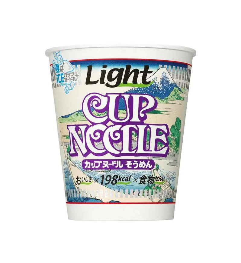
A white paper cup stands in a direct frontal view, its cylindrical form wrapped by a label dominated by lavender and indigo hues. Bold purple lettering spells out 'CUP NOODLE' beneath the word 'Light' rendered in black, while Japanese characters for 'cup noodle sour flavor' sit on a magenta banner below. The background illustration depicts Mount Fuji and a stylized landscape reminiscent of ukiyo-e woodblock prints, accented with light blue 'ICE' graphics in the upper left corner suggesting cold preparation methods.

Visual distinction emerges from the unconventional marriage of instant food packaging with traditional Japanese aesthetic motifs, specifically the mountainous scenery rendered in classic printmaking styles. The lavender typography creates an unexpected color palette for a savory product category typically associated with warmer reds or yellows, while the inclusion of calorie information—198 kcal—and text about reduced ingredients signals a health-conscious positioning that contrasts with the indulgent nature of standard cup noodles.

Product designers analyzing cross-cultural packaging strategies would find value in how this item balances heritage artistry with modern nutritional messaging. Brand strategists could examine the color psychology behind using cool purples to communicate lightness, while illustrators might study the integration of landscape elements into commercial typography without overwhelming legibility.