Pokka Sapporo Ramen Spicy Red Dynamic Typography
Topics
Details
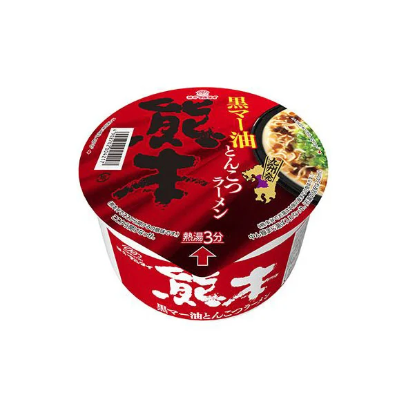
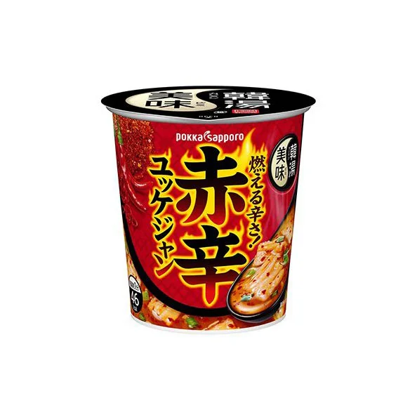
A cylindrical plastic cup of Pokka Sapporo instant ramen dominates the frame, its body wrapped in a saturated crimson label that transitions into a black lid at the top. The central visual anchor consists of large, bold Japanese characters reading "赤辛" (Spicy Red) in yellow with black outlines, flanked by vertical text for "エクジン" and the phrase "燃える辛さ" (Burning Spiciness) rendered in stylized katakana. A photographic inset on the right side displays the prepared noodles in a rich broth, while the brand name "DOKKA SAPPORO" appears in white sans-serif lettering above the main typography, all set against a neutral light-gray backdrop with soft, even studio lighting.
The typographic hierarchy here demonstrates aggressive visual weight through scale contrast, where the primary kanji characters occupy nearly half the container's visible surface area to communicate intensity before any text is read. Color psychology plays a crucial role as the dominant red field triggers immediate associations with heat and spice, while the yellow-to-orange gradient within the character fills suggests thermal radiation or flame. Compositionally, the diagonal orientation of secondary text elements creates dynamic tension that prevents the cylindrical format from feeling static, effectively translating flavor sensation into graphic energy.
Packaging designers studying Asian market conventions would examine this specimen to understand how maximum information density functions within constrained circular real estate without sacrificing legibility. Typography researchers could analyze the stroke weight variations in the custom kanji renderings to inform their own work on bilingual food packaging that requires immediate emotional impact. Marketing teams developing spicy product lines might reference this color palette and layout structure when conceptualizing visual systems that need to convey sensory heat across cultural contexts.