Nissin Rao Cup Noodle Spicy Wheat Yellow Traditional
Topics
Details
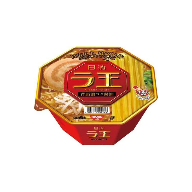
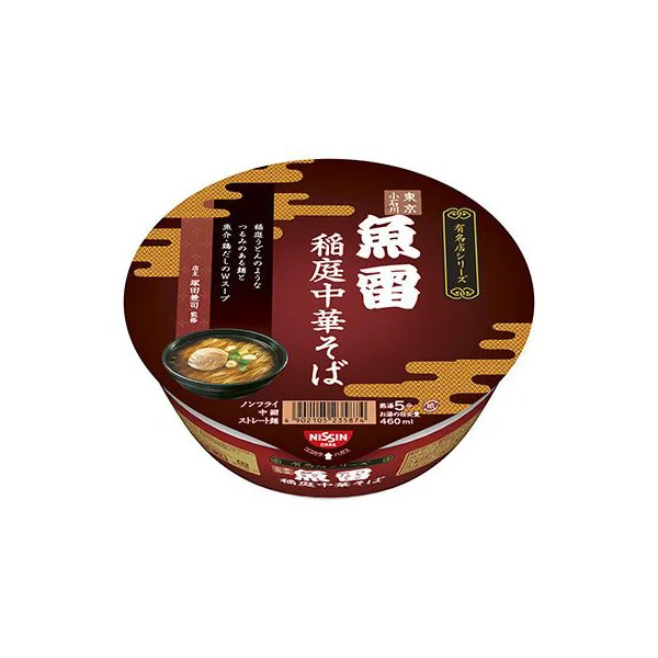
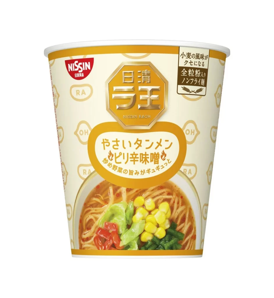
A cylindrical paper cup dominates the frame, wrapped in a cream-colored sleeve accented with a bold golden-yellow band at the top and bottom. The central visual field features the Nissin logo in red, positioned above an octagonal gold emblem containing the kanji for 'Nissin Raoh' in metallic lettering. Below this, a rounded orange rectangle houses the flavor text 'Yasai Tanmen Spicy' alongside smaller script describing vegetable toppings, while the lower third displays a photographic inset of noodles in reddish broth garnished with corn, cabbage, and peppers.
The packaging employs a sophisticated hierarchy of geometric shapes that creates visual rhythm without clutter. The octagonal gold badge acts as a prestige anchor, contrasting with the softer curves of the orange flavor label and the circular food photography. Subtle background patterning of the letters 'RA' and 'OH' repeats across the cream surface, adding texture that prevents the large empty spaces from feeling vacant while maintaining legibility of the primary information.
Brand strategists analyzing Japanese convenience-food aesthetics would examine this composition to understand how premium positioning is communicated through material choices and typographic weight. Packaging engineers could reference the structural balance between photographic realism and graphic abstraction when developing new product lines. Color theorists might study the specific golden-yellow palette to evaluate how warmth influences consumer perception of spicy flavor profiles in shelf-ready contexts.